

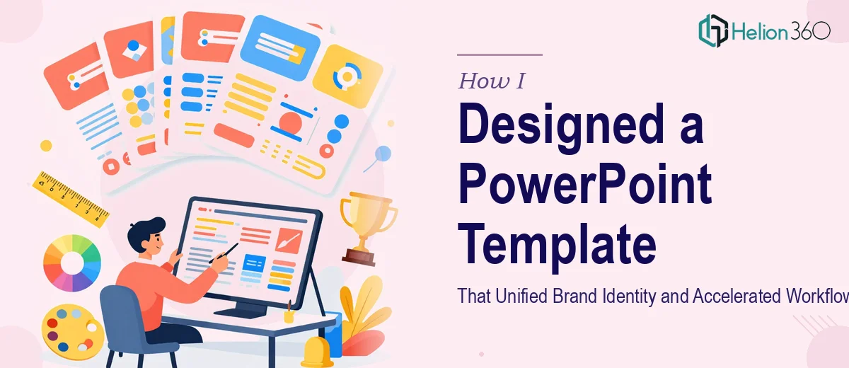
When an Old Template No Longer Fits the Brand
We had recently gone through a full marketing overhaul — new colors, updated typography, a refreshed logo, and a whole set of brand guidelines that nobody had actually applied to our internal presentations yet. Every deck we sent out still carried the look of the old company. It was inconsistent, and in client-facing situations, that inconsistency was starting to matter.
The task seemed simple enough on the surface: take our existing PowerPoint template and rebuild it to reflect the new brand identity across roughly 100 slides. I figured I could handle it myself over a weekend.
The Problem With Rebuilding a Large PowerPoint Template
I started by opening the old file and doing a quick audit. What I found was a patchwork of inconsistent slide masters, mismatched font styles, placeholder layouts that had drifted over time, and color fills that were hardcoded rather than tied to the theme palette. Fixing one slide would break the formatting on three others.
The real challenge was scale. A 100-slide branded PowerPoint template is not just a design job — it is a systems job. Every layout has to work together. The slide master has to carry the correct brand colors so that anyone using the template later does not accidentally introduce off-brand elements. Font hierarchies need to be locked in. Section dividers, agenda slides, data slide layouts, and cover pages all need to feel like they came from the same visual language.
I spent several hours reorganizing the slide master, but my changes kept cascading unpredictably. I also realized I did not have a reliable process for testing all 100 layouts at once to confirm consistency. The deadline was tight, and I was moving too slowly.
Bringing in the Right Help
After hitting a wall, I came across Helion360. I sent them the existing template, the new brand guidelines document, and a brief explaining the scope — approximately 100 slides, full rebrand, tight turnaround. Their team reviewed the files and came back with a clear plan for how they would approach the rebuild.
What they proposed made sense: start from the slide master and build everything outward, ensuring the theme colors, fonts, and spacing were locked in before touching individual layouts. That way, every slide would automatically inherit the correct brand settings without manual overrides.
What the Rebuild Actually Involved
The team at Helion360 worked through the template systematically. The slide master was rebuilt from scratch using the updated brand palette, with secondary and accent colors mapped correctly to the PowerPoint theme engine. Typography was set at the master level so that title slides, body slides, and data slides all pulled from the same font stack without requiring manual adjustment.
From there, they built out the full set of layouts — cover slides, section transitions, content slides with single and dual column formats, chart and table layouts, image-heavy slides, and supporting slides for appendices and footnotes. Each layout was tested to make sure placeholder behavior worked correctly when new content was dropped in.
The visual language across all 100 slides felt cohesive. The brand elements from the recent marketing overhaul — iconography style, spacing principles, photographic treatment guidelines — were all reflected consistently across the template.
What Changed After the Template Was Done
The difference was immediately noticeable in how the team used the file. People stopped reformatting slides manually because the defaults were already correct. New presentations came together faster because the layout options were purpose-built for the kinds of content we actually produce.
Beyond the visual improvement, there was a practical workflow benefit. With a properly structured branded PowerPoint template, anyone on the team could open it and produce something on-brand without needing design input for every slide. That independence saved time across the board.
Building a 100-slide custom PowerPoint template the right way requires more than design skill — it requires understanding how PowerPoint's theme and master system actually works, and having the discipline to build for long-term usability rather than just short-term appearance.
If you are in a similar position — an existing template that no longer matches your brand, a large slide count, and a deadline that does not give you room to figure it out as you go — Helion360 is worth reaching out to. They handled the complexity cleanly and delivered exactly what was needed.
For professional support with business presentation design services, or to learn more about how cohesive PowerPoint master slides scale across teams, check out these resources. You can also explore how business PowerPoint presentations simplify complex data to drive strategic clarity.