

When a Simple Template Request Turned Into a Complex Design Challenge
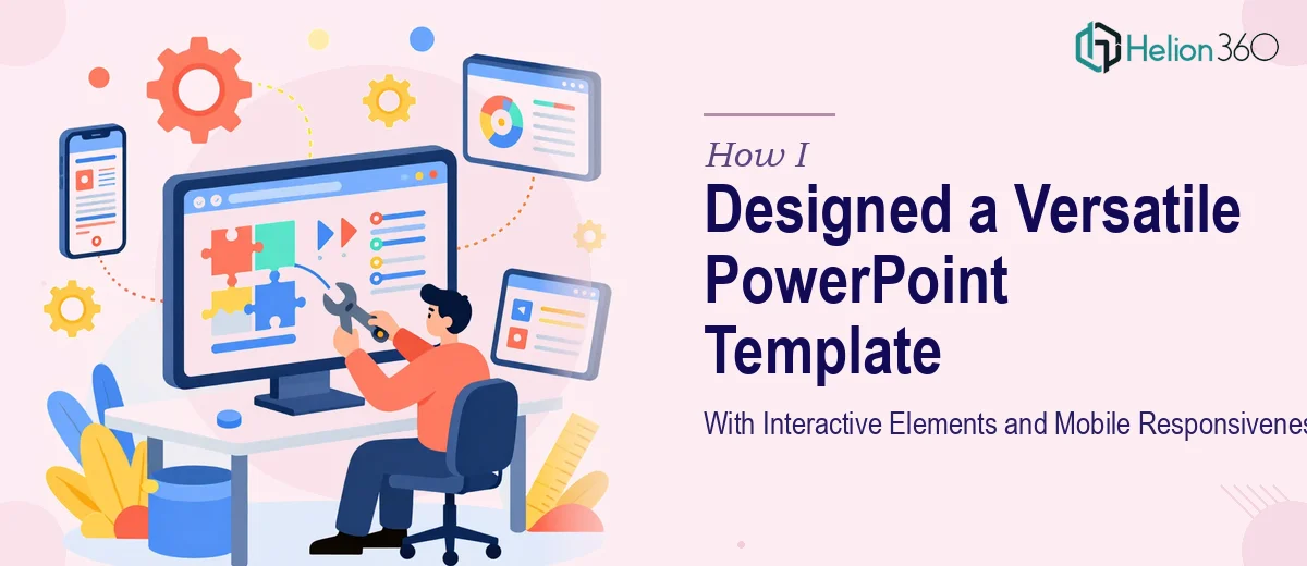
I was building a new product and needed a PowerPoint template that could do more than just look good. The plan was to use it across different presentation types — business strategy decks, marketing plans, and financial reports. One template needed to handle all of it cleanly, without looking like a patchwork of styles.
At first, I thought I could put something together myself. I had a rough idea of the layout, a brand color palette, and some reference slides I liked. How complicated could it really be?
Pretty complicated, as it turned out.
Where It Started to Fall Apart
The visual side was manageable — picking fonts, setting up slide masters, defining color themes. But the moment I started adding interactive elements, things got messy. I wanted clickable buttons with hyperlinks that navigated between sections, and I needed those to behave intuitively whether someone was presenting from a laptop or viewing on a tablet.
Mobile responsiveness in PowerPoint is not as straightforward as it sounds. Slide layouts that look balanced on a widescreen presentation can become cramped or misaligned when viewed on a smaller screen. Getting proportions right across different aspect ratios took far more time than I had budgeted.
Then came the data visualization requirement. I needed slide layouts that could accommodate charts, graphs, and infographic-style data displays — all while staying consistent with the overall template design. Every time I tested a chart placeholder, something else broke. A text box would overlap. A chart would resize incorrectly. The spacing across slide types became inconsistent.
I had spent nearly two full days on it and was maybe a third of the way through what I actually needed.
Bringing in the Right Help
That's when I reached out to Helion360. I explained what I was trying to build — a professional PowerPoint template that was versatile enough for business, marketing, and financial content, with interactive navigation, responsive layouts, and integrated data visualization support. I also shared the reference slides and the brand guidelines I had been working from.
Their team asked the right questions upfront. How many core slide layouts did I need? Should the interactive buttons trigger section jumps or link to external content? Did I want the data visualization placeholders pre-formatted with sample charts, or clean and ready for input? Within one conversation, it was clear they had done this kind of work before and understood exactly where my DIY approach had been falling short.
What the Finished Template Actually Delivered
Helion360 came back with a template that solved every problem I had been stuck on. The slide master was built cleanly, so any changes to fonts or colors propagated consistently across all layouts. The interactive buttons were mapped logically — a section navigation panel on key slides let users jump between the strategy, marketing, and financial sections without hunting through the deck.
The mobile responsiveness issue was handled through careful layout structuring. Content blocks, image placeholders, and chart areas were sized and positioned so the slides scaled well across different viewing environments. It was not a workaround — it was just good structural design from the start.
The data visualization slides were the part I was most impressed with. Each layout had pre-set chart placeholders formatted to match the overall template style, with clear labels and clean spacing. Dropping in real data required almost no reformatting. For anyone building financial reports or marketing decks regularly, that kind of ready-to-use structure saves a significant amount of time per presentation.
What I Took Away From This
Building a professional PowerPoint template that works across use cases — especially one with interactive elements and responsive design — is a much deeper project than it appears. The visual layer is the easy part. The architecture underneath, how slide masters interact with layouts, how hyperlinks are structured, how chart placeholders behave — that's where the real complexity lives.
I went in thinking I could handle it with a few hours of effort. What I actually needed was someone who builds these systems regularly and knows where the problems hide before they show up.
If you're trying to build a custom PowerPoint template with interactive navigation, data visualization layouts, or consistent multi-use design, Helion360 is worth reaching out to — they handled the full scope of what I had mapped out and delivered something that actually works in practice.
You might also find it helpful to explore how others tackled similar challenges, like the approach to professional templates for business operations or the strategy behind minimalist PowerPoint templates.