

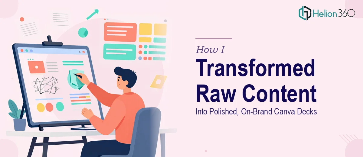
When Good Content Is Not Enough to Make a Great Deck
Our marketing team had no shortage of ideas. We had content ready, messages refined, and a rough structure mapped out across multiple slides. What we did not have was a presentation that actually looked the part. The decks we were building in Canva were functional, but they felt inconsistent — fonts mixed across slides, colors slightly off from our brand palette, layouts that looked crowded on some pages and empty on others.
I took it upon myself to fix the problem. I spent a few evenings going through the slides, trying to apply our brand colors more consistently, adjusting font sizes, and cleaning up layouts. For a while, it felt like progress. But every time I improved one slide, something else would feel slightly off. The spacing would look wrong, or the visual hierarchy would break down when viewed as a full deck rather than individual slides.
The issue was not just about aesthetics. Our presentations were going in front of key stakeholders, and a messy or inconsistent deck sends the wrong signal before anyone reads a single word.
Where the Real Challenge Began
Polishing a Canva deck sounds straightforward until you realize how many small decisions are involved. Color theory, typographic hierarchy, grid alignment, image treatment, and consistent brand application — these are not things you can learn and apply perfectly in a few hours. I had a decent eye for what looked wrong, but I kept struggling to articulate what the right version should look like.
I also realized the problem was going to repeat itself. We had multiple decks in various stages of completion, and each one had its own set of inconsistencies. This was not a one-slide fix. It was a system-wide design problem that required someone who actually understood how to build a cohesive visual language inside Canva.
That is when I reached out to Helion360. I explained the situation — multiple marketing presentation decks that had solid content but lacked visual polish, brand consistency, and professional layout. Their team understood the brief quickly and asked the right questions about our brand guidelines, color palette, and the audience these decks were meant for.
What the Design Process Actually Looked Like
The Helion360 team started by reviewing all the existing Canva decks alongside our brand guidelines. Rather than rebuilding from scratch, they worked with what we had — restructuring layouts, correcting the color application, establishing consistent typography rules, and applying proper spacing and visual hierarchy throughout.
What stood out was how they handled the content itself. Instead of just making things look prettier, they organized each slide so that the most important information was visually dominant. Supporting details were styled to sit at the right level — present, but not competing for attention. The decks started to feel like they had been built with intention, not just assembled.
They also created a set of master slide templates in Canva so that future decks could follow the same visual framework. That was something I had not even thought to ask for, but it solved the recurring problem at its root.
The Difference a Polished Deck Makes
When the final versions came back, the contrast was immediately visible. The same content that had felt rough and inconsistent now looked professionally designed. The brand identity was clear from the first slide to the last. Stakeholders who reviewed the brand-aligned marketing presentations commented on how much more structured and credible the material felt.
More practically, our team now had a reliable starting point for every new deck. The Canva templates meant we were no longer building from a blank slate or guessing at font sizes and spacing every time. The design system did the heavy lifting, and the team could focus on the content.
Polishing a Canva presentation deck is not just about making it look nice. It is about making sure the design is doing the same job as the words — communicating clearly, building trust, and keeping the audience focused on what matters.
If your team is sitting on cluttered PowerPoint decks that have good content but inconsistent design, Helion360 is worth reaching out to. They took a fragmented set of slides and turned them into a consistent, on-brand presentation system that we still use today.