

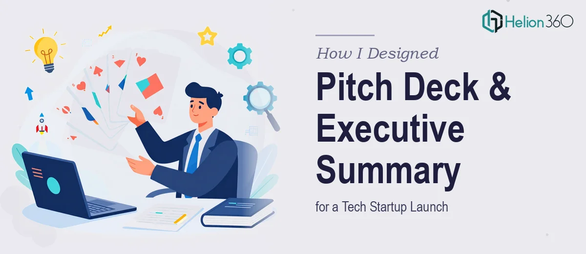
The Brief Looked Simple Enough
When I first sat down with the materials for this project, I thought it would be straightforward. A 12-page pitch deck for a newly launched tech startup, plus a one-page executive summary. Clean scope, tight deadline — next Friday.
The startup had a clear story. They were building innovative solutions in the tech space, already seeing early traction, and needed the presentation to do two things: communicate their product features and benefits visually, and leave stakeholders with a strong first impression. The one-pager was meant to capture the mission, vision, and the core customer problem they solve — all in a single, polished page.
On paper, this felt manageable. In practice, it was anything but.
Where the Complexity Crept In
The pitch deck was not just a slide deck — it was a startup pitch deck packed with data visualizations, infographics, and a narrative arc that needed to hold up in front of investors or partners. Every page had to earn its place. The visual hierarchy, the color system, the typography — it all needed to speak to a tech-savvy audience while staying accessible enough for non-technical stakeholders.
I started building slides in Canva, arranging sections around product features, market opportunity, and traction metrics. But I kept running into the same problem: the data-heavy slides looked cluttered no matter how I arranged them. Charts that made sense in a spreadsheet turned into visual noise on a slide. Infographics I was proud of at first draft looked amateurish at second glance.
The executive summary added another layer. Condensing a company's mission, vision, and value proposition into one page without it feeling like a wall of text — that is a specific design skill. I was treating it like a Word document with some formatting. It needed to be a designed artifact.
I was already behind by mid-week.
Bringing In the Right Team
After hitting a wall on the data visualization slides, I reached out to Helion360. I explained the full scope — the 12-page startup pitch deck, the one-page executive summary, the tight deadline, and the level of polish the client expected. Their team understood the brief immediately and asked the right questions: brand colors, target audience, tone, and what story the deck needed to tell.
They took over from there.
What I handed off was a messy working draft. What came back was a coherent, visually tight presentation design where every slide had a clear purpose. The infographics were clean and readable. The data visualizations were structured so the insight landed before the viewer had to decode anything. The overall layout felt like something a funded startup would actually use in a room with investors.
What the Final Deliverable Looked Like
The 12-page pitch deck came back with a consistent visual language across all slides — a defined type scale, a color palette that felt modern without being trendy, and a grid-based layout that made the data-heavy slides breathe. Each section transitioned logically into the next, reinforcing the product story rather than just presenting information.
The executive summary was the piece I was most worried about. Helion360 treated it as a standalone design document, not an afterthought. It communicated the mission and vision clearly, called out the customer problem with impact, and still had enough white space to feel intentional rather than rushed.
The whole package was delivered before the Friday deadline.
What This Project Taught Me
A professional pitch deck and a well-designed one-page executive summary are not just formatting exercises. They require visual storytelling skills, an understanding of how investors and stakeholders consume information, and the ability to translate raw content into something that builds trust at a glance.
I am comfortable with a lot of design work. But investor pitch decks — especially when they involve dense data visualization and infographics under a real deadline — are a discipline of their own. Knowing when to bring in a team that specializes in exactly that made the difference between a project that barely made it and one that actually impressed.
If you are in a similar spot — staring at a half-built pitch deck that is not quite coming together — Helion360 is worth reaching out to. They stepped in, handled the complexity, and delivered work that held up exactly where it needed to.