

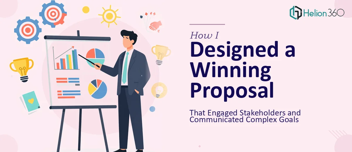
When a Proposal Is More Than Just a Document
I had a project proposal that needed to go in front of a mixed audience — internal team leads and a few external stakeholders who had never seen the project before. The content was solid. The goals were clear in my head. But when I opened PowerPoint and started building the deck, the result looked like a formatted Word document with a logo slapped on the first slide.
That is not the kind of professional PowerPoint proposal that convinces anyone of anything.
I spent an evening trying to fix it myself — adjusting fonts, pulling in stock images, tweaking slide layouts. Everything I did made it look more inconsistent, not less. The alignment was off. The hierarchy of information was unclear. And I still had slides that were just walls of text, which I knew would lose the room in the first five minutes.
The Real Problem With DIY Proposal Formatting
The issue was not that I lacked understanding of the content. I knew the project inside out. The issue was translating dense, structured information into a visually engaging presentation that different types of viewers could follow without effort.
A well-designed PowerPoint proposal needs to do several things at once. It needs clean visual hierarchy so readers know what matters most. It needs consistent formatting across every slide so the deck feels intentional and credible. And it needs the right balance of text, graphics, and white space so stakeholders are not overwhelmed.
That combination — especially across a proposal with technical sections, timelines, and budget context — requires a different skill set than simply knowing the content.
Bringing In the Right Support
After hitting a wall with my own attempts, I came across Helion360. I explained what I had: a rough deck with about twenty slides of unformatted content, some data that needed to be visualized as charts, and a clear deadline. Their team asked the right questions — about the audience, the tone, the branding guidelines I needed to follow — and then took it from there.
What I handed over was essentially a raw content file and a few notes. What came back was a structured, professionally formatted proposal presentation that I would not have been able to produce on my own in the time I had.
What Good Proposal Formatting Actually Looks Like
Seeing the finished deck taught me a lot about what professional PowerPoint formatting involves that I had been underestimating.
The opening slides established context quickly — a clear problem statement, a defined scope, and a summary of goals — before any detail was introduced. That structure helped external stakeholders get oriented without needing background knowledge. Each section used consistent heading styles and visual cues to signal transitions, so the flow felt natural rather than choppy.
The data slides were the biggest improvement. What had been a few rough numbers in bullet form became clean charts with callouts that highlighted the most important figures. This kind of data visualization in a proposal is not decorative — it is functional. It allows decision-makers to absorb information faster and focus their questions on what matters.
Branding was applied consistently across every slide — not just on the cover. The color palette, typography choices, and icon style were cohesive throughout, which gave the deck a polished, credible look that matched the seriousness of what we were proposing.
How the Presentation Landed
The proposal went into the stakeholder meeting in much better shape than I expected when I first sat down to build it. Feedback from the room confirmed what good presentation design is supposed to do — people followed the logic without needing everything explained verbally. The visual structure did the heavy lifting.
Looking back, the challenge was never the content. It was communicating that content in a format that respected the audience's time and attention. Trying to handle the design work myself would have cost more hours than I had and still produced a weaker result.
Helion360 stepped in at the right point and delivered exactly the kind of professional proposal presentation the moment required. If you are working on a high-stakes proposal and the design side is slowing you down, they are worth reaching out to.