

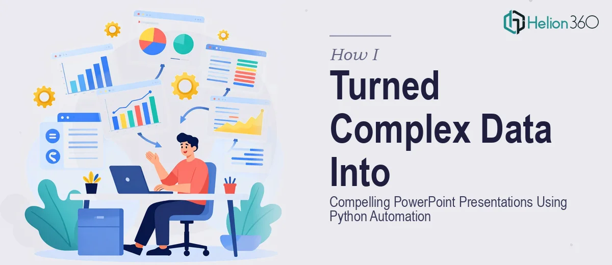
When the Data Was Ready but the Slides Were Not
I had everything I needed on paper — months of business performance data, trend lines, revenue projections, and market comparisons. The numbers told a clear story. The problem was translating all of that into a PowerPoint presentation that an executive audience could actually follow.
I knew Python could help. I had worked with it before for data processing, and I had heard about libraries like Matplotlib, Seaborn, and python-pptx that are specifically designed to push charts and visuals directly into slides. So I rolled up my sleeves and started scripting.
What I Managed to Build on My Own
My first attempt got me somewhere. I used Matplotlib to generate some bar charts and line graphs from the datasets, then used python-pptx to drop them into a slide template. The automation worked in a basic sense — I could update a data source and regenerate the deck in seconds. That part felt genuinely useful.
But the slides looked rough. The charts were technically accurate but visually flat. The layouts felt inconsistent. Some slides had too much information crammed into them, while others looked sparse. The color scheme did not match our brand, and the typography was all over the place. When I ran it by a colleague, the feedback was polite but honest: the data was there, but the presentation did not feel credible.
Automating data into PowerPoint is one thing. Designing slides that actually communicate with clarity and visual impact is a different skill set entirely.
Bringing in a Team That Could Handle Both
After hitting that wall, I came across Helion360. I explained the situation — I had Python-generated outputs and structured data, but I needed the presentations to look professional and be built in a way that could scale as we updated the data regularly. Their team understood immediately what the gap was.
They did not ask me to scrap the automation approach. Instead, they worked with what I had built and layered proper presentation design on top of it. They established a clean slide master with our brand colors, consistent fonts, and reusable layout grids. The charts were redesigned so they communicated the right emphasis — not just displaying data but guiding the viewer's eye to what mattered.
They also restructured the slide flow. What I had built was essentially a data dump across 30 slides. What they returned was a 20-slide presentation with a clear narrative arc — context, key findings, implications, and recommended actions. Same data, completely different experience for the audience.
What the Final Presentation Actually Delivered
The finished deck was something I could not have produced on my own within the timeframe I had. The data visualization was precise and on-brand. Charts were labeled clearly, callouts highlighted the most important metrics, and each slide had one primary message rather than five competing ones.
The Python automation piece still ran underneath all of this — I could refresh the underlying data and regenerate the charts — but now those outputs fed into a properly designed template that held its structure and visual quality regardless of what the numbers were.
The presentation went to a senior leadership audience and landed well. Several people asked who had designed it, which is honestly the best signal you can get from a business presentation — when the design is noticed for the right reasons.
What This Experience Taught Me About Python and Presentation Design
Python automation is genuinely powerful for data-heavy presentations. It removes the manual effort of rebuilding charts every reporting cycle and keeps everything consistent at the data level. But automation alone does not make a presentation effective. The structure, the visual hierarchy, the way information is sequenced — those require deliberate design decisions that no script can make on its own.
The combination of solid automation and thoughtful slide design is where the real value sits. Getting both right at the same time is difficult, especially under deadline pressure.
If you are working through a similar situation — where you have the data and maybe even the automation in place, but the presentations are not landing the way they should — Helion360 is worth reaching out to. They handled the design gap I could not close on my own and turned what I had into something the audience actually engaged with.