

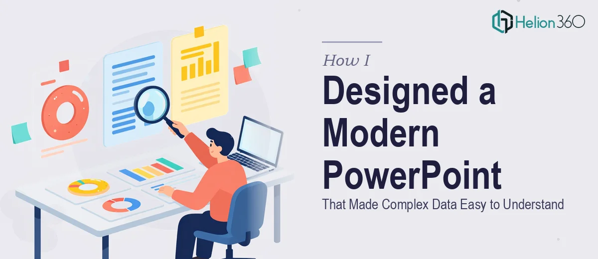
When One Slide Carries a Lot of Weight
It started with what felt like a simple enough request. I needed to put together a single PowerPoint slide that could communicate our team's recent project results — complete with data visualizations, a couple of graphs, and a short description of each initiative. Nothing too elaborate, or so I thought.
The reality hit once I opened PowerPoint and started laying things out. The data itself was dense. The graphs were meaningful but visually messy. The text I had written was necessary but too long for a single slide. Every version I tried either looked too cramped, too plain, or too inconsistent. I was spending more time tweaking margins and font sizes than actually thinking about what the slide needed to communicate.
The Challenge with Data-Heavy Slide Design
The core problem was balance. I wanted a modern, clean design — something that looked professional without being cold or hard to read at a glance. But every time I added a chart, the layout broke. Every time I pulled the text back to make room, something important got cut.
I tried a few downloaded templates, but none of them matched the specific combination of data visualization and project narrative I needed. Generic templates are built for generic content. My content had a specific structure that needed a custom approach.
After a few more hours of rearranging elements and still not landing on something I was confident in, I decided to stop pushing and find someone who could handle the design properly.
Bringing In a Professional Eye
That's when I reached out to Helion360. I explained what I had — the raw data, the graphs, the project descriptions — and what I was going for: a modern, readable, visually balanced slide that didn't feel overloaded. They asked a few clarifying questions about style preferences and color direction, and then they took it from there.
What came back was a significant step up from what I had been working on. The data visualizations were redesigned with cleaner chart styles that were easier to scan. The project descriptions were laid out in a way that guided the eye naturally across the slide without competing with the graphs. The typography was consistent and purposeful. It looked like the kind of professional presentation design you'd see in a boardroom — but approachable and clear.
What Good Slide Design Actually Does
Seeing the finished version made one thing obvious: good PowerPoint slide design is not just about aesthetics. It's about how information flows. A well-designed slide tells the viewer where to look first, what context to read next, and what to take away — all within a few seconds of glancing at it.
The modern presentation design Helion360 delivered achieved exactly that. The charts were no longer floating objects competing for attention. They were integrated into the layout so that each visual supported the text next to it. The result was a slide that communicated everything it needed to without feeling crowded.
What I Took Away from This Process
Handling data visualization inside a PowerPoint slide is genuinely harder than it looks. It's not just about dropping a chart into a placeholder. The chart type, size, color scheme, and position all affect how readable the overall slide is. When you're also trying to balance written content alongside visuals, it becomes a design problem that requires more than just software knowledge.
I came into this thinking I could manage it myself with enough patience. And I probably could have — eventually. But the deadline was real, and the result needed to be polished. Knowing when to hand something off is a practical skill, not a shortcut.
If you're working on a presentation slide with dense data and graphs that needs to read clearly and look modern, Helion360 is worth reaching out to — they stepped in at exactly the right moment and delivered exactly what the work required.