

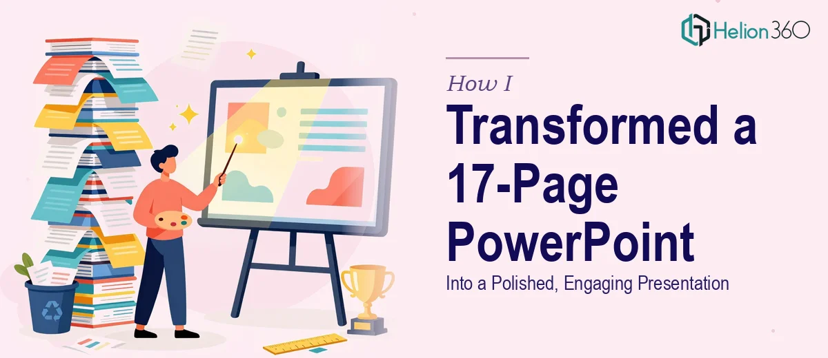
The Presentation Was There — But It Didn't Look the Part
I had a 17-page PowerPoint that covered everything it needed to. The content was solid, the information was organized, and the key points were all in the right places. But every time I opened it to review, something felt off. The slides looked flat. The layouts were inconsistent. Some pages had too much text crammed in, while others felt oddly sparse. The whole deck lacked a visual thread that tied it together.
I knew the presentation had to look professional. This wasn't something I could just send across as-is.
I Tried to Fix It Myself First
My first instinct was to handle it on my own. I started rearranging layouts, swapping out fonts, and trying to add some visual elements to make the slides feel more alive. I spent a couple of hours adjusting alignment, testing color combinations, and looking for icons that might work.
The problem wasn't that I didn't know how PowerPoint worked. It was that making a presentation look genuinely polished requires a design eye — a sense of spacing, hierarchy, and visual flow that goes beyond moving boxes around. Every time I fixed one slide, another felt out of place. And the deadline was not moving.
I also realized I was losing time I didn't have. Between juggling the content itself and trying to fix the design, I was burning hours on something that still wasn't getting better fast enough.
Handing It Off to Someone Who Could Actually Fix It
After hitting that wall, I came across Helion360. I reached out, explained the situation — 17 slides, tight deadline, needed a full visual refresh — and shared the file. Their team asked a few quick questions about the tone I was going for and whether I had any brand guidelines to follow. Once I gave them the details, they took it from there.
What I appreciated was that I didn't have to micromanage the process. I handed over the deck and trusted that they understood what "polished and engaging" actually meant in practice.
What the Redesigned Deck Actually Looked Like
When I got the file back, the difference was clear from the first slide. The layouts had been reworked so each page felt purposeful rather than crowded. Visual elements were added where the content called for them — not decoratively, but in a way that actually supported the message on each slide.
The typography was consistent throughout. Spacing felt intentional. The slides had a visual flow now, where one page led naturally into the next. The presentation design held together as a whole instead of feeling like a collection of disconnected pages.
All 17 slides had been touched, and none of them looked like an afterthought.
What This Experience Actually Taught Me
There's a gap between knowing your content and being able to present it well visually. I understood my material completely — but translating that into a professional PowerPoint presentation that looks clean, flows well, and keeps an audience engaged is a different skill entirely.
I also learned that a tight deadline is exactly the wrong time to try to learn that skill on the fly. The smarter move is recognizing when the work needs a different kind of expertise and getting that in place quickly.
The redesigned deck came back on time, looked significantly better than what I had started with, and required no further edits on my end. That alone made the whole process worth it.
If you're sitting on a presentation that has good content but doesn't look the way it needs to, consider visual enhancement of presentation — or explore how others have tackled similar challenges. Learn more about transforming data-heavy reports into visually engaging PowerPoint presentations, or discover how bland presentations became captivating visual stories. Helion360 stepped in when I was stuck and delivered exactly what I needed, without the back-and-forth I was dreading.