

The Slides Were Functional — But Just Barely
I had been using the same company presentation for close to two years. The content was solid, the data was accurate, and the narrative made sense. But every time I opened the file before a meeting, I felt a quiet sense of dread. The slides were dated — heavy text blocks, inconsistent fonts, clip-art-style icons, and transitions that looked like they belonged in a 2009 tutorial video.
It was not broken enough to abandon, but it was clearly not working hard enough for us. Clients had stopped engaging during walkthroughs. Team members would glance at their phones. I knew the presentation needed a full redesign, not just a polish.
I Tried Doing It Myself First
I spent a weekend attempting the PowerPoint redesign on my own. I cleared out the clutter, tried a few cleaner layouts, and experimented with some modern slide design principles I had read about. I even downloaded a free template to use as a base.
The results were mixed at best. The slides looked cleaner in isolation but felt inconsistent when you moved through them as a deck. The color palette I chose clashed subtly with our brand. I could not get the interactive elements — linked navigation, clickable section tabs — to behave properly. And the animations I added felt either too subtle to notice or too distracting to ignore.
The bigger issue was time. Between managing regular work and trying to figure out the finer points of slide design, I was spending hours on something that still did not look right. A modern professional presentation redesign is more than swapping out colors and adding a transition effect. It requires a consistent visual language across every slide, and that takes both skill and experience to execute well.
Bringing In the Right Team
After hitting a wall, I came across Helion360. I sent over the existing deck along with a brief explaining what we needed — cleaner layouts, consistent branding, a few interactive navigation elements, and animations that added flow without being distracting. I also shared some reference slides from other decks I admired.
Their team came back quickly with questions that immediately told me they understood the brief. They asked about brand guidelines, preferred font pairings, and whether the deck would be presented live or shared as a self-navigating file. Those questions mattered — and the answers shaped the direction of the redesign.
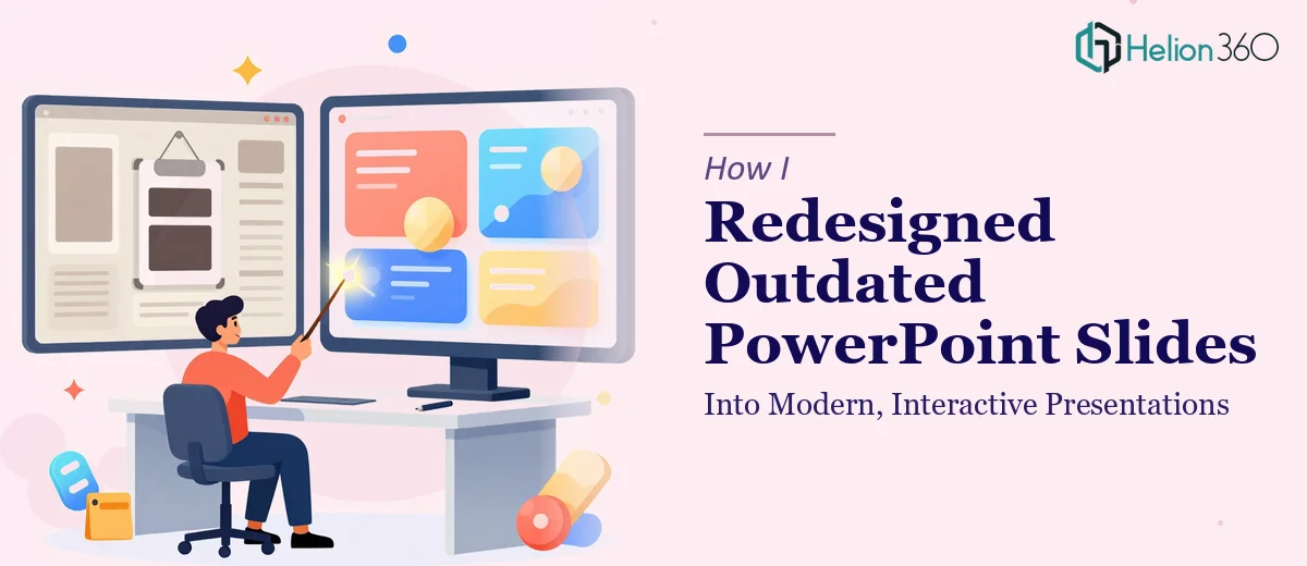
What the Redesign Actually Looked Like
The finished presentation was a significant step up from what I had been working with. Every slide followed a coherent visual system — consistent spacing, a refined color palette tied directly to our brand, and typography that was clean and easy to read at a distance. The data slides used simple, well-structured charts instead of cluttered tables. Section dividers made the deck easier to navigate during live presentations.
The interactive elements were handled thoughtfully. Rather than adding complexity for its own sake, the team built in a clickable agenda slide that let you jump between sections, which was genuinely useful when presenting to different audiences who needed different parts of the deck.
The animations were subtle — entrance effects that guided attention without pulling focus away from the content. It felt like a modern professional presentation, not a demonstration of what PowerPoint could technically do.
What I Took Away From This
The experience clarified something I had been slow to accept: presentation redesign is a specialized skill. Knowing how to use PowerPoint is not the same as knowing how to design in PowerPoint. Slide design involves hierarchy, visual rhythm, spacing, and consistency across dozens of slides simultaneously. It is a different discipline, and treating it that way made the outcome far better than anything I could have produced in my spare time.
The deck has since been used in multiple client meetings and internal reviews. The difference in how people engage with it is noticeable. Nobody checks their phone during the walkthrough anymore.
If your current slides are holding your content back, Helion360's business presentation design services are worth reaching out to — they took a cluttered, outdated deck and rebuilt it into something that actually works, without losing any of the substance that mattered.