

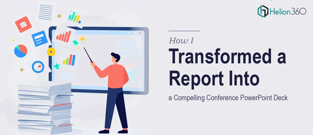
The Report Was Ready. The Presentation Was Not.
With our annual conference less than a month away, I had everything I needed — or so I thought. The 12-page report was thorough, data-rich, and well-researched. The problem was turning all of that into a conference PowerPoint deck that could actually hold an audience's attention for 20 minutes.
Reading a report and presenting one are two completely different things. What works on paper rarely works on a slide.
Where I Got Stuck
I opened PowerPoint and started laying things out. The first few slides came together reasonably well — a title slide, a brief overview. But then came the challenge of condensing dense paragraphs into slide-ready content without losing the meaning. Every time I trimmed a section, I felt like I was cutting something important. Every time I left it in full, the slide looked like a wall of text.
The data sections were even harder. The report had several findings with supporting numbers, and I knew these needed charts or visual summaries to land properly in a live presentation setting. But designing those visuals from scratch, while also managing layout, fonts, color consistency, and overall slide flow — it was more than I could pull off cleanly within the timeline I had.
I also had brand guidelines to follow. Specific fonts, a defined color palette, logo placement rules. Getting all of that right while also focusing on content structure felt like too many things to manage at once.
Bringing in the Right Support
After hitting that wall, I came across Helion360. I sent over the report, explained the conference context, shared the brand guidelines, and outlined what I needed: a professional yet modern presentation design that summarized each section clearly, used visuals where the data called for it, and maintained a logical flow from one slide to the next.
Their team took it from there. I did not have to explain presentation design principles or brief them on how to handle dense content — they clearly already understood the challenge of converting a report to a presentation.
What the Final Deck Looked Like
What came back was a clean, well-structured PowerPoint deck that covered all 12 pages of source material without feeling rushed or cluttered. Each section of the report had been distilled into its core message, supported by the right visual — a chart here, an icon-based summary there, a highlighted statistic where the number needed to stand out.
The slide flow made sense. There was a natural progression from context to findings to implications, which mirrored how a speaker would actually walk an audience through the content. The branding was consistent throughout — right fonts, right colors, right logo placement — and it looked polished enough to use on a conference stage without any last-minute edits.
The design had a modern quality without being flashy. It felt like the kind of presentation that respects the audience's time and makes the information accessible rather than overwhelming.
What This Process Taught Me
Converting a detailed report into a presentation is genuinely a different skill set from writing the report itself. It requires decisions about hierarchy — what gets a full slide, what gets a line, what gets cut entirely. It requires visual judgment about when a chart communicates better than a sentence. And it requires design discipline to keep everything cohesive across 15 or 20 slides.
I knew the content. I did not have the time or the design bandwidth to execute the translation properly. Recognizing that early saved me from delivering a mediocre deck at an event that actually mattered.
The conference went well. The presentation held up on screen, the structure made it easy to speak to, and the audience could follow along without squinting at overcrowded slides.
If you are in a similar position — sitting on a solid report but struggling to turn it into something presentation-ready — Helion360 is worth reaching out to. They handled the translation from document to deck with exactly the kind of care the project needed.