

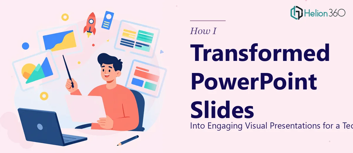
The Slides Were Fine. But Fine Wasn't Enough.
When I sat down to review the two PowerPoint presentations for our startup, I could see the information was solid. The content covered our latest innovations, a market analysis section, and a roadmap for what was coming next. All the right pieces were there. But the slides felt flat. Dense text, default fonts, inconsistent spacing — the kind of deck that makes an audience work too hard to stay interested.
As a founder, I wear a lot of hats. I can write a pitch, run a product demo, and hold my own in investor conversations. But making a presentation visually compelling — making it feel designed rather than just assembled — that's a different skill set entirely.
What I Tried Before Asking for Help
I spent a couple of hours trying to clean things up myself. I swapped out a few colors, tried to align the layout better, and played around with some icons. The slides looked marginally better, but they still didn't feel cohesive. The market analysis data especially felt like a wall of numbers without any visual logic pulling it together.
The challenge wasn't the content — it was presentation design. Knowing how to structure information visually, how to guide a viewer's eye across a slide, how to make data readable at a glance — that takes more than a few formatting tweaks. I realized I was spending time on something that wasn't producing results, and I needed to move on it quickly.
Bringing In the Right Support
After hitting that wall, I came across Helion360. I explained the scope: two slides, existing content to keep intact, and a need for a polished, professional redesign that would make the presentations genuinely engaging. Their team asked the right questions — about brand tone, audience context, and how the slides would be used — and then took it from there.
That clarity at the start made a real difference. Rather than guessing at what I needed, they worked from a clear brief.
What the Redesigned Slides Actually Looked Like
The transformation was meaningful without being dramatic. The content stayed intact — that was the requirement — but the way it was presented changed completely.
The innovations section, which had previously been a block of bullet points, was restructured into a clean visual layout that used iconography and whitespace to give each point room to breathe. The market analysis data, which was the harder of the two to crack, was turned into a data visualization that made trends immediately readable. Percentages that had been buried in paragraphs became clear, standalone callouts. Charts were redesigned with a consistent color palette that matched the startup's branding.
The slide hierarchy was cleaned up too. Headers, subheaders, and body text were given distinct visual weight, so a viewer scanning the slide could immediately orient themselves. Future plans were laid out in a timeline format that felt forward-looking rather than just informational.
What This Process Taught Me About Presentation Design
One thing I took away from this experience is that good PowerPoint redesign isn't about decoration. It's about making the content easier to absorb. When data is visualized well, an audience spends less cognitive effort just reading — and more time actually engaging with what's being said.
The two slides we had were informative. After the redesign, they were persuasive. That's the difference presentation design makes when it's done with intention.
I also learned that keeping content intact while improving design is its own skill. It requires understanding what the content is trying to say and then building a visual structure that supports that message rather than distracting from it.
If you're working on slides with complex information that aren't landing the way they should, Helion360 is worth reaching out to — they handled the design complexity that was slowing me down and delivered exactly what the presentations needed.