

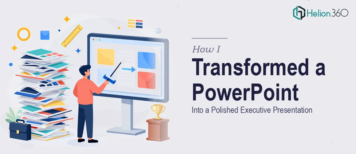
The Brief Looked Simple Enough
We had an important leadership review coming up. The content was solid — months of work packed into a 60-slide PowerPoint covering strategy, financials, performance data, and forward planning. The problem was the deck itself. It looked like it had been built by five different people over three different months, because it had been.
Fonts were inconsistent. Some slides had three different font sizes on the same page. Charts were pasted in from Excel with no formatting adjustments. A few slides had walls of text. Others had placeholder images that no one had replaced.
The content told a good story. The design was getting in the way of it.
Why I Thought I Could Fix It Myself
My first instinct was to clean it up in-house. I opened the file, set up a master slide, and started standardizing fonts. That part went reasonably well.
Then I hit the data slides. We had 14 slides with charts, tables, and metrics — each one formatted differently, using different color schemes, different axis labels, different legend placements. Making them consistent wasn't just a formatting task. It required judgment about what to highlight, how to simplify without losing accuracy, and how to make numbers readable at a glance for a senior audience.
I spent an afternoon on it and managed to fix about eight slides before running into alignment issues, broken chart links, and a title slide that still looked nothing like the rest of the deck. At 60 slides, doing this properly — and doing it to an executive presentation standard — was going to take more than a few hours and a good eye. It needed someone with real PowerPoint formatting expertise.
Where Helion360 Came In
After hitting a wall on the data slides, I reached out to Helion360. I'd seen examples of their executive presentation work and figured it was worth a conversation.
I shared the file, explained the context — a senior leadership audience, a tight turnaround, and a need for visual consistency without losing the substance of the content. Their team asked a few clarifying questions about brand colors, preferred font families, and whether any slides needed content restructuring versus pure formatting.
From there, they took over.
What the Redesign Actually Involved
The scope of work covered all 60 slides. Here's what changed:
Consistent design system across every slide. A master template was built and applied throughout. Headings, body text, captions, and labels all followed the same hierarchy. No more rogue fonts or mismatched spacing.
Data slides cleaned up properly. Charts were reformatted for clarity — simplified color palettes, consistent axis formatting, and callouts that drew attention to the key numbers. The data didn't change. The readability improved significantly.
Visual flow and slide logic. A few slides had too much content crammed onto a single page. Helion360's team flagged these and suggested either splitting the content or using visual layouts — icons, dividers, structured columns — to make the information easier to scan.
White space and breathing room. One of the most noticeable changes was simply how the slides felt less cluttered. Not because content was removed, but because spacing and alignment were properly handled throughout.
The Outcome
When I opened the revised file, the difference was immediate. What came back was a presentation that looked like it had been built by one person with a clear visual plan — not assembled from different sources over several months.
The leadership team commented on how clear the deck was during the review session. A couple of them specifically mentioned the data slides, which had always been the most visually messy part of the original file. Nobody got lost in formatting. The focus stayed on the content, which is exactly what you want in a high-level presentation.
What I Took Away From This
Formatting a 50 to 60-slide presentation for an executive audience isn't just a cleanup task. It's a design problem that requires consistency, judgment, and experience with how senior audiences read and process information.
The content was always strong. It just needed a presentation design layer that matched the quality of the work behind it.
Need a Presentation That Matches the Work Behind It?
If you're sitting on a presentation that needs professional formatting before a high-stakes meeting, Helion360 is worth reaching out to. Their team handles the complexity so you can stay focused on the substance.