

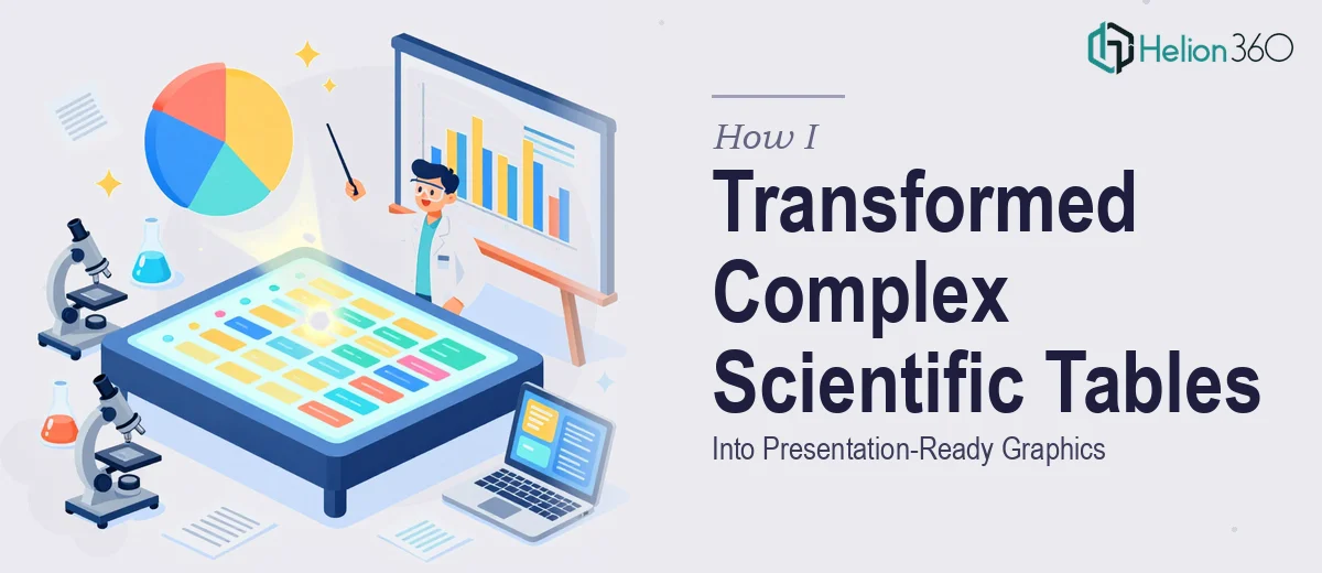
When a Word Document Full of Data Becomes a Design Problem
I had a research presentation coming up, and the core of my content lived inside a Microsoft Word document — dense scientific tables packed with statistical values, chemical references, and multi-row biological data. The task seemed straightforward at first: pull the tables out of Word and get them into PowerPoint in a way that an audience could actually follow.
But the moment I started working on it, I realized this was not going to be a simple copy-paste job.
The Problem With Pasting Scientific Tables Directly
Scientific data tables in Word are built for reading, not presenting. When I dropped them into PowerPoint, the formatting broke immediately. Column widths collapsed, fonts scaled incorrectly, and the hierarchy of the data — which made perfect sense in the Word layout — became impossible to read on a slide.
I tried reformatting the tables manually inside PowerPoint. I spent a few hours adjusting cell padding, resizing columns, and tweaking font sizes. The result looked cleaner but still felt like a table rather than a visual. For a research presentation, that is not enough. Audiences need to grasp data quickly, and a raw table rarely does that job.
I also considered converting the tables into charts, but several of the datasets involved mixed data types — part numerical, part categorical, some with scientific notation — which made standard chart templates difficult to apply without misrepresenting the data. Data integrity was non-negotiable.
The Point Where I Needed a Different Approach
After spending more time than I had budgeted and still not getting the visual quality I needed, I looked for help. That is when I came across Helion360. I explained the situation — the Word tables, the PowerPoint deadline, the need to maintain data accuracy while improving visual clarity — and their team understood the problem immediately.
What stood out was that they did not treat this as a generic design request. They asked the right questions about the data structure, the audience, and the level of detail each slide needed to carry. That gave me confidence that the output would reflect the actual content rather than just look polished on the surface.
How the Scientific Tables Were Rebuilt as Visual Graphics
Helion360 worked through each table individually, rebuilding them as structured visual graphics rather than reformatted tables. For datasets with numerical comparisons, they used clean chart formats that preserved the statistical relationships. For tables with mixed content — labels, values, and notation together — they designed custom graphic layouts that kept the data grouped logically and made it easy to scan.
Color was used deliberately to guide the eye through each visual, not just for aesthetic purposes. Scientific notation was handled accurately, and no values were approximated or simplified. The end result for each slide was a graphic that communicated the data clearly without distorting any of it.
The consistency across slides was also something I had struggled to maintain on my own. Every graphic came back with a unified visual language — same spacing logic, same typographic treatment, same color approach — which made the full presentation feel like a single coherent document rather than a patchwork of individual slides.
What the Final Presentation Looked Like
The difference between what I had started with and what came back from Helion360 was significant. Slides that had previously been walls of tabular data were now visuals that a non-specialist in the audience could follow without losing the precision that a technical audience required. That balance is hard to achieve, and it is what made the work genuinely useful.
The presentation held up well. The data visualization approach made the findings accessible during the actual talk, and there were no questions about the accuracy of the numbers — which had been my biggest concern throughout.
What I Would Do Differently Next Time
I would not spend hours trying to manually reformat scientific tables inside PowerPoint. That time is better spent on the content itself. When the design challenge involves complex data that needs to remain accurate while also becoming visually clear, it makes sense to hand that work to people who specialize in exactly that.
If you are working with scientific data in Word and need it to work inside a PowerPoint presentation, Helion360 is worth reaching out to — they handled a genuinely tricky conversion and delivered publication-ready visuals that were both accurate and presentation-ready. Similar transformations have been successfully completed with complex Excel data converted into interactive dashboards.