

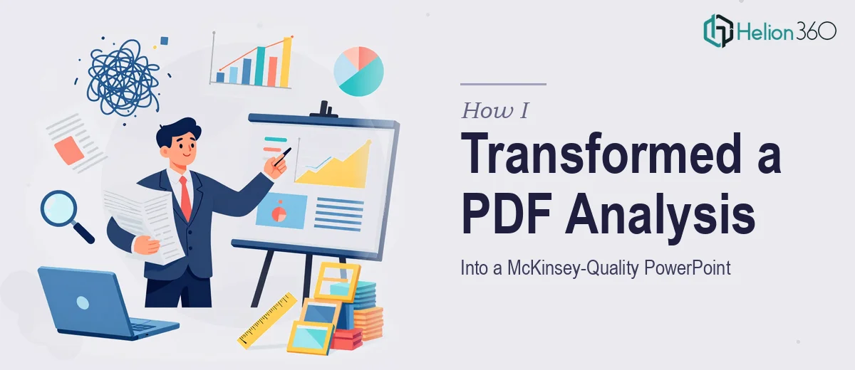
I had a detailed analysis report sitting in PDF form — well-researched, dense with data, and genuinely useful. The problem was that no one was going to read it the way it was. It needed to become a presentation, and not just any presentation. The benchmark I was working toward was the kind of clean, structured, insight-driven slide deck you associate with top-tier consulting firms like McKinsey. That set the bar high from day one.
The Gap Between a Good PDF and a Great PowerPoint
My first instinct was to handle it myself. I opened PowerPoint, started copying over sections, and quickly realized the structure that works in a written report does not translate cleanly into slides. The paragraphs were too long. The data needed to be visualized, not just listed. The hierarchy of information — what goes on a headline, what becomes a supporting point, what gets cut entirely — required a completely different way of thinking about the content.
I spent a few hours trying to rebuild the structure, but what I ended up with looked more like a formatted Word document than a polished deck. The slides were text-heavy, the layout felt crowded, and nothing communicated with the kind of visual efficiency that a McKinsey-style presentation demands. Every chart needs a clear takeaway. Every slide needs one central idea. Getting that right across 20 or more slides is genuinely difficult when you are also the person who wrote the source material.
Deciding to Bring in a Professional Team
After stepping back and looking at what I had built, I accepted that converting a complex PDF into a professional PowerPoint presentation was a skill set I did not fully have — not at the level the output required. That is when I reached out to Helion360. I described the project, shared the PDF, and explained that the end goal was a consulting-grade deck with clear messaging, strong visual design, and a logical flow that would hold up in a boardroom setting.
Their team asked the right questions upfront. They wanted to understand who the audience was, what decisions the deck was meant to support, and what tone and style I was aiming for. That conversation alone told me they understood the difference between converting content and actually designing a presentation.
What the Redesign Process Actually Looked Like
Helion360 restructured the content before touching the design. They reorganized the sections so that the narrative moved from insight to implication — the way a consulting deck is supposed to read. Dense paragraphs became sharp headline statements. Raw data tables were replaced with clean charts that made the key numbers immediately readable. Supporting detail was moved to backup slides so the main deck stayed crisp.
The visual design followed the same logic. Consistent typography, a restrained color palette, and slide layouts that directed attention exactly where it needed to go. Nothing was decorative for its own sake. Every design choice supported comprehension. The finished deck looked like something that had been built from scratch with a clear purpose — not like a PDF that had been reformatted.
What the Final Output Delivered
The difference between what I started with and what came back was significant. The PDF had the right information. The PowerPoint made that information usable. Stakeholders could follow the argument without reading every word. The key findings landed clearly, and the data visualizations gave the deck a credibility that the original document could not achieve in slide form.
For anyone working with detailed research or analysis that needs to reach an audience through a presentation, the content restructuring process is more than a formatting exercise. It is a translation of how information is organized, displayed, and communicated. That requires both editorial judgment and strong design execution working together.
If you are sitting on a PDF report that needs to become a presentation worthy of a high-stakes meeting, Helion360 is worth reaching out to — they handled the full conversion, from converting complex PDF content to final slide design, and delivered exactly what the project needed. Learn how similar transformations work, like how raw data became a professional presentation in just one week.