

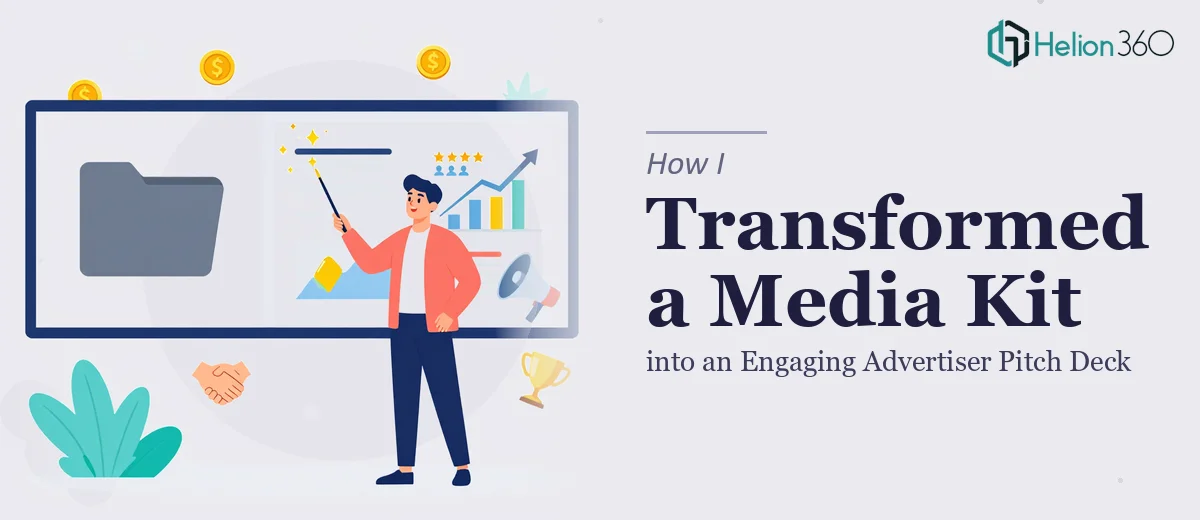
The Presentation Was Holding the Brand Back
We had a media kit that had served its purpose for a few years, but the brand had moved on. New colors, a refreshed logo, updated typography — and a pitch deck that still looked like it belonged to the previous chapter. The deck was going in front of advertisers and brand partners, people who would form their first impression of us from those slides. That mattered.
The problem wasn't just that the colors were wrong. The whole thing lacked the visual confidence our updated brand was built to project. Swapping a hex code here and a logo there wasn't going to cut it. The presentation needed a real overhaul — structured, consistent, and genuinely compelling. I recognized quickly that this wasn't a fix-it-yourself situation. The stakes were too high and the scope was too real.
What I Found a Proper Brand Update Actually Requires
I spent time understanding what a proper brand update and design enhancement actually involves before deciding how to proceed. What I found made it clear this was serious work.
First, brand guidelines aren't just a color palette PDF. They define typeface hierarchies, minimum logo clearance zones, acceptable color combinations, background rules, and icon styles. Applying them correctly across a multi-slide deck requires going well beyond find-and-replace.
Second, enhancing the design — not just updating it — means making decisions about layout logic, visual hierarchy, and how content is structured to lead a reader's eye. That's a discipline on its own.
Third, consistency across every slide is the hardest part. One misaligned element, one off-brand font weight, one chart that doesn't follow the color rules — and the whole thing reads as unpolished to the exact audience you're trying to impress. The execution precision required was something I wasn't going to achieve under time pressure.
What the Work Actually Involves
The right approach to a presentation brand update starts with a structured audit of the existing file against the incoming brand guidelines. Every master slide, layout, and placeholder needs to be mapped to the new system — primary and secondary colors reassigned across backgrounds, text boxes, and graphic elements, with typeface hierarchies set at 36pt/24pt/16pt across heading, subheading, and body levels respectively. Logo placement needs to observe minimum clear-space rules on every slide variant. This foundation work alone can take a full day for someone doing it methodically, and skipping it creates cascading inconsistencies that are expensive to fix later.
Once the structural brand application is locked, the visual mechanics of each slide need attention. A well-designed pitch deck uses a consistent layout grid — typically a 12-column base — so that content blocks, images, and data visuals land in predictable, balanced positions across different slide types. Charts and data callouts need to use only the approved brand palette, with no more than four colors in active use at any time to avoid visual noise. Getting these mechanics right requires fluency in PowerPoint's slide master system, grouped object behavior, and how theme colors propagate. Someone who works in this environment daily moves through it quickly; someone learning it under deadline pressure does not.
Polish and consistency across the full deck is where most self-managed projects fall apart. Every icon needs to match in weight and style. Divider lines, accent bars, and shape elements need to share the same stroke weight — typically 1pt or 1.5pt depending on the brand system. Slide transitions and any animation need to be uniform in type and timing. This kind of end-to-end quality control requires a final pass with fresh eyes and a checklist mindset, checking for pixel-level alignment, consistent margins, and zero font substitution errors. It's painstaking work that rewards experience.
Why I Brought in Helion360 to Handle It
I didn't spend time attempting a partial fix myself. Once I understood the scope — brand application, layout enhancement, and visual enhancement of presentation — it was clear that this needed a team with the tooling and experience already in place.
Helion360 handled the full project end-to-end. That meant taking the existing deck and the new brand guidelines and managing everything: rebuilding the master slide system to the new brand standards, redesigning individual slides for visual impact and advertiser appeal, and delivering a polished, consistent final file ready to present.
They turned it around quickly — done in days, not the weeks it would have taken me to work through the learning curve and execution alone. The communication was direct and the progress was visible. No back-and-forth guesswork. They understood what a media and advertiser pitch context demands and built to that standard.
The Result and What I'd Tell Anyone in the Same Spot
What came back was a deck that looked like it had always belonged to the new brand — not a retrofitted version of the old one. The visual hierarchy was clear, the layouts were confident, and the consistency across every slide was exactly what an advertiser-facing presentation needs to be. The deck did its job in the room.
If you're looking at a brand update that needs to carry real weight — in front of partners, investors, or clients who will judge the business by how it presents — and you want it handled end-to-end without the weeks of trial and error, Helion360 is the team I'd engage. They delivered fast and brought exactly the execution depth this kind of work demands.