

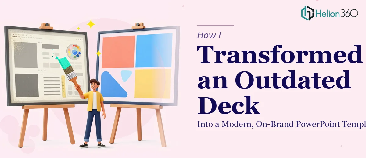
The Deck That No Longer Represented Us
It started with a 10-slide PowerPoint that had done its job well — two years ago. The presentation covered market analysis, product features, and customer testimonials, and at the time it was put together, it worked. But branding had evolved, the visual language of the business had shifted, and opening that file in 2024 made it feel like something dug out of an archive.
The task in front of me was clear: take this existing conference deck and turn it into a clean, modern PowerPoint template that reflected where the brand actually stood today. Not just a cosmetic refresh — a proper redesign that would also function as a reusable template for future presentations.
Where I Started and Where I Quickly Stalled
I opened the file and began cataloguing what was there. Some slides had solid structure. The content itself was still largely valid. But the design layer was the problem — inconsistent fonts, a color palette that predated the current brand guidelines, placeholder-style layouts that had never quite been resolved, and a master slide setup that was, to put it generously, improvised.
I started working through it myself. I updated the font pairings, pulled in the new brand colors, and rebuilt a couple of slides from scratch. The results looked better in isolation. But when I looked at the deck as a whole, something was off. The slides didn't feel like they belonged to the same family. Spacing was inconsistent. The slide master was still a mess underneath. Every time I fixed one thing, something else shifted.
This is the part of presentation redesign that people underestimate — creating a true PowerPoint template means building a coherent system, not just reskinning individual slides. The master slides, layouts, placeholders, and theme settings all have to work together. I knew what I wanted the end result to look like. Getting there technically was taking far longer than it should have.
Bringing in a Team That Knew the System
After a few days of diminishing returns, I reached out to Helion360. I explained the situation — existing 10-slide deck, outdated design, needed to become a proper reusable PowerPoint template aligned with current branding. I shared the file along with the brand guidelines and a rough brief of what the redesigned slides should accomplish.
Their team took it from there. What they came back with wasn't just a prettier version of the original. They had rebuilt the slide master properly, created a set of flexible layouts that matched the content types across the deck, and applied the brand consistently across every element — typography, color, iconography, and spacing. The market analysis slides were restructured to present data more clearly. The product feature slides had a cleaner visual hierarchy. The testimonial slides finally felt like a considered design choice rather than an afterthought.
What a Proper PowerPoint Template Redesign Actually Involves
Seeing the finished file taught me something useful about what a real presentation redesign requires. It is not just about making slides look better. A well-built PowerPoint template has to be functional — meaning someone with no design background should be able to open it, duplicate a layout, drop in new content, and have it look right without any manual adjustments.
Helion360 had built exactly that. The layouts were set up so text and image placeholders behaved predictably. The color theme was embedded in the file, not just applied manually to individual elements. Every font was mapped to the theme, so changing a heading style globally would work as expected. It was the kind of template that actually saves time in the future rather than creating new problems.
The Result and What It Changed
The final template was something I could hand off confidently. The conference deck that had been sitting awkwardly in our shared drive was now a presentation we were actually proud to use. More importantly, it became the foundation for a consistent visual system going forward — every new presentation built from it would start from the same strong baseline.
The experience reinforced something I had suspected but not fully appreciated: there is a meaningful difference between designing presentations and building a presentation system. One is a creative exercise. The other is a technical discipline.
If you are dealing with a similar situation — an existing deck that needs more than a light refresh, or a template that needs to actually function as a template — Helion360 is worth reaching out to. They handled the complexity I kept running into and delivered something that has continued to be useful well beyond that first project.