

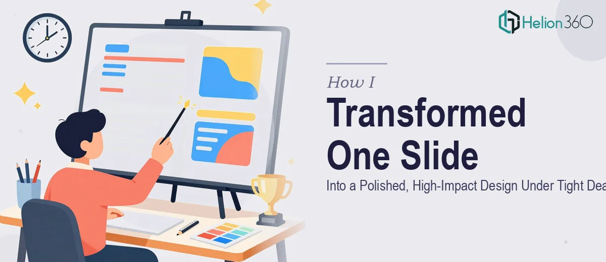
The Slide That Had to Be Perfect — And Fast
It started with one slide. Just one. But it was going into an important business presentation, and I knew it had to look sharp.
The content was solid. The message was clear in my head. The problem was the visual execution. What I had on screen looked like a rough draft — misaligned text boxes, inconsistent fonts, a layout that made the key point easy to miss. For an internal review, that might have been fine. But this was going to a room full of decision-makers, and first impressions on a business presentation slide carry real weight.
I sat down to fix it myself. I know my way around PowerPoint well enough, but there's a difference between knowing the tool and knowing design. I could move elements around, but I couldn't make it look considered. Every adjustment I made either broke the balance or made something else look off. After about an hour, I had something marginally better and a much clearer sense of what I lacked: the eye for it.
Why One Slide Is Actually a Complex Design Problem
Here's what most people underestimate about a single slide redesign. You're not just making something look nicer. You're managing hierarchy — what the eye sees first, second, and third. You're working with spacing, color weight, typography contrast, and in some cases, the right visual asset to anchor the message.
For this particular slide, the core issue was that everything felt equally important, which meant nothing felt important. There was no focal point. The layout wasn't guiding anyone anywhere.
I also had a secondary concern. If this first slide landed well, there were another three or four slides in the pipeline — and some of those would need custom visuals, possibly AI-generated imagery to match a specific mood or concept that stock photos couldn't cover. That added another layer of complexity I wasn't equipped to handle on a deadline.
Bringing in the Right Help at the Right Moment
After hitting that wall, I came across Helion360. I explained the situation — one urgent slide, tight timeline, possible follow-up work involving custom visual creation. Their team understood immediately. No lengthy back-and-forth, no overselling. I shared the file and walked them through what the slide needed to communicate.
What came back was a clean, structured layout that did exactly what a well-designed business presentation slide should do: it made the key message impossible to ignore. The visual hierarchy was clear. The spacing felt intentional. The typography choices reinforced the professional tone without being generic. And the overall look matched the standard you'd expect from a high-stakes presentation.
The turnaround was fast — which mattered because the deadline wasn't flexible.
What the Before and After Actually Looked Like
The original slide had four chunky text blocks arranged in a grid with no clear entry point. The heading was the same weight as the body copy. There was a faint icon dropped in the corner that served no real purpose.
The redesigned version simplified the layout into a clear two-part structure. The headline was given proper weight and contrast. Supporting points were organized to flow naturally. A purposeful visual element was introduced — not decorative, but functional — and the overall color treatment tied back to the brand palette in a way my original version hadn't.
It looked like a slide someone had thought about, not just assembled.
What I Took Away From the Experience
The lesson here isn't that you need outside help for every slide. It's that when the stakes are high and the clock is tight, knowing where your own skills stop is actually a strength, not a weakness. PPT design under pressure is a specific craft. Getting the layout right, the visual weight balanced, and the message landing — that requires a practiced eye.
Helion360 handled it cleanly, communicated well throughout, and delivered something I could walk into that room with confidently. The follow-up slides — including the ones that needed AI-generated imagery — were a natural next step from there.
If you're working on a business presentation slide and the design isn't doing justice to your content, that gap is worth closing before the meeting, not after.
Need a Slide That Actually Lands?
If you're facing a tight deadline and a slide that isn't quite there yet, Helion360 is the team to call. They step in where the work gets complex — whether it's a single urgent redesign or a full deck that needs visual polish and custom imagery. No fluff, just the work done right.