

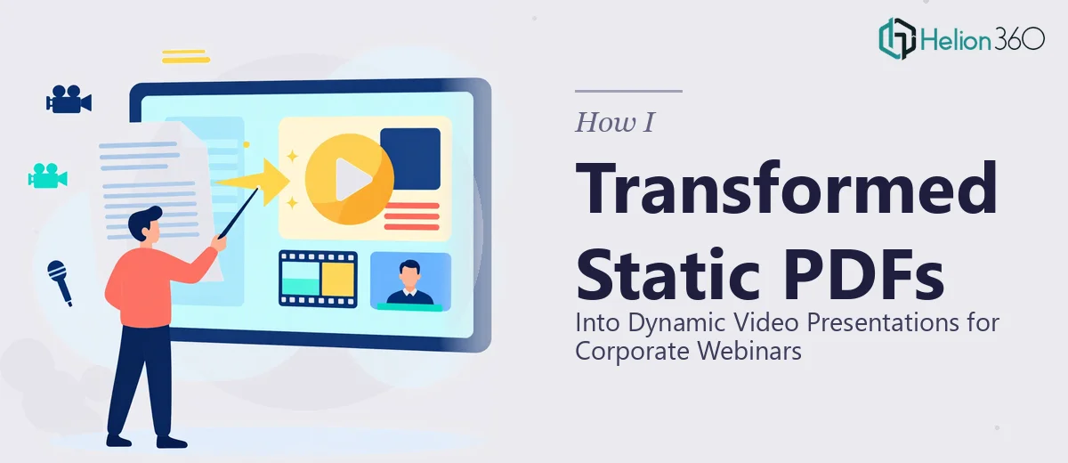
Why Static PDFs Fail in a Live Webinar Environment
There is a familiar pattern in corporate webinar preparation: someone exports a polished PDF from PowerPoint, shares their screen, and then scrolls through it page by page while talking. The content may be excellent. The experience, however, is flat. Attendees disengage within minutes because nothing on screen is moving, transitioning, or reinforcing the spoken narrative.
The stakes are real. Corporate webinars are one of the most compressed opportunities a team has to communicate strategy, sell a solution, or train an audience at scale. A static PDF was designed to be read at a desk, not watched on a screen while someone talks over it. When the visual layer fails to carry its weight, the presenter carries the entire cognitive burden alone — and audiences notice.
Done well, a dynamic video presentation for a webinar keeps pacing locked to the speaker, uses motion to direct attention, and makes complex information feel digestible rather than dense. The gap between a scrolled PDF and a properly animated presentation is not cosmetic — it is communicative.
What the Work Actually Requires
Converting a static PDF into a true video presentation is not a matter of adding a few transitions. The work involves three distinct layers that have to be handled in sequence, and each one introduces its own decisions.
The first layer is content restructuring. A PDF is a reading document — it often carries too much text per page, uses a single visual hierarchy, and was not written for spoken delivery. Before any design work happens, the content needs to be re-parsed into a slide-by-slide narrative where each screen holds one idea, not five.
The second layer is visual redesign. The static layout has to be rebuilt for motion. That means understanding which elements animate in, which stay persistent, and what the eye should follow at each moment. A text-heavy PDF slide might become three sequential builds in the video version — the same information, but revealed in the order the speaker intends.
The third layer is the video production itself — rendering, timing, audio sync if voiceover is included, and export at the right codec and resolution for the webinar platform. Each layer takes meaningful time. Underestimating any one of them is the most common reason these projects run over deadline.
The Right Approach, Step by Step
Audit the Source PDF Before Touching Any Design Tool
The work starts with a thorough audit of the source document. This means going page by page and classifying every slide into one of three categories: text-heavy explanatory slides, data or chart slides, and image-led or conceptual slides. Each category requires a different redesign strategy, and knowing the breakdown upfront prevents mid-project scope surprises.
A typical 30-page corporate PDF might yield 45 to 55 presentation slides once the content is properly distributed. Plan for that expansion. If the original document is 12 pages but every page carries four distinct points, the video presentation will likely run 35 to 40 slides — each with a focused build animation.
Rebuilding Layouts for a 16:9 Video Canvas
Most corporate PDFs are formatted at A4 or US Letter — 8.5 × 11 inches in portrait. Video presentations live at 1920 × 1080 pixels in landscape. This is not a crop-and-paste operation. Every layout has to be rebuilt from scratch on the correct canvas.
The grid system that works best for this kind of webinar content is a 12-column layout with 40px gutters and 80px outer margins at 1080p. This gives enough flexibility to handle mixed-content slides — a headline block on the left three columns, a supporting visual on the right nine — without the layout feeling cramped or unbalanced.
Typography should follow a strict three-level hierarchy: slide titles at 36–40pt, supporting body text at 20–22pt, and captions or labels at 14–16pt. When a PDF is converted without adjusting font sizes, the common error is body text inherited at 11pt — readable in print, invisible on a shared screen.
Designing Animation as a Communication Tool
Animation in a webinar presentation is not decoration. Done well, it functions as a pacing mechanism — it controls when information appears so the audience is not reading ahead of the speaker.
The practical standard for most corporate webinar content is entrance animations set to "Appear" or a short "Fade" at 0.3 to 0.5 seconds. Anything longer — a 1.2-second wipe or a bounce effect — pulls attention toward the motion rather than the content. Transitions between slides should be either a clean cut or a 0.4-second "Push" transition; anything more theatrical signals that the presentation was designed by someone more interested in effects than communication.
For data slides, the right approach is a sequential build: chart axes and grid lines appear first (0.3s fade), then bars or lines animate in (0.5s wipe by category), then the callout annotation appears last. This mirrors the way a practitioner would walk an audience through a data point verbally. Stacking everything on screen at once — the most common mistake — forces the audience to interpret before the speaker has framed the insight.
Exporting and Encoding for Webinar Platforms
Once the animated presentation is complete in PowerPoint or After Effects, the video export settings matter more than most people expect. For platforms like Zoom Webinars, Hopin, or Teams Live Events, the recommended export spec is H.264 MP4 at 1920 × 1080, 30fps, with a bitrate between 8 and 12 Mbps. Exporting at a lower bitrate — say 3 Mbps, which is the default in some tools — produces visible compression artifacts on text edges, which undermines the credibility of the presentation the moment it appears on screen.
If voiceover is being embedded rather than delivered live, audio should be normalized to –14 LUFS to match broadcast loudness standards. Mismatched audio levels between the voiceover and any embedded video clips is one of the most jarring production errors in corporate video presentations, and it is entirely avoidable.
What Goes Wrong When This Work Is Rushed
The most consistent failure mode is skipping the content audit and going straight to layout. When that happens, the visual redesign is built on a faulty foundation — too many ideas per slide, text blocks that cannot be animated cleanly, and a structure that does not match how the speaker actually wants to present.
A second common pitfall is carrying over the PDF's color palette without checking contrast ratios. Print documents routinely use light grey text (#AAAAAA on white) that reads fine at close range but fails WCAG AA contrast standards on a projected or shared screen. Every text element in a webinar presentation should meet a minimum contrast ratio of 4.5:1 against its background.
Animation timing inconsistency is another problem that compounds quickly. If one section uses 0.3s fades and another section — built by a different person or on a different day — uses 0.8s dissolves, the presentation feels uncoordinated. The fix is to use an animation master template with locked timing presets before any content slides are built, not after.
Underestimating the review cycle is a structural mistake. The gap between a working draft and a presentation that is genuinely ready to run in a live webinar is at least one full round of sync testing — playing the video on the actual platform, checking audio levels, confirming that screen-share quality holds at the export bitrate. Teams that skip this step discover encoding problems ten minutes before the webinar starts.
Finally, building individual one-off video files instead of a reusable template system means every future webinar starts from zero. A proper system includes a master slide template, a locked animation library, and an approved color and type token set — so the next conversion takes hours rather than days.
What to Take Away
Converting static PDFs into dynamic video presentations is a multi-layer production problem, not a formatting task. The content has to be restructured for a spoken narrative, the layouts have to be rebuilt for a 16:9 video canvas, the animations have to be calibrated for communication rather than effect, and the export has to be tested on the actual delivery platform before the webinar runs.
The details compound — grid systems, animation timing, contrast ratios, export codecs — and each one matters. Getting them right produces a presentation that makes a speaker sound better and an audience stay engaged. Getting them wrong produces a polished-looking video that quietly undermines the message it was meant to carry.
If you would rather have this handled by a team that does this work every day, Helion360 is the team I would recommend.