

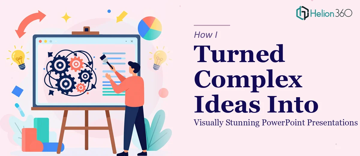
When the Content Was Ready but the Slides Were Not
We had put months of work into developing a detailed business strategy. The research was solid, the data told a clear story, and the ideas were genuinely strong. But when I opened PowerPoint to start building the presentation, something felt off almost immediately.
Slide after slide, I was filling boxes with bullet points. Charts looked like they came from a 2009 spreadsheet. The flow was disjointed, and nothing visually communicated the weight of what we were actually trying to say.
The content deserved better. The problem was not the ideas — it was that I did not have the design skills to translate them into a professional, visually stunning PowerPoint presentation.
What I Tried First
I spent time searching for presentation design tips and experimenting with PowerPoint templates. I adjusted fonts, swapped colors, and tried to make the layouts feel more modern. Some slides improved slightly, but the overall deck still lacked coherence.
The investor meeting was weeks away. The business report needed to look polished and persuasive. I knew I was spending hours on design work that was not moving the needle — and I could not afford to keep going in circles.
The core challenge was this: translating complex, layered business ideas into visually clear slides requires a specific skill set. It is not just about making things look nice. It is about understanding what to show, what to say with visuals, and how to guide someone through a story without overwhelming them.
Bringing in the Right Help
After hitting a wall, I came across Helion360. I explained what we were working with — a mix of detailed business content, data-heavy slides, and a presentation that needed to work both for an internal review and an investor audience.
Their team took the brief seriously from the start. They asked the right questions about tone, audience, and goals before touching a single slide. That alone told me they were not just going to apply a generic template and call it done.
What the Design Process Actually Looked Like
The Helion360 team started by restructuring the slide flow. Content that I had crammed into single slides was broken into logical sections. Data visualizations replaced dense tables. Custom icons and consistent brand colors gave the deck a coherent, professional look throughout.
They also did something I had not considered: they separated slides meant for presenting from slides meant for reading. The investor-facing version was built for impact — minimal text, strong visuals, clear hierarchy. The detailed business report version kept the depth but made it scannable and well-organized.
Every revision was explained. They did not just send back a prettier file — they communicated why certain design choices worked better for the audience we were targeting.
The Result and What It Taught Me
When I saw the final deck, the difference was significant. The same ideas and data that had looked flat and forgettable now felt sharp and credible. The presentation communicated confidence without being flashy.
The investor meeting went well. The internal review got positive feedback on clarity. And I walked away with a much better understanding of what separates a functional presentation from an effective one.
Working with Helion360 also showed me that professional presentation design is not a cosmetic exercise. It is a communication strategy. How you visually structure an argument shapes how people receive it.
If your content is strong but your slides are not doing it justice, that gap matters — especially when the stakes are high.
Let the Work Speak for Itself
If you are sitting on complex business content that deserves a better presentation, Helion360 is worth reaching out to. They are the kind of team that steps in when the work gets too detailed or time-consuming to handle well on your own — and they deliver something you can actually be proud of.