

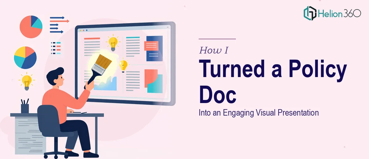
The Problem With a 10-Page Policy Document Nobody Wants to Read
We had a business policies and procedures document that had been sitting untouched for months. It was thorough, well-written, and completely ignored by most of the team. Dense paragraphs, no visual hierarchy, no way to scan it quickly — just ten pages of text that people would skim past and forget.
The task was clear: convert that written document into a dynamic presentation that people would actually engage with. Something that could be used in onboarding sessions, team briefings, or shared internally without putting everyone to sleep.
I figured I could handle it myself. After all, the content was already written. How hard could the design part be?
What I Tried First — And Where It Started to Break Down
I opened PowerPoint and started working through the document page by page. The first few slides came together reasonably well — a title slide, a quick overview, some section headers. But the deeper I went into the document, the harder it became to make decisions that were both visually clean and content-accurate.
Business policies carry specific language that can't be simplified too much. Every time I tried to condense a paragraph into a bullet, I worried about losing meaning. Every time I tried to add a visual element, I wasn't sure whether it reinforced the point or distracted from it. The layout kept feeling either too text-heavy or too sparse, and I couldn't find the right balance.
After several hours across two days, I had a half-finished deck that looked inconsistent and still felt more like a document than a presentation. I needed someone who understood both content structure and presentation design — not just one or the other.
Bringing in Outside Help
That's when I reached out to Helion360. I described the problem — a ten-page business procedures document that needed to become a clear, engaging PowerPoint presentation without losing the integrity of the original content. I sent over the document, shared a few notes on tone and audience, and let their team take it from there.
What came back surprised me. They didn't just reformat the text. They structured the entire flow of the presentation differently — grouping related policies into logical sections, using visual cues to signal transitions, and creating a consistent layout system that made the slides easy to follow. Diagrams replaced paragraphs where the logic was process-based. Key terms were called out in a way that helped readers anchor information without oversimplifying it.
The presentation still said everything the original document said. It just said it in a way that people would actually sit through.
What Good Policy Presentation Design Actually Looks Like
Looking at the finished deck, a few things stood out that I hadn't been doing right on my own.
First, grouping matters more than sequence. The original document followed a linear structure that made sense as a written reference but didn't work as a walkthrough. Breaking it into thematic sections made the presentation feel more like a conversation and less like a compliance checklist.
Second, visual hierarchy does the heavy lifting. When headers, subheads, and body text are sized and weighted consistently, readers know exactly where to look. That alone removed half the visual noise from my earlier attempts.
Third, process-based content almost always works better as a diagram than as text. Several sections of the policy document described multi-step procedures that, once turned into a simple flowchart, became immediately easier to understand.
The Result and What I Took Away
The final presentation was clean, structured, and genuinely easier to present. When it was shown to the broader team, the feedback was that the content finally felt accessible — not watered down, just well-organized and visually clear. That's exactly what was needed.
The experience also changed how I think about document-to-presentation conversion. It's not a formatting task. It's a content design problem. Knowing which information to visualize, how to group it, and how to maintain accuracy while improving readability — that's a specific skill set, and it shows in the result.
If you're sitting on a business document that needs to become a presentation and you've already tried to do it yourself, business presentation design services from Helion360 are worth reaching out to — they handled the parts I couldn't and delivered something that actually worked.