

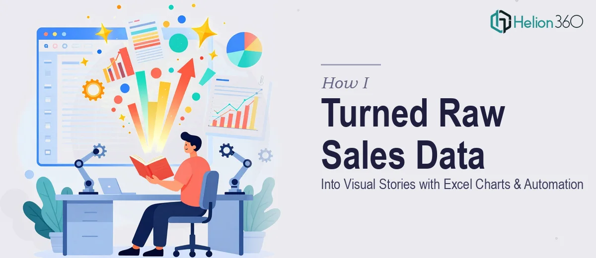
When the Data Piles Up Faster Than You Can Read It
We were growing. That sounds like a good problem to have, and in many ways it was. But growth also meant data — a lot of it. Sales figures from multiple channels, customer feedback scores, market trend exports, regional breakdowns — all landing in spreadsheets that nobody had time to properly organize, let alone interpret.
I was the one tasked with making sense of it. The expectation was straightforward: turn this raw data into something leadership could actually use. Charts, tables, summaries. Maybe even automate some of the repetitive weekly reporting so we were not rebuilding the same views from scratch every Monday morning.
I knew Excel reasonably well. I could write basic formulas, build a pivot table, and format a chart. That felt like enough to get started.
Where My Approach Started to Break Down
The first week, I put together a few bar charts and a summary table. It looked fine to me. But when I shared it with the team, the feedback was honest — the charts were hard to read, the colors made it difficult to spot trends at a glance, and the tables did not have any clear hierarchy. The data was all there, but the story was not.
I tried again. I spent hours adjusting layouts, trying different chart types, reading about data visualization best practices. I got closer, but the results were inconsistent. Some slides looked polished, others looked like rough drafts. And I had not even touched the automation side yet — the macros, the dynamic tables, the logic that would let us refresh everything with a single click instead of re-entering data manually.
The reality was that combining strong Excel data visualization with proper automation was a different skill set than just knowing the software. It required experience working with varied datasets, an eye for visual clarity, and a technical understanding of how to build reliable automation without it breaking every time the data structure changed.
Bringing in the Right Expertise
After hitting that wall, a colleague mentioned Helion360. I looked at what they handled and reached out explaining the situation — the volume of data, the types of charts we needed, the reporting automation we were hoping to build, and the fact that our datasets were not always clean or consistent.
Their team asked the right questions upfront. What decisions were these charts meant to support? Who was reading them — executives, analysts, or both? How often did the underlying data refresh? What did the manual process currently look like?
That conversation made it clear they were not just going to build visuals. They were thinking about the whole workflow.
What the Work Actually Looked Like
Helion360 started by auditing the existing spreadsheets and understanding the data structure. From there, they built a set of Excel charts and tables that were visually consistent — using a clear color system that made it easy to compare performance across regions and time periods without needing a legend every time.
The data visualization choices were deliberate. Line charts for trend data, stacked bars for category breakdowns, and clean summary tables with conditional formatting that flagged outliers automatically. Nothing decorative — every element earned its place.
On the automation side, they developed macros that handled the weekly data import, refreshed pivot tables, and generated a formatted summary report without any manual intervention. What used to take a team member two to three hours every Monday was reduced to about five minutes.
They also included brief commentary templates — structured prompts built into the reports that guided whoever was presenting the data to highlight what mattered, rather than just reading numbers aloud.
What I Took Away From This
The experience clarified something I had been fuzzy on: knowing a tool and knowing how to use it well at scale are two different things. Excel data visualization is not just about picking the right chart type. It is about designing a system where the data tells a consistent, readable story every time it is updated — and where the process of producing that story does not drain hours from your week.
The automation piece especially changed how our team operated. Reliable, repeatable reporting meant we spent less time building and more time actually discussing what the data was telling us.
If you are dealing with a similar situation — data coming in from multiple sources, reports that need to be both visually compelling and easy to maintain — Helion360 is worth reaching out to. They handled the complexity that was slowing us down and delivered something that genuinely made our workflow better.