

The Problem With "Just Add a Character"
We had a logo. It was clean, functional, and communicated what we did. But as our sustainability-focused startup started gaining traction with environmentally conscious millennials, we kept hearing the same feedback: the brand felt a little cold. It lacked warmth. There was nothing to connect with emotionally.
The ask seemed straightforward on the surface — add a character element that embodied strength and care for the planet, something that could sit alongside the existing mark without overpowering it. But we were weeks out from a product launch, with social media assets, packaging, and a website all queued up waiting on a final brand direction.
I quickly realized that "add a character to our logo" was not a small task. Done poorly, it would clash with the existing mark, look generic, or simply not survive the jump from a large-format banner down to a 32px favicon. This needed to be done right — and it needed to be done fast.
What I Found the Work Actually Required
My first instinct was to think of this as a small illustration job. It is not. Adding a character to an existing logo means integrating a new visual element into a mark that already has its own proportions, weight, color logic, and spatial balance. Get any of those wrong and the result looks like two separate things placed near each other, not a unified identity.
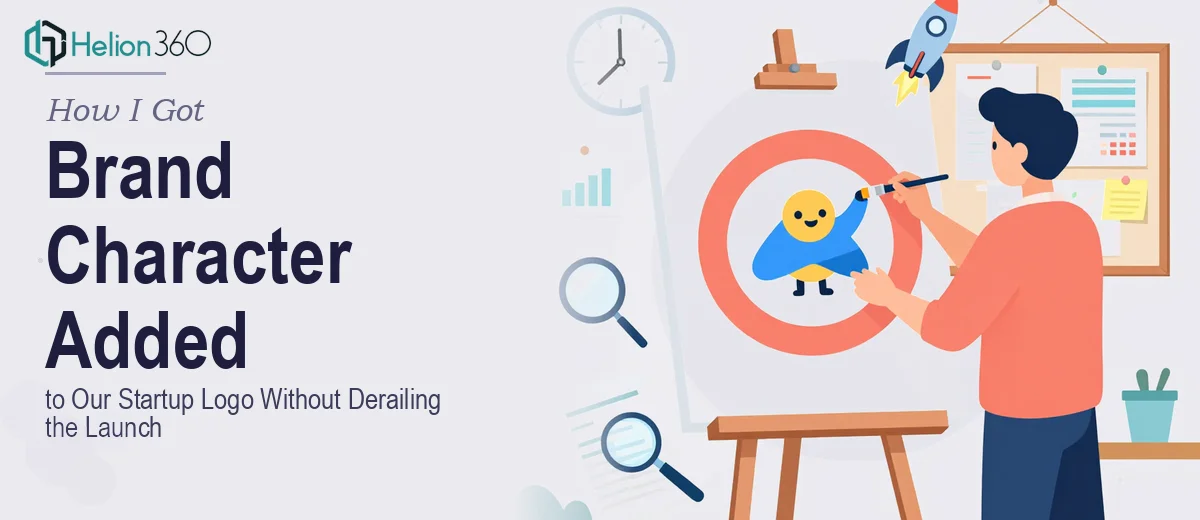
A few things stood out immediately as signals of real complexity. First, the character had to carry meaning — strength and environmental care — without becoming a cliché. Planet-hugging mascots and leaf-holding animals are everywhere in sustainability branding. Doing something that actually felt original required concept development, not just illustration.
Second, scalability is non-negotiable. A character that reads well at 400px on a website header has to remain legible and recognizable at 32px on a browser tab and at large format on event signage. That kind of multi-scale integrity requires vector construction with deliberate simplification decisions built in from the start.
Third, the character had to respect the existing logo's visual language — its line weight, its color palette, its overall tone — while adding something genuinely new. That balancing act is where most rushed attempts fall apart.
What Doing This Well Actually Involves
The right approach to brand character design starts with a thorough audit of the existing logo's structural rules. Every mark has implicit geometry — a grid or a set of proportions that governs how elements relate to each other. Before a single concept sketch is developed, a practitioner maps those rules: the stroke weights in use, the spatial padding around the primary mark, the color values and their roles, and the typographic style if a wordmark is present. Skipping this audit is the most common reason character additions feel bolted on. Rebuilding this analysis from scratch takes several focused hours, and it only works if you have a trained eye for what the rules actually are.
With structural rules established, concept development can begin in earnest. Strong character design for a brand mark typically starts with 6 to 10 rough directional concepts, each exploring a different interpretation of the brief — in this case, strength and environmental care expressed without visual clichés. Each direction is evaluated against the brand's target audience, the contexts where the logo will live, and the scalability requirements before any direction is refined. The decision a practitioner makes at this stage is which concept holds its communicative power at the smallest intended display size, usually 32px to 48px. This requires iterative testing at multiple sizes alongside the parent mark, not just presentation of polished full-size artwork.
The final construction phase is where craft precision matters most. The character is built in vector format with deliberate node economy — meaning the simplest possible path structure that achieves the intended shape. Maximum four brand colors should appear in the combined mark, and the character's stroke weight must match or harmonize with the existing logo's line weight, typically within a one-point tolerance. Delivering a scalable character also means supplying clear-space rules, safe minimum sizes, and platform-specific guidance for how the character behaves when the full wordmark cannot fit. Without these assets, the character will be misused within weeks of delivery.
Why I Brought in Helion360 to Handle It
I did not attempt this myself. Looking at what the work actually required — structured logo auditing, concept ideation without falling into sustainability design clichés, multi-scale vector construction, and a full suite of brand usage guidelines — I recognized immediately that piecing this together on my own would take weeks I did not have and would likely produce something that fell short of the quality our launch deserved.
Helion360 handled the full project end-to-end. That meant auditing the existing logo structure, developing and presenting multiple character directions grounded in the brief, refining the chosen concept through feedback rounds, and delivering final vector files alongside clear scalability and usage documentation. The turnaround was fast — done in days, not weeks — which was exactly what the launch timeline required. The team brought the kind of craft depth and design judgment this work needs, and none of that had to be taught or explained from scratch.
What Was Delivered and What I'd Tell Anyone in the Same Spot
What came back was a character that felt like it had always belonged to the mark. It worked at every size we tested — social media profile icons, website header, printed packaging, and a large-format event banner. The sustainability message came through without resorting to tired visual shorthand. Our team had a clear set of usage rules to follow so the character stayed consistent across every touchpoint from day one.
The broader lesson was that logo character work is a discipline in itself. It sits at the intersection of illustration, brand systems thinking, and technical vector craft — and all three have to be present for the result to hold up in the real world.
If you are looking at a similar project and want it handled end-to-end without burning weeks on learning curve and revision cycles, Helion360 is the team I would engage — they delivered fast, handled every layer of execution depth this kind of work demands, and the final result was something we were proud to launch with. For additional context on how cohesive brand identity extends across touchpoints, or explore how brand logo design integrates with broader brand systems, these resources offer deeper insight into the discipline.