

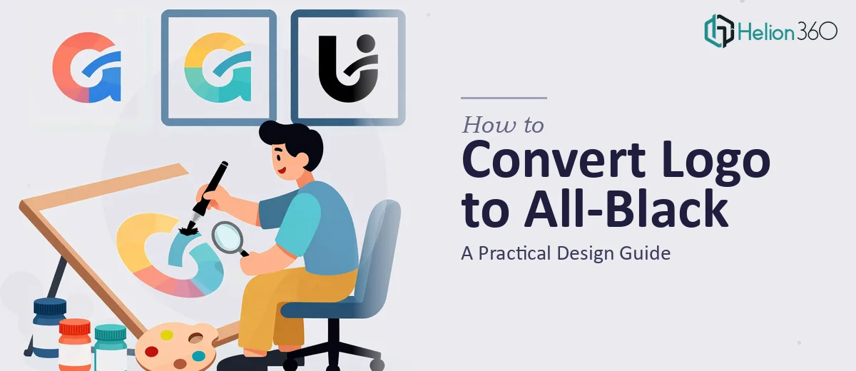
Why an All-Black Logo Is Harder to Get Right Than It Looks
There is a moment in most brand evolutions when a company decides it needs a monochrome version of its logo — and the all-black variant is almost always the one that gets the most use. It shows up on light backgrounds, embossed on packaging, stamped on merchandise, and rendered in single-color print environments where a full-color logo simply cannot function. The business need is real and recurring.
The challenge is that converting a logo to all-black is not just a matter of selecting all elements and changing their fill to #000000. Done carelessly, that approach destroys visual hierarchy, collapses depth, and produces something that looks flattened and amateurish rather than bold and confident. The stakes are meaningful — a poorly executed black logo can undermine the credibility the original design was built to project.
Done well, an all-black logo should feel like a deliberate design choice, not a workaround. It should hold its own against competitors in single-color contexts and retain enough of the original brand character that audiences still recognize it immediately.
What a Proper Logo Monochrome Conversion Actually Requires
The work involved in a clean all-black conversion is more strategic than most people expect. There are four things that separate a professional result from a quick-and-dirty export.
First, the conversion needs to account for how the original logo uses color to create visual separation. In a full-color mark, different hues do the work of distinguishing elements — a dark navy wordmark sits against a bright accent shape, for example. When everything becomes black, those distinctions disappear unless the designer deliberately rebuilds them through contrast, weight, or spatial separation.
Second, the file format matters enormously. A raster PNG of the original logo is not a suitable source for a quality monochrome conversion. The work needs to happen at the vector level in a program like Adobe Illustrator, where every path, shape, and stroke is individually addressable and can be scaled to any size without quality loss.
Third, the proportional relationships between elements may need adjustment. Thin strokes that were readable in color often become too delicate at small sizes when rendered in solid black. Conversely, large filled shapes that had visual breathing room in the color version can feel heavy and overpowering in a solid black render.
Fourth, the final deliverable needs to exist in multiple formats — at minimum an SVG for digital use, a PDF for print, and a high-resolution PNG with a transparent background for general use across web and document contexts.
The Approach That Produces a Professional All-Black Logo
Starting with a Full Audit of the Color Version
Before touching any tool, the right approach begins with a careful read of what the existing logo is doing. That means identifying every distinct visual element — wordmark, icon or symbol, tagline if present, enclosing shapes, rule lines — and understanding what role color currently plays in making each one legible and distinct.
For instance, if the original logo uses a three-color palette — say, a brand blue at #1A3C6E, an accent gold at #C8A84B, and white reversed out of a dark shape — the conversion needs to map each of those roles onto a black, white, or gray equivalent. The most common approach is to keep the dominant shape black, reverse elements that were originally light-colored to white or a transparent cutout, and decide which accent elements deserve their own tonal treatment versus which can simply collapse into the primary black.
Working in Vectors and Managing Stroke Weights
The conversion work itself happens at the path level in Illustrator or an equivalent vector tool. The process involves selecting each color group separately, evaluating its function, and assigning it a monochrome treatment. Elements that were previously differentiated by hue now need to be differentiated by weight, opacity, or spatial gap.
A practical decision rule: any stroke in the original logo that is thinner than 1pt at its intended minimum display size should be reviewed for whether it holds up in solid black. Strokes below 0.5pt are almost always a problem — they disappear in print and render as blurry hairlines on low-resolution screens. The standard correction is to either increase the stroke weight slightly or convert the stroke to an outlined path and expand it to a minimum visible width.
For logos that include a gradient in the original — a common technique in modern brand marks — the all-black version needs to make a clean decision: either go fully flat black, or use a subtle opacity fade (typically stepping from 100% to 60% black) to preserve some of the dimensional quality. Flat is usually the stronger choice, because it behaves predictably across every print and digital environment.
Typography Handling Within the Mark
Wordmarks require special attention. If the logo includes a custom typeface rendered as outlined paths, the letterforms should be examined at both large scale (where fine details are visible) and small scale (where counters — the enclosed spaces inside letters like 'e', 'a', 'o' — can close up). A common intervention is to very slightly expand the counters on critical letters, widening them by 2–4% to maintain optical openness at small sizes in solid black.
If the logo uses a live text element rather than outlined paths, the monochrome version is a good moment to outline the text definitively, so the file behaves consistently regardless of the environment it is opened in. An outlined wordmark at #000000 with no font dependency is a more reliable deliverable than one that requires the correct font to be installed.
Preparing the Final File Set
A complete black logo deliverable typically includes four files: an AI or EPS source file with all elements on organized named layers; an SVG for web and digital use; a print-ready PDF; and a PNG at a minimum of 2000px on the longest dimension with a transparent background. Naming conventions matter here — files should be labeled with the version type clearly, such as CompanyName_Logo_Black_RGB.svg and CompanyName_Logo_Black_CMYK.pdf, so whoever uses them downstream selects the right file for the right context without guessing.
What Goes Wrong When This Work Is Rushed
The most common mistake is treating the conversion as a five-minute task — opening the file, selecting everything, applying a black fill, and exporting. That approach produces a logo where elements that were previously separated by color now bleed into each other visually, turning a crisp mark into an indistinct mass.
A second frequent problem is failing to test the result at multiple sizes. A logo that looks fine at 400px wide often falls apart at 80px — which is exactly the size it will appear as a favicon, a social media profile picture thumbnail, or a document header. Proper work includes rendering and evaluating the mark at small, medium, and large scales before signing off.
Inconsistency in the file set is another issue that creates downstream pain. Delivering only a PNG when the client actually needs a vector file means the logo cannot be scaled for a banner, embossed on a product, or handed to a print vendor without quality loss. A single-format delivery is an incomplete delivery, regardless of how clean the design looks on screen.
Skipping a review of how the black version sits against both white and dark backgrounds is also a persistent oversight. An all-black logo on a white background is the obvious test case, but the logo will also appear on dark slides, photography, and colored surfaces. Some marks that convert cleanly to solid black still need a companion reversed version — white on transparent — for use on dark backgrounds, and that companion file should be part of the same deliverable set.
Finally, rushing past the optical adjustment phase — the minor spacing, weight, and proportion corrections that make a monochrome logo feel intentional rather than derived — is what separates work that reads as professional from work that reads as a quick fix.
What to Take Away
An all-black logo conversion is a contained piece of brand work, but it rewards careful execution. The core principle is simple: color does invisible structural work in a logo, and when color is removed, that structure needs to be rebuilt through weight, contrast, and spatial clarity. The file format and size-testing discipline are just as important as the visual decisions.
If you would rather have this handled by a team that does this work every day, Logo Design Services from Helion360 is the team I would recommend. For more guidance on minimalist branding and logo design, or to explore health and wellness service brand logo principles, we have extensive resources available.