

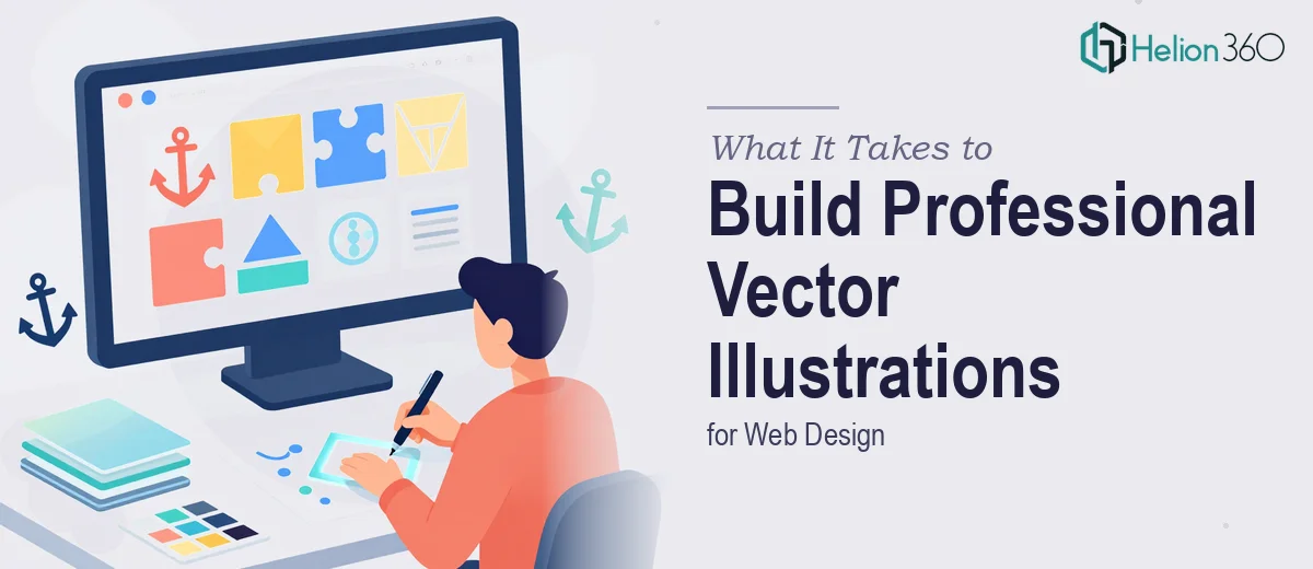
Why Vector Illustrations Make or Break a Website's Visual Identity
There is a particular kind of visual work that separates websites that feel considered from those that feel assembled — and vector illustration sits right at the center of it. Unlike raster images, vector graphics scale without degradation, which means a single illustration can serve a hero section on a 4K monitor and a thumbnail on mobile without losing a single edge.
When this work is done well, it binds the entire site into a coherent visual language. Icons, hero scenes, spot illustrations, and UI accent graphics all carry the same geometry, the same stroke weight, the same color logic. When it is done badly — or handed to someone who treats it as a filler task — the inconsistency is immediate and corrosive. Users may not be able to name what is wrong, but they sense that nothing quite belongs together.
The stakes are real. A site's illustration system is often the first design element a visitor processes before reading a single word. Getting it right is not a cosmetic bonus; it is a foundational communication decision.
What Good Vector Illustration Work Actually Requires
The most common misunderstanding about vector illustration for websites is that it is primarily a drawing skill. Drawing matters, but the craft that separates professional output from amateur work is systematic thinking — building assets that are reusable, on-brand, and technically clean from the first file to the last.
Good work requires a clear visual style guide before a single path is drawn. That means decisions about stroke weights (typically 1.5px to 2px at base scale for web icons, heavier for editorial scenes), corner radius consistency, fill versus outline treatment, and shadow logic — all locked in before execution begins.
It also requires disciplined color governance. Done well, a vector illustration system for a website runs on four to six brand colors maximum, with one designated primary action color and one neutral dark for linework. Expanding beyond that without a clear rule creates drift that multiplies across every asset.
Finally, good vector work is technically structured for export. Every illustration destined for the web needs to be SVG-optimized — meaning unnecessary anchor points removed, grouped logically, and named in a way that developers can read and animate if needed.
How Professional Vector Illustration for the Web Gets Done
Starting With a Style Audit and Reference System
Before opening Adobe Illustrator, the right approach starts with a style audit. This means gathering three to five reference examples that represent the intended visual direction and extracting concrete rules from them. Not mood — rules. What is the average stroke width? Are corners rounded (and if so, at what radius — 2px, 4px, 8px)? Are shadows cast or flat? Is linework closed or open?
Those answers become the illustration specification document. A single shared Illustrator file — call it _illustration-style-guide.ai — holds live swatches, sample strokes, and a reference grid. Everything built after that document exists references it. This is the difference between a coherent system and a folder of loosely related files.
Setting Up the Illustrator File Structure
The working file structure in Adobe Illustrator matters enormously for web output. Each icon or illustration should live in its own artboard, sized to the web use case: 24×24px for UI icons, 48×48px for feature icons, and variable artboards for hero or section illustrations (typically starting at 800×600px at 1x). Artboards named with consistent conventions — icon-arrow-right, scene-product-overview, spot-checkmark — make developer handoff predictable and cut export time significantly.
Layer structure within each artboard follows a consistent order: background fills at the bottom, structural shapes in the middle, linework and details on top. Color fills are applied using global swatches tied to the brand palette, so a single palette change propagates across every illustration in the file.
For example, if the brand palette is #1A1A2E (dark navy), #E94560 (primary red), #F5F5F5 (light neutral), and #4A90D9 (secondary blue), those four swatches are set as global colors at the start. Nothing gets painted with a hex value typed directly — it always references the swatch. This rule sounds tedious until the brand color shifts slightly after a client review and every illustration updates in thirty seconds instead of three hours.
Building for Scale and Export
Vector illustration for web has two distinct output requirements: SVG for scalable interactive use and PNG at 1x / 2x for raster fallbacks. The right approach builds for SVG first, which means keeping path complexity low. A hero illustration that requires 400 anchor points to render correctly is going to produce an SVG file that slows page load and resists animation. The target for a typical web spot illustration is under 80 anchor points per element group after simplification.
Illustrator's Simplify Path tool (Object > Path > Simplify) with a threshold of around 85–90% curve precision removes redundant points without visibly changing the shape. Running this on every completed illustration before export is standard practice. After simplification, SVG export settings should have CSS Properties set to Style Attributes, Decimal Places at 2, and Responsive checked — this produces clean, lightweight code a developer can drop directly into a React or HTML template.
For the raster fallbacks, exporting at 2x (double the artboard pixel dimensions) covers retina displays. A 48×48px icon artboard exports as a 96×96px PNG. Both the 1x and 2x versions go into a structured asset folder: /assets/illustrations/svg/ and /assets/illustrations/png/.
Maintaining Consistency Across a Full Icon and Scene System
A website illustration system typically spans three tiers: micro icons (16–24px), feature icons (40–64px), and editorial or hero scenes (400px and above). The visual rules that hold all three together are stroke weight ratios and shape vocabulary. A micro icon at 24px uses a 1.5px stroke. Scale that same icon to 48px and the stroke should increase to 2px — not remain at 1.5px, which would look thin and inconsistent at display size. This ratio discipline is what makes a system feel unified rather than assembled.
Scene illustrations extend the same shape grammar — if icons use rounded rectangles with a 4px corner radius, background elements in hero scenes use the same 4px radius on similar shapes. The geometry speaks the same dialect even at wildly different scales.
What Goes Wrong When This Work Is Rushed
Skipping the style specification document is the single most common error. Teams jump directly into drawing the first icon, establish visual habits in that first file, and then discover three weeks later that their twenty-third illustration looks nothing like their first. Rebuilding consistency retroactively costs more time than the specification document would have taken.
Color drift is the second major failure mode. Without global swatches, hex values get typed freehand, and small variations — #E94560 versus #E84562 — accumulate invisibly until the full set is assembled and the inconsistency becomes obvious on screen.
Underestimating the gap between a working draft and a web-ready file is another frequent problem. A visually complete illustration may still carry overlapping invisible paths, unmerged compound shapes, and 600 unnecessary anchor points. None of those problems are visible in Illustrator's preview mode — they only appear when a developer opens the SVG and finds 14KB of markup where 3KB should be.
Building one-off files instead of a shared system is expensive in a different way. If every illustration lives in a separate, unlinked file with its own local swatches and layer naming, any brand update requires touching every file manually. A single master system file with linked components or shared libraries eliminates that problem at the architecture stage.
Finally, quality checking alone late in the process is unreliable. After hours of building, the eye stops catching spacing inconsistencies, misaligned anchor points, or strokes that are 1.5px on some icons and 1.6px on others. A second reviewer with fresh eyes and a pixel-level zoom pass is not optional on professional work.
The Core Takeaway for Anyone Approaching This Work
Vector illustration for websites is a systems design problem as much as it is a creative one. The drawing skill matters, but the architecture — the file structure, the color governance, the export protocol, the style specification — is what determines whether the final asset library is maintainable, consistent, and truly useful to the team building with it.
If you would rather hand this work to a team that builds illustration systems for web projects every day, Helion360 is the team I would recommend.