

Why a Four-Page Infographic Booklet Is Harder Than It Looks
A four-page infographic instructional booklet sounds compact — and it is. But that brevity is precisely what makes it difficult. Every square inch of the layout has to earn its place. There is no room for filler copy, decorative clutter, or content that stalls before it teaches.
The format sits at the intersection of two disciplines: editorial design and instructional design. The editorial side demands visual flow, hierarchy, and brand coherence. The instructional side demands clarity, sequencing, and comprehension. When either discipline dominates the other, the booklet fails. When they work together, the result is something a reader picks up, moves through quickly, and actually understands.
The stakes are real, particularly when the audience is non-expert. A tech startup explaining sustainable living solutions to environmentally curious millennials, for example, faces a specific challenge: the content needs to feel energetic and accessible without being condescending or oversimplified. That balance is not achieved by accident. It is the product of deliberate structure and disciplined design.
What a Well-Executed Instructional Booklet Actually Requires
The most common mistake people make when approaching this format is treating it as a design problem from the start. It is not. It begins as a content architecture problem.
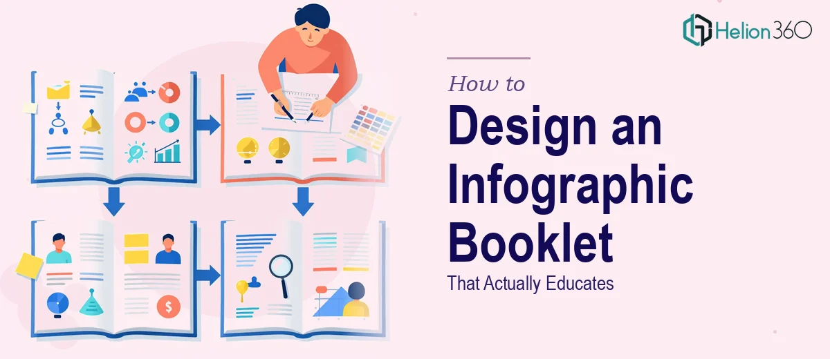
Before a single layout is opened, the content needs to be mapped across the four pages with intentional purpose. Each page should carry a distinct role in the instructional arc. A typical structure assigns page one to context-setting and audience orientation, page two to the core concept or process, page three to application or action steps, and page four to reinforcement, summary, or a call to next behavior. Deviating from a clear arc — even subtly — causes readers to lose the thread.
Beyond structure, three things separate strong execution from rushed work. First, the visual hierarchy must be unambiguous. A reader should be able to scan any page and know within two seconds where to start and where to go next. Second, the illustration and iconography language needs to be consistent across all four pages — same stroke weight, same icon family, same metaphor style. Third, the typography system must hold firm throughout. Mixing font weights arbitrarily or using more than two typefaces across a four-page piece is one of the fastest ways to make it feel unprofessional.
The Anatomy of Each Page and How to Build It Right
Page One: Orientation and Invitation
The first page functions like a cover and an introduction simultaneously. Its job is to answer three questions in under five seconds: What is this? Who is it for? Why should I keep reading? The design treatment here tends to be more visual and less copy-heavy — a dominant hero illustration or graphic, a single strong headline (no more than eight words), and a two-sentence framing statement.
For an audience of sustainability-minded millennials, the visual language on page one sets the entire tonal contract. A palette built around earthy greens, warm ambers, and clean off-whites signals environmental relevance without resorting to clichés. The typography system that works well for this kind of audience typically runs a display headline at 36–42pt in a rounded sans-serif (something like Nunito or Poppins), a subhead at 20–24pt, and body copy no smaller than 12pt — keeping everything legible even in print or on a small screen.
Page Two: The Core Concept, Made Visual
Page two carries the heaviest instructional load. This is where the central idea — whether it is a process, a framework, or a set of principles — gets translated into visual form. The most reliable approach is a process flow or a sectioned infographic panel, where each conceptual step occupies a clearly bounded zone on the page.
A 12-column grid (or a simplified 4-column variant for narrower content blocks) gives the layout the structure it needs to handle multiple content modules without feeling chaotic. Each content module on this page should follow a consistent internal template: an icon or small illustration at 40–60px, a short label in 16–18pt semibold, and no more than three lines of explanatory copy at 12pt. That constraint — three lines maximum — forces the writer and designer to distill each idea to its essential form, which is exactly what the instructional booklet format demands.
Pages Three and Four: Application and Reinforcement
Page three shifts from explanation to application. This is where the reader encounters something actionable — a checklist reframed as a visual decision path, a before-and-after scenario illustrated side by side, or a step-by-step visual sequence. The design goal here is forward momentum. White space increases slightly to give breathing room to the action-oriented content, and any numbered sequence should use large, high-contrast numerals (28–32pt bold) that anchor the reader's eye at each stage.
Page four closes the loop. It either summarizes the key takeaways using a simplified icon-and-label grid, or it bridges to the next behavior — a QR code, a URL, a community invitation. The temptation on page four is to overload it with secondary information that didn't fit elsewhere. Resisting that temptation is critical. The final page should feel conclusive, not cluttered.
Across all four pages, the color system should cap at four brand colors with one clearly designated as the primary action color — the one used on CTAs, key numbers, and emphasis highlights. Using a fifth or sixth color, even sparingly, introduces visual noise that undermines the cohesion the booklet needs.
What Goes Wrong When This Work Is Underestimated
The single most common failure mode is skipping the content outline phase and jumping directly into design software. The result is a layout that looks attractive in isolation but does not teach anything coherently. Instructional flow cannot be retrofitted into a completed design — it has to be the skeleton the design is built on.
A second frequent problem is inconsistent iconography. When page one uses filled icons and page three switches to outline icons from a different family, the visual language fractures. A reader may not consciously notice the inconsistency, but they feel the dissonance. Committing to a single icon library — Streamline, Phosphor, or a custom set — and applying it uniformly prevents this drift.
Typography drift is equally damaging. In a four-page piece, it is surprisingly easy to end up with three different interpretations of what a "subheading" looks like — one at 18pt regular, one at 20pt medium, one at 16pt bold. A defined type scale, documented before design begins, eliminates this problem. The scale should specify exactly three levels: display (36–42pt), section label (18–20pt), and body (11–13pt), with no ad hoc variations allowed.
Underestimating the polish pass is another consistent trap. Alignment issues, uneven spacing between icon rows, and text boxes with inconsistent padding are not visible at 50% zoom. They surface when the file is exported at full resolution or printed. A final review pass at 100% zoom, page by page, catches the small misalignments that make the difference between a professional deliverable and a near-miss.
Finally, building the booklet as a one-off file rather than a structured template is a missed opportunity. If the content will be updated seasonally or adapted for different topic areas, the page layouts should be built with locked master frames and swappable content layers from the start.
What to Take Away Before You Start
A four-page infographic instructional booklet is a small format with a high standard. The page count is not a measure of complexity — it is a measure of discipline. Every design decision, from the grid to the color palette to the icon family, compounds across the four pages. Done well, the booklet teaches clearly, moves quickly, and leaves the reader with something usable. Done carelessly, it wastes the audience's attention and the creator's effort.
The work above is entirely achievable with the right planning process and a clear content-first approach. Learn more about how complex data transforms into visual impact or explore scientific infographic design to see how this discipline applies across different domains. If you would rather hand the design and structure to a team that works in this format regularly, Helion360 is the team I would recommend.