

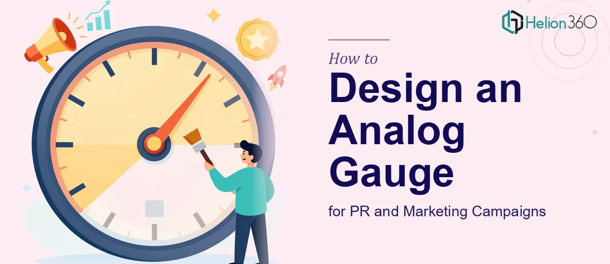
Why Analog Gauge Graphics Are Harder to Get Right Than They Look
There is a particular kind of visual that shows up in PR campaigns, executive dashboards, and product launches — the analog gauge. It looks deceptively simple: a semicircle, a needle, a few labels. But when it needs to communicate a real KPI, hold up across screen sizes, and look polished enough to anchor a campaign prop, the design problem gets surprisingly deep.
The stakes are real. A gauge used as a PR prop is not a background element — it is the focal point. Journalists, stakeholders, and audiences will read it at a glance and form an immediate impression. If the visual looks amateurish, cluttered, or technically inconsistent, it undermines the credibility of the message it is meant to reinforce. Done well, an analog gauge graphic becomes a memorable, instantly readable encapsulation of performance — the kind of visual that gets screenshotted and shared.
The challenge is that most designers approach this as a purely aesthetic problem and underestimate the structural and technical requirements sitting underneath it.
What Well-Executed Gauge Design Actually Requires
A polished analog gauge graphic for a PR or marketing context is not just a pretty illustration. It sits at the intersection of data design, scalable vector graphics, and brand communication — and each of those dimensions has its own demands.
First, the gauge must accurately map a KPI range onto a visual arc in a way that is both truthful and legible. That sounds obvious, but it requires deliberate decisions about arc span, tick mark density, and zone segmentation before a single visual element is drawn.
Second, the design must be built in a format that scales. A gauge that looks sharp at 1920×1080 on a conference screen but blurs or loses proportions on a tablet is not production-ready. This means working in SVG or a vector-native environment from the start — not rasterizing early.
Third, the visual language has to carry brand weight. The gauge is not a generic widget; it needs to feel like it belongs to the campaign it is supporting. That means intentional color application, typography that matches the broader brand system, and a level of finish — shadows, gradients, bezel treatments — that reads as intentional rather than default.
Finally, it must be buildable as a functional or at minimum a convincing static representation of a dynamic element, which informs every structural choice from the ground up.
How to Actually Build the Gauge — Structure, Decisions, and Real Specifics
Mapping the Arc and KPI Range
Most professional gauge designs use a 240-degree arc — starting at roughly the 7 o'clock position and ending at 5 o'clock — because this mirrors the intuitive reading of analog speedometers and pressure gauges that audiences already understand. A 180-degree arc (pure semicircle) is cleaner and works well for simpler PR props, but it compresses the readable range.
The KPI range needs to map proportionally onto that arc. If the gauge represents, say, a brand sentiment score from 0 to 100, each degree of arc corresponds to 100 ÷ 240 = approximately 0.42 units. Major tick marks typically appear every 20 units (every 48 degrees), with minor ticks at every 10 units (every 24 degrees). Getting this math wrong — even slightly — means the needle position will be visually misleading, which is a serious problem for a PR asset representing real data.
Zone coloring (red-yellow-green, or brand-equivalent hues) should divide the arc into meaningful performance bands. A common split is 0–40 in a warning zone, 40–70 in a neutral zone, and 70–100 in a target zone. These bands should be rendered as SVG arc path segments rather than as rasterized fills, so they remain crisp at any scale.
SVG Structure and Scalable Build
The gauge should be constructed as a structured SVG with clearly named groups: a background group (bezel, face), a zones group (colored arc segments), a scale group (tick marks and labels), and a needle group (the pointer and center pivot). Keeping these as separate SVG groups — or layers if working in Figma or Illustrator — means any element can be updated independently without rebuilding the whole graphic.
The needle itself deserves specific attention. A well-proportioned gauge needle is typically 65–70% of the gauge radius in length, with a small counterweight tail of about 15–20% of the radius behind the pivot. The pivot circle sits at the center-bottom of the arc and should have a diameter of roughly 8–10% of the gauge diameter. These ratios prevent the needle from looking either stubby or dangerously thin at different display sizes.
For campaigns where the gauge will be embedded in a web or HTML5 environment, the SVG transform attribute on the needle group handles rotation cleanly: a rotate(angle, cx, cy) transform applied to the needle group, where the angle maps linearly to the KPI value. For a 240-degree arc spanning 0–100, the formula is: angle = -120 + (value / 100) × 240. A value of 75 would rotate the needle to angle = -120 + 180 = 60 degrees from the 12 o'clock vertical — placing it solidly in the upper-right quadrant of the gauge face.
Typography and Color Within the Gauge
The typography hierarchy inside a gauge is compact but must still follow a clear scale. The KPI value displayed digitally below the needle (a common addition for precision) reads best at 28–32pt equivalent within the gauge's coordinate space. Zone labels or descriptor text ("Poor", "Good", "Excellent") should sit at 12–14pt, and tick labels at 10pt. Using a single sans-serif typeface — ideally the same one in the campaign's brand system — keeps the gauge coherent rather than isolated.
Color application should cap at three functional hues for the zone bands, plus one neutral for the bezel and face. If the brand system uses a strong primary color, that color belongs in the target zone — reinforcing the positive association. The needle is almost always rendered in a high-contrast dark tone (near-black or deep charcoal) to remain readable across all zone backgrounds.
What Trips People Up When Designing Gauge Graphics
The most common failure is treating the gauge as a static illustration job and ignoring scalability from the start. A gauge built as a flattened raster image at 800×800 pixels will look acceptable in one context and degraded in every other — especially if the campaign ends up repurposing the asset for a different format.
Skipping the KPI mapping math before drawing anything leads to visually dishonest gauges. If the arc proportions are eyeballed rather than calculated, a needle pointing to what looks like "75%" might actually be sitting at the 60% position geometrically. For a PR prop, this kind of inaccuracy can create real problems if the data is scrutinized.
Another common issue is inconsistent visual weight across the gauge's components. Tick marks that are too thin disappear on dark backgrounds; a bezel that is too thick overwhelms the dial face; a needle that is too wide reads as clunky. These are not subjective preferences — they are proportion decisions that require deliberate iteration, not first-draft acceptance.
Designers also underestimate the polish gap between a working draft and a campaign-ready asset. Gradient fills on the gauge face, subtle drop shadows on the needle, anti-aliasing on zone transitions — none of these are luxuries. A flat, unfinished gauge in a polished PR context reads immediately as off-brand. Allocating time for this finish pass is not optional.
Finally, building a one-off gauge without exporting a reusable source file (structured SVG or editable Figma/Illustrator file) creates a maintenance problem the moment the KPI value needs to change or the gauge needs to appear in a different size. The source file should be the deliverable, not just the exported image.
What to Take Away From This
Analog gauge graphic design for PR and marketing is a discipline that rewards rigorous planning. The arc math, the SVG structure, the typography scale, and the finish work all compound — get any one of them wrong and the rest of the effort is undermined. The investment is in building something that is both visually convincing and structurally sound enough to adapt as the campaign evolves.
If you would rather have this handled by a team that does this kind of visual work every day, Helion360 offers UI presentation graphics design that brings this level of rigor to every project.