

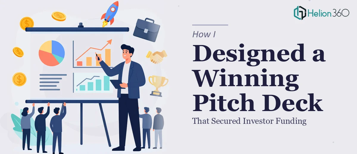
The Moment I Realized What Was Actually at Stake
I had a funding conversation on the calendar. Not a casual intro call — a formal pitch to a room of people who would be evaluating every slide, every number, and every word. The investor presentation needed to do a lot of work: tell a coherent business story, back it up with data, and look like it came from a company worth betting on.
I had the raw material — research, financial projections, competitive data, market sizing. What I didn't have was a presentation that held it together in a way that would land with that audience. A deck thrown together over a weekend wasn't going to cut it. The stakes were real, the timeline was tight, and I recognized immediately that this needed to be executed at a level I wasn't positioned to deliver on my own.
What I Found a Strong Investor Deck Actually Requires
I spent time researching what separates a presentation that moves investors from one that gets politely set aside. The gap is significant.
The first thing that stood out was narrative structure. Investors aren't reading your deck linearly and analytically — they're pattern-matching fast. The story arc has to be deliberate: problem, solution, market opportunity, competitive positioning, traction, financial projection, and ask. Each section has to earn the next one. Getting the sequence wrong, or burying the lead, costs you the room.
The second thing was data visualization. Investor presentations are dense with numbers — market sizing, revenue models, growth curves, competitive benchmarking. The way that data is visualized determines whether it builds confidence or creates confusion. A poorly labeled chart or an inconsistent axis scale can raise questions you don't want raised.
The third signal was visual consistency. Investors see hundreds of decks. A presentation with mismatched fonts, inconsistent spacing, or off-brand colors signals something about operational discipline — whether that's fair or not. Polish isn't vanity; it's part of the message.
What Building This Presentation Actually Involves
The structural work on an investor presentation starts with a narrative audit of the source material — reviewing the research, the financials, and the competitive data to identify what the story actually is before a single slide is built. The right approach maps the content against a proven investor narrative arc, which typically runs 10 to 14 slides with a clear problem-solution-market-traction-ask spine. Getting this architecture right takes real judgment. It's easy to include too much, bury the insight under supporting detail, or sequence slides in a way that loses the room at slide four.
The visual mechanics of a well-executed investor deck are more specific than most people expect. Proper layout uses a consistent grid — typically a 12-column system — with type set at a strict hierarchy: section titles at 36pt, body headers at 24pt, supporting text at 16pt or smaller. Chart types need to be matched deliberately to the claim being made: a bar chart for market comparison, a line chart for growth trajectory, a waterfall for financial build-up. Color usage is constrained to four brand colors maximum, applied with discipline across every slide so nothing looks arbitrary. Practitioners working in this space know these rules by feel; for someone building a deck from scratch, figuring them out mid-project adds hours.
Polish and consistency across 12 to 14 slides is where a lot of self-built decks fall apart. Every slide needs to sit on the same grid, respect the same margin rules, use the same icon style, and apply the same chart formatting. A single misaligned text box or an inconsistent legend style is the kind of thing a designer catches immediately and a non-designer doesn't see until someone else points it out in the room. The execution friction here is real — small inconsistencies compound across a deck and require a systematic pass that most people underestimate.
Why I Brought in Helion360 to Handle It
I didn't spend time attempting a draft and then asking for help cleaning it up. Looking at what the work actually required — narrative architecture, data visualization, full visual consistency across every slide — I recognized straight away that engaging a team with the expertise and tooling already in place was the smart move.
Helion360 handled the full project end-to-end. That meant taking the raw research, financial data, and competitive analysis and turning it into a structured, designed, presentation-ready deck. They worked through the narrative arc, built out the data visualizations, and delivered a fully polished presentation with consistent branding applied across every slide. It was done in days, not weeks — handled in a fraction of the time it would have taken me to learn and execute it myself.
The speed mattered as much as the quality. With a funding conversation already scheduled, there was no runway to iterate slowly.
The Outcome and What I'd Tell Anyone in My Spot
What came back was a presentation that looked and felt like it belonged in the room. The story was clear, the data was readable, and the visual execution was consistent from the first slide to the last. The funding conversation went forward on the strength of a deck that communicated credibility before anyone said a word.
The broader lesson I took from this is simple: an investor presentation is not a document you produce — it's an argument you make visually. The mechanics that make it work are specific, the execution is time-intensive, and the margin for error in a high-stakes pitch is low. If you're looking at the same situation — real material that needs to become a real presentation, with a real deadline — Helion360 is the team I'd engage. They delivered fast, handled the full scope of the work, and brought the level of execution this kind of presentation demands.