

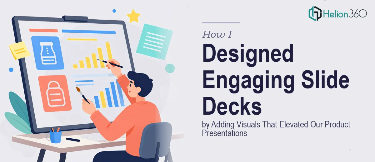
The Problem with a Deck Full of Text
We had an upcoming product presentation that needed to land — not just inform, but actually move the room. The deck covered new product features and event planning services we were rolling out, and when I pulled it up to review, what I saw was slide after slide of dense, unbroken text. No visual hierarchy. No breathing room. No way for the audience to absorb what mattered most.
The stakes were real. This wasn't an internal recap — it was a presentation going in front of stakeholders and potential clients who would be forming impressions in the first few seconds of each slide. I knew immediately that a lightly polished version of the same deck wasn't going to cut it. What the presentation actually needed was a proper visual redesign: icons, infographics, structured layouts, and design that worked with the content rather than competing with it. I also knew that doing this well — really well — wasn't something I was going to knock out in a weekend.
What I Found a Visual Slide Redesign Actually Requires
Once I started looking seriously at what a professional slide redesign involves, it became clear quickly that this was more than swapping text for graphics. Done well, redesigning a text-heavy presentation into a visually engaging deck touches several interconnected layers of work.
The first signal of real complexity: visual decisions aren't decorative, they're structural. The right approach involves deciding which content becomes an icon set, which becomes a process flow, which becomes a data chart, and which stays as text — and getting those calls wrong makes a deck harder to follow, not easier. The second signal: brand discipline. Any visual redesign has to stay within established brand guidelines, which means color palettes, approved typefaces, and a consistent visual language that holds across every slide. The third: the sheer volume of execution detail. A professionally designed slide uses type hierarchies (36pt headings, 24pt subheadings, 16pt body copy is a common baseline), consistent spacing grids, and visual elements that are sized and aligned with precision — across every single slide in the deck. None of this is guesswork, and none of it moves fast without experience.
The Work That Needs to Happen in a Real Slide Visual Redesign
The starting point for any serious slide visual redesign is a content audit. The work involves reviewing each slide to determine what the core message actually is and what visual format best carries it — a process diagram, a comparison table, a stat callout, or a structured icon group. Getting this right before touching any design tool is what separates a coherent deck from one that just looks like it has more graphics. Practitioners working through this will often remap the entire narrative flow before a single visual is placed, and that audit alone can take several hours on a deck of twenty or more slides.
Once the visual strategy is mapped, the layout and visual mechanics work begins. Professional slide design operates on a consistent grid — typically a 12-column structure — so that text blocks, images, and graphic elements align predictably across slides. Typography hierarchy is applied systematically: primary headlines at one size, supporting callouts at another, body text kept minimal. Icon sets need to match in style, weight, and scale. Charts need to use the correct type for the data being shown — a bar chart for comparison, a line chart for trend, never a pie chart for more than three segments. Each of these decisions compounds across the full deck, and inconsistency in any one of them is immediately visible to a trained eye.
Polish and brand consistency is the layer that takes the longest when working at scale. A single slide might look clean in isolation, but the real work is ensuring that the color palette — typically no more than four brand-aligned colors — is applied with discipline across twenty or thirty slides. Background treatments, accent usage, and icon coloring all need to follow the same logic. This is where most self-managed redesigns start to unravel: the early slides look sharp, but by slide fifteen, inconsistencies have crept in. Catching and correcting those across a full deck requires both a sharp eye and a methodical review pass that most people underestimate.
Why I Brought in Helion360 to Handle It
I looked at what a proper visual redesign of this deck actually required and made a straightforward call: this needed a team that does this work every day, with the design systems and visual libraries already in place. Attempting it myself — or piecing it together — would have meant weeks of learning curve and still no guarantee of a professional result.
Helion360 handled the project end-to-end and delivered fast. They took the full text deck, ran the content audit, mapped the visual strategy, and executed the redesign across every slide — icons, infographics, layout grids, brand-consistent color application, the lot. What would have taken me weeks to attempt at even a basic level was turned around in a fraction of that time. The team already had the tooling, the design system, and the experience to make decisions quickly and execute them cleanly. I didn't have to manage the detail — I just had to review the output.
The Result and What I'd Tell Anyone Looking at the Same Problem
The deck that came back was a different presentation. The product feature slides used structured icon grids and clear visual callouts so the key points were scannable in seconds. The event planning service content was organized into a clean flow that made the offering easy to follow for someone seeing it for the first time. The visual language held consistently from slide one to the last, and it stayed squarely within our brand guidelines. The presentation went into the room looking like something the team had spent serious time and resource on — because the right team had.
If you're looking at a text-heavy deck that needs to become a genuinely engaging visual presentation, and you want it done right and done quickly, Helion360 is the team I'd engage — they delivered end-to-end with the kind of execution depth and speed this work actually demands.