

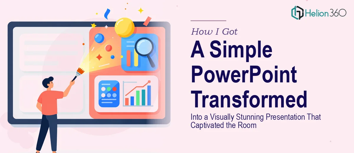
The Presentation Was Fine. Fine Wasn't Going to Cut It.
We had a presentation coming up that actually mattered. The audience included people whose opinion of us — and our work — would be shaped in part by what they saw on screen. The slides we had were functional: bullet points, a logo in the corner, a few stock photos dropped in wherever there was blank space. They communicated the information. But they did not communicate confidence, polish, or brand clarity.
I knew the difference between a slide deck that gets tolerated and one that genuinely captivates an audience. I also knew that closing that gap wasn't just a matter of picking a nicer template. A visually stunning presentation — one that actually holds attention and reinforces the message — is a designed artifact. It takes real craft. And with the timeline we were working against, I needed someone who already had that craft dialed in.
What I Found Out This Kind of Work Actually Requires
Before engaging anyone, I spent time understanding what separates a generic slideshow from a presentation that genuinely lands. The gap is bigger than most people realize.
First, the visual design isn't decorative — it's structural. Typography hierarchy, color palette discipline, slide layout logic: each of these has rules that, when violated, quietly undermine the viewer's trust in the content. A visually stunning PowerPoint presentation requires consistent application of those rules across every slide, not just the title card.
Second, brand integration is not the same as dropping in a logo. It means the typefaces, colors, spacing, and visual language all feel like they belong to the same identity system. Done properly, the deck looks like it was built for this organization — not assembled from a template someone downloaded.
Third, interactive elements and slide transitions, when used well, add a layer of intentionality that generic decks completely lack. But they're also easy to botch — clunky animations undermine credibility faster than a plain static slide would. Knowing what to include, and what to leave out, is a judgment call that comes from experience.
At that point, it was clear this wasn't a weekend project.
What the Work to Build This Properly Actually Involves
The first major layer of work is the structural and narrative audit. Before a single slide is restyled, the content needs to be mapped against the story the presentation is trying to tell. That means evaluating what each slide is doing, whether it belongs where it sits, and whether the sequence builds toward a clear conclusion. Done properly, this often surfaces slides that should be merged, split, reordered, or cut entirely. Working through twenty or thirty slides in this way — weighing what stays, what moves, and what needs to be rewritten for visual clarity — takes focused analytical time. Skipping this step is why redesigned decks still feel disjointed even when they look prettier.
The second layer is the visual system itself. A professional presentation design operates on a defined layout grid — typically a 12-column structure — with a strict typographic hierarchy: headline at around 36pt, subhead at 24pt, body at 16–18pt, and captions no smaller than 12pt. The color palette is capped at four brand colors plus neutrals, applied with deliberate contrast ratios to ensure legibility across different screen environments. Setting up master slides and slide layouts so that these rules propagate correctly across the full deck — rather than needing to be manually corrected on each slide — is a technically demanding setup task that trips up anyone who hasn't done it repeatedly.
The third layer is polish and brand consistency across the entire deck. This is where most attempts at DIY presentation redesign fall apart at the finish line. Individual slides can look good in isolation but feel disconnected when viewed in sequence. Consistent icon weight, aligned image treatments, matching chart styles, uniform margin spacing, and pixel-level alignment across every layout — these details collectively determine whether the deck reads as a coherent, professional piece of communication or as a well-intentioned patchwork. Maintaining this consistency across a full deck while also incorporating interactive transitions requires a level of attention and tooling that is hard to sustain without doing this kind of work regularly.
Why I Brought Helion360 In to Handle the Full Project
I looked at what the work actually required and made a straightforward call: this needed a team that designs presentations at this level every day, with the process and tooling already in place.
Helion360 handled the project end-to-end. That meant the narrative audit and content restructuring, the full visual system buildout with proper master slides and layout grids, and the brand integration — pulling our identity into every element of the design rather than just surfacing it on the cover slide. They also incorporated intentional interactive transitions where the content called for it, and left them out where they didn't add value.
What stood out was how quickly it came together. The turnaround was done in days, not weeks — a fraction of the time it would have taken me to learn the tooling, set up the system, and work through the execution myself. The team clearly had this process mapped out, and it showed in both the speed and the quality of what came back.
What Was Delivered — and What I'd Tell Anyone in the Same Spot
The finished deck was a different artifact entirely. Not just visually cleaner — structurally tighter, brand-coherent from the first slide to the last, and confident in a way that the original slides simply weren't. The audience noticed. The presentation held the room in a way that the previous version never would have.
The experience reinforced something I already suspected: the distance between a functional slide deck and a genuinely captivating presentation design is real work, and it's specialized work. Attempting to close that gap without the right expertise is how you end up spending a week on something that still looks like a template.
If you're looking at the same situation — a presentation that matters, a timeline that doesn't allow for a learning curve, and a standard the content deserves to meet — Helion360's business presentation design services are the team to engage. They handled the full execution fast and brought the kind of craft this work actually requires.