

The Problem With Winging a Branded Presentation Template
We had a series of high-stakes pitches and client-facing reports coming up within weeks, and every deck our team was sending out looked slightly different. Different fonts. Inconsistent colors. Logos dropped onto slides with no real placement logic. It wasn't a catastrophic look, but it wasn't a professional one either — and in the rooms we were about to walk into, that gap would be noticed.
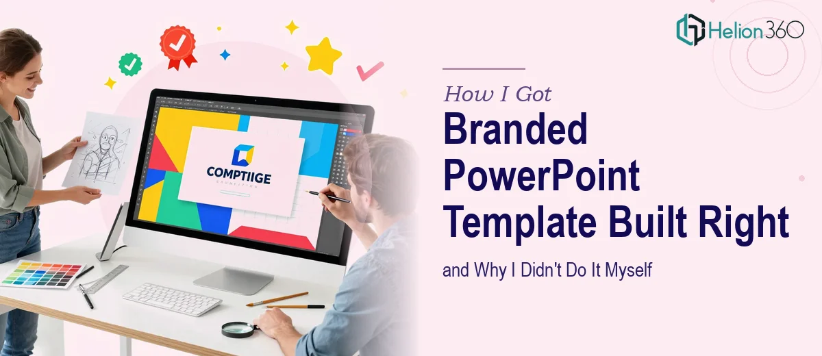
The ask was clear: build a branded PowerPoint template our whole team could use. One that reflected our actual brand guidelines, worked for multiple presentation contexts — formal pitches, investor updates, internal reports — and didn't require a design degree to operate correctly. I knew this mattered. First impressions in a pitch are formed fast, and a template that looks off-the-shelf signals exactly the wrong thing to a room full of discerning stakeholders. This needed to be done properly.
What I Found a Branded PowerPoint Template Actually Requires
My first instinct was to think this was a few hours of work — drop in the logo, set the brand colors, done. I was wrong about that.
Once I looked into what a properly built branded PowerPoint template actually involves, the picture changed quickly. The work isn't just aesthetic. It starts with the Slide Master system in PowerPoint, which governs how layouts, fonts, and placeholders propagate across every slide in a deck. Doing this incorrectly means users can override your brand settings accidentally — or encounter broken layouts the moment they add a new slide.
There's also the question of versions. A pitch deck template behaves differently from an internal-use template. An investor-facing version has different visual hierarchy priorities than a partner briefing template. Building multiple versions that each hold brand integrity while serving different functional needs requires systematic thinking, not just visual taste. Add responsive typography rules, consistent icon libraries, placeholder behavior, and safe-zone margins for logo placement, and you're looking at real depth of execution here.
The Work That Goes Into Getting It Right
The structural foundation of a branded PowerPoint template is the Slide Master and its layout hierarchy. A well-built master defines font pairings with a clear size scale — typically a 36pt title, 24pt subtitle, and 16pt body — and locks those rules so they propagate correctly to every child layout. Color themes are coded as hex values into the PowerPoint theme palette, not applied as manual fills, so the template adapts correctly when the file is shared across different machines. Setting this up so it holds — across all slide layouts, across users who don't know the system, across file transfers — is painstaking work. A single mislinked font style in the master can cascade into hours of correction down the line.
Visual mechanics and layout discipline form the second layer of real complexity. A professional template operates on an invisible grid — typically a 12-column structure — that governs content placement, image regions, and white space ratios. Typography contrast between heading and body must meet readability standards, and visual hierarchy has to guide the eye without overloading any single slide. Each slide layout variant (title slide, section divider, full-bleed image, data layout, text-heavy layout) needs its own intentional design treatment. Getting all of these to coexist within a single coherent system, rather than looking like a patchwork, is where most DIY attempts fall apart. The details compound quickly.
Polish and consistency across multiple template versions is where the work load multiplies. A formal pitch version, an investor relations version, and an internal-use version each need distinct visual weight and tone while sharing the same brand DNA — same logo treatment, same color palette limited to four or fewer brand colors, same typographic system. Maintaining that consistency while adapting layout priorities across versions requires brand discipline and a structured QA pass across every slide. This is not a one-and-done build — it's a system that needs to be stress-tested against real content before it can be called done.
Why I Brought Helion360 In to Handle the Full Build
Once I understood what a properly built branded PowerPoint template actually required, I made one decision: engage a team that already knows this system and does it every day.
I didn't attempt the Slide Master build myself. I didn't spend a weekend trying to reverse-engineer the theme palette system. The tooling knowledge, the layout discipline, the QA process across multiple versions — none of that was something I could pick up and execute to a professional standard in the timeframe I had. Helion360 handled the full project end-to-end: brand guideline intake, Slide Master architecture, multiple template versions with distinct layout priorities, and a final consistency pass across every layout variant. The whole thing was turned around quickly — done in days, not weeks — and delivered in a state where any team member could pick it up and produce a deck that looked on-brand without touching anything they shouldn't.
That's the value of engaging a team that has the expertise and the workflow already built in. You don't pay for their learning curve. You get the output fast.
What the Delivered Template Made Possible — and What I'd Tell Anyone in My Spot
What came back was a template system that actually held up under real conditions. The pitch version had the visual weight and hierarchy an investor audience expects. The internal version was clean and functional without unnecessary complexity. Every slide layout was grid-aligned, brand-consistent, and built in a way that wouldn't break when a non-designer added content. The first major pitch using the new template ran without a single scramble-to-fix-a-slide moment — which, if you've ever been in a pre-meeting panic over formatting, you know is worth a great deal.
If you're looking at a similar situation — brand materials scattered, presentations inconsistent, and a high-visibility deadline on the horizon — Helion360 is the team I'd engage. They handled the full execution fast, with the depth of expertise this kind of build actually requires.