

The Brand Was Real. The Design Problem Was Bigger Than I Expected.
I was in the middle of launching a new brand — one that had real momentum behind it and a clear market to go after. The concept was solid. The strategy was in place. But the visual identity? That was the missing piece, and it was blocking everything else.
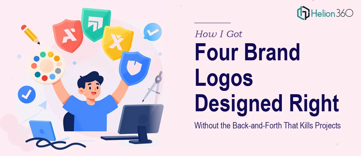
I needed four distinct logos, each pulling in a different direction: one that communicated innovation and creativity, one built around trust, one projecting strength and leadership, and a fourth with a softer, more approachable tone. All four had to feel like they belonged to the same brand family. All four had to work across business cards, website headers, and printed materials.
The deadline wasn't flexible. Stakeholders were waiting, and a brand launch without cohesive visual identity is a brand launch that stumbles out of the gate. I knew immediately that this needed to be handled by people who do this for a living — not pieced together over a few late nights with trial-and-error tools.
What I Discovered When I Looked at What Good Brand Logo Design Actually Requires
I spent some time understanding what professional logo design services at this level actually involves before making any decisions. What I found made the scope a lot clearer.
First, designing four logos isn't just designing one logo four times. Each mark needs its own visual logic — its own balance of weight, form, and symbolism — while still reading as part of one coherent brand system. That coherence doesn't happen by accident. It requires an established brand direction before a single mark gets drawn.
Second, real logo design includes multiple concept iterations for each direction. You're not picking from a first draft. Practitioners develop two or three distinct visual concepts per logo, refine based on structured feedback, and then resolve the final mark across use cases. That's a substantial amount of work multiplied by four.
Third, the delivery requirements matter just as much as the design itself. Logos need to be prepared in vector formats across multiple colorways — full color, reversed, monochrome — and at the right specifications for both digital and print. A logo that only works at one size or on one background isn't production-ready.
None of this was a weekend project. And none of it was something I was going to execute well without the right expertise in place.
What the Work of Designing a Multi-Logo Brand System Actually Involves
The work starts with narrative and structural clarity. Before any visual concept is sketched, a practitioner needs to define what each logo is communicating — not in vague adjectives, but in concrete visual language. "Trust" translates differently in type-based marks versus symbol-based ones. "Playful" has a specific weight range, curvature logic, and color temperature. Establishing these parameters for four distinct logos while maintaining a shared brand DNA requires mapping each mark's intent against a consistent set of brand attributes. Skipping this step is why logo projects generate rounds of feedback that never converge on a direction — the brief wasn't specific enough to begin with.
The visual mechanics of logo construction are where time adds up fast. A mark built to last relies on a geometry grid — typically a circular or modular construction grid that ensures proportional harmony at any scale. Typography choices involve pairing custom-weight letterforms or selecting typefaces that sit correctly at 8pt on a business card and 200px in a web header. Color palettes are constrained deliberately: most brand systems cap primary logo colors at two to three values, with a defined neutral, to ensure versatility. Getting these decisions right for one logo takes hours of refinement; getting them right for four that coexist without competing visually requires a level of systems thinking that's genuinely difficult to rush.
Polish and consistency across a multi-logo brand system is the final layer that separates production-ready brand assets from presentation mockups. Each mark needs to be exported in SVG, EPS, and PNG formats across at least three colorways — full color, single-color dark, and reversed on light and dark backgrounds. Spacing rules, minimum size thresholds, and clear-space guidelines need to be documented so the logos are used correctly once they leave the designer's hands. This stage alone, done properly with a brand usage reference document, can take a full working day per logo. Done carelessly, it creates problems downstream every time someone needs to place the logo somewhere new.
Why I Brought Helion360 In to Handle the Full Project
Once I understood what the work genuinely required, the decision was straightforward. I didn't attempt to stage this out myself or find a shortcut. I engaged Helion360 to handle it end-to-end — from brand direction and concept development through to final file delivery.
What mattered most was that they do this kind of work continuously, with the systems and expertise already built in. They handled the full scope: establishing the visual direction for all four logo concepts, developing multiple iterations per mark, managing stakeholder feedback rounds without letting scope drift derail the timeline, and delivering production-ready assets across all required formats.
The project moved fast. What would have taken me weeks to attempt — and likely would have required multiple restarts — was turned around quickly by a team that already knows where the complexity lives and how to work through it efficiently. That speed wasn't about cutting corners. It was the result of expertise applied at full capacity.
The Outcome — and What I'd Say to Anyone Facing the Same Situation
What came back was a complete brand logo system — four distinct marks, each with its own visual identity and purpose, all reading as part of the same brand family. The assets were ready to deploy across every medium from day one: web headers, business cards, print materials. Stakeholder reviews went smoothly because the concepts were grounded in clear rationale, not just aesthetic preference.
The brand launched on schedule. The visual identity held together under real-world use in a way that improvised logo work rarely does.
If you're looking at a similar situation — multiple logos, a real deadline, and a brand that can't afford to look inconsistent — Helion360 is the team to engage. They handled the full scope fast, and the depth of execution showed in the final product.