

The Documentation Deadline That Made Logo Design Urgent
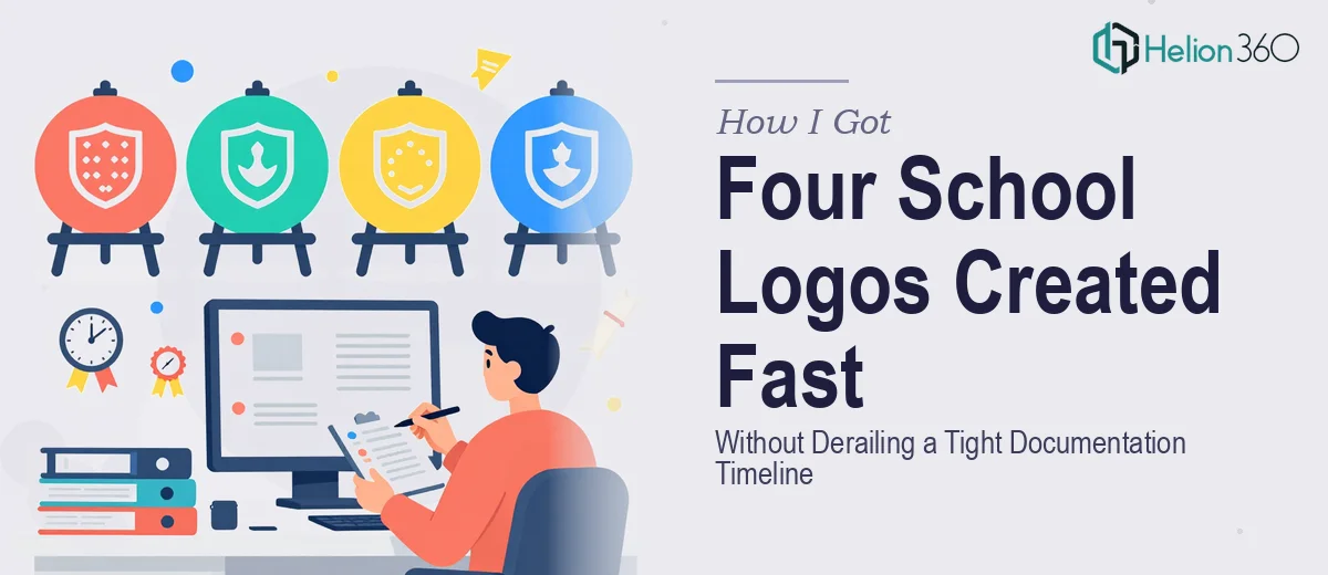
I was pulling together draft documentation for a set of US curriculum schools — four of them, each with a distinct name and identity — and I hit a wall almost immediately. The documents looked unfinished and unconvincing without something in the logo slots. Not polished final branding, just credible, coherent placeholder logos that read as real institutions. Four schools: Great Oaks Academy, Columbus Academy, Amherst Collegiate School, and Fairfax County Academy.
The timeline was tight. The drafts needed to circulate internally within days, and blank placeholder boxes weren't going to cut it. The logos didn't need to be final brand assets, but they did need to look the part — consistent, professional, and tonally appropriate for a US academic context. I knew immediately this wasn't something to attempt casually. Getting four logos wrong — even placeholder ones — would undermine the credibility of everything attached to them.
What I Found Out About Making Logos That Actually Work
When I looked at what proper placeholder logo creation actually involves, it was more considered than I expected. The work isn't just picking a font and dropping in a school name. Even a draft logo needs to communicate institutional credibility, and that requires design decisions that compound quickly across four separate identities.
Three things stood out as genuine complexity signals. First, there's the question of typographic register — the typeface choices need to read as academic and American, which is a narrower target than it sounds. Second, each of the four school names has a different character length and rhythm, which means the layout approach can't simply be copied across all four. Third, color palette selection for academic institutions follows recognizable conventions — navy, forest green, burgundy, gold — and getting the right pairing for each name without making them all look identical is a real craft decision, not a five-minute call.
I also noticed that even "placeholder" logos need to work at multiple sizes, because they'd appear in headers, footers, and cover pages simultaneously. That's not a trivial constraint.
What the Logo Creation Work Actually Involves
The foundation of this kind of work is visual identity interpretation — translating a school name into a design language that signals the right institutional register. For US curriculum schools, that means drawing on established academic visual codes: serif or refined sans-serif typefaces in the 32–48pt range for the primary name, balanced with a secondary line (such as an institution type descriptor) set 2–3 weight steps lighter. The designer's task is to make each logo feel like it belongs to a real school without defaulting to generic clip art territory. Getting this right across four distinct names — each with different character counts and syllabic rhythm — requires careful optical spacing and alignment work that takes real time to do properly.
Visual mechanics are where the execution friction compounds. A 4-logo set needs internal consistency — shared proportions, comparable visual weight, and a coherent system — while still allowing each identity to feel distinct. Working within a defined grid and applying consistent safe zones around each mark ensures the logos behave correctly in a document layout at varying sizes. Color selection follows institutional palette conventions, but even choosing from a constrained set of navy, forest green, burgundy, and gold requires testing combinations against white and dark backgrounds. That testing phase alone adds hours, particularly when four logos need to remain distinguishable from each other at a glance.
Polish and consistency across the set is the final pressure point. Placeholder logos still need to look intentional — mismatched line weights, inconsistent cap heights, or unbalanced padding between a crest element and the name text are the kinds of details that make draft documentation look amateurish rather than in-progress. Ensuring all four logos share a unified design logic, export cleanly at both screen and print resolutions, and sit correctly inside the document templates requires a final QA pass that most people underestimate. It's the difference between drafts that read as credible working documents and drafts that invite unnecessary criticism before the content even gets reviewed.
Why I Brought Helion360 In to Handle It
I recognized quickly that attempting this myself — even for placeholder assets — would cost more time than I had and produce results that didn't match what the documentation needed. The moment I mapped out what four coherent school logos actually required, the decision to bring in a capable team was straightforward.
Helion360 handled the full project end-to-end: interpreting the brief for each of the four school names, making color and typographic decisions appropriate to the US academic context, and delivering a consistent set of logos ready to drop directly into the draft documents. There was no back-and-forth on fundamentals, no need to explain what "institutional" should look like. The work was turned around quickly — done in days, not weeks — which was the only timeline that made sense given where the documentation project was.
The value wasn't just speed. It was having a team with the design tooling and institutional visual literacy already in place, so no time was lost on a learning curve.
The Result and What I'd Tell Anyone in the Same Position
What came back was a set of four logos that looked like they belonged in real school documentation — distinct from each other, consistent in quality, and appropriate in tone for a US curriculum context. Great Oaks Academy, Columbus Academy, Amherst Collegiate School, and Fairfax County Academy each had a visual identity that held up across the cover pages, headers, and footers where they needed to appear. The drafts circulated on time and drew attention to the content, not the design gaps.
Anyone who's looked at a documentation deadline and thought "I'll just knock the logos together quickly" should read this back. The gap between a logo that looks like a placeholder and one that looks like a credible institution is entirely in the craft decisions — and those decisions take real expertise and time. If you're in a similar spot and need Logo Design Services handled properly and fast, Helion360 is the team to engage.
The experience reminded me of a similar challenge I'd faced with management training deck design — the same principle applied: draft assets that look intentional cost more upfront but protect credibility downstream. And just as with process documentation in Visio and PowerPoint, the difference between something that looks thrown together and something that looks professional comes down to design depth and attention to system-level consistency. Helion360 delivered the full set quickly and with the kind of design depth that made the documentation work.