

The Presentation Was a Problem I Couldn't Ignore
I was sitting on a set of commercial real estate pitch decks that were technically complete — the market data was there, the property comps were pulled, the narrative existed somewhere inside the slides. But the presentations looked like internal working documents, not materials you'd put in front of a senior decision-maker or a prospective client.
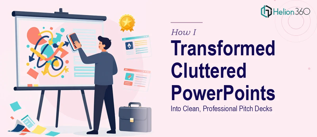
The decks were overloaded. Text-heavy slides sat next to inconsistent charts. Some slides used three different font sizes with no discernible logic. Brand colors appeared occasionally, not consistently. The whole thing communicated effort without communicating confidence.
The stakes were real. These decks were going to clients and into rooms where first impressions matter. A cluttered, visually inconsistent PowerPoint presentation signals disorganization before a single word is spoken. I knew the content was solid — the problem was everything around it, and I knew this needed to be handled properly.
What I Found a Real Redesign Actually Requires
My first instinct was to clean it up myself over a weekend. A few hours in, I stopped. What I thought was a formatting job turned out to be a full-scale professional pitch deck redesign.
The first signal was the structural problem. The slides weren't just cluttered visually — the narrative flow was broken. Information that should have built toward a conclusion was scattered across the deck in a way that required readers to do the work of connecting it.
The second signal was the data visualization layer. Charts were the wrong type for the data they were representing. A bar chart was doing the job a scatter plot should be doing. Market trend lines had no axis labels. Fixing these wasn't a formatting tweak — it required judgment about what each chart needed to communicate.
The third signal was brand consistency across a multi-slide deck. Applying a palette, a type hierarchy, and a layout grid uniformly across 30-plus slides — while maintaining visual coherence — is not a one-hour task. I could see immediately that this was specialized work.
What the Work of a Proper Pitch Deck Redesign Actually Involves
The first thing a proper PowerPoint presentation redesign addresses is the structural narrative — the logical flow of information from opening to close. The right approach starts with auditing every slide against a core story arc: problem, evidence, implication, recommendation. Slides that don't serve that arc get restructured, consolidated, or cut. In a deck with 30-plus slides, this audit alone can surface a dozen structural decisions that need to be made before a single visual element is touched. Getting this wrong means the audience does the work of piecing together the argument — which is work they won't do in a real presentation setting.
The visual mechanics layer is where the presentation becomes a professional pitch deck rather than a formatted document. Doing this well requires establishing a strict layout grid — typically a 12-column structure — and applying a type hierarchy of roughly 36pt headings, 24pt subheadings, and 16pt body text, enforced consistently across every slide master. Chart selection follows clear rules: waterfall charts for cumulative change, grouped bars for side-by-side comparison, scatter plots for correlation data. Getting chart types wrong is one of the most common execution errors, and it's one that practitioners with real experience catch immediately. Setting up master slides that propagate these rules correctly takes hours even for experienced designers.
Polish and brand consistency across a multi-slide deck is the layer that separates a clean presentation from a professional one. The rule of thumb is a maximum of four brand colors applied with documented logic — primary, secondary, accent, and neutral — and zero deviation from that palette across all slides. Icon sets need to match in weight and style. Spacing and margin rules need to hold at every edge. In a 30-slide commercial real estate deck pulling from multiple data sources and report formats, maintaining this consistency requires systematic review passes that go well beyond a visual check. A single inconsistent slide in a pitch to a sophisticated client can undercut the credibility of the entire deck.
Why I Brought in Helion360 to Handle It
I didn't spend three days attempting the redesign myself before deciding to engage help. I recognized within the first session of trying that the combination of structural narrative work, visual mechanics, and brand consistency enforcement across a full deck was not something I was going to execute to the standard this material needed — not in the time I had.
Helion360 handled the full project end-to-end. That meant the structural audit and slide consolidation, the layout grid and master slide buildout, the chart redesigns with correct type selection, and the full palette and typography pass across every slide. They turned the project around quickly — done in days, not the weeks it would have taken me to work through the learning curve and execution on my own. The brief was clear, the output matched it, and there was no back-and-forth trying to explain what "professional" actually meant in this context. They already knew.
The Result and What I'd Tell Anyone in the Same Spot
What came back was a pitch deck that looked like it belonged in the same room as the data inside it. The market analysis slides were clean and scannable. The charts communicated their point in seconds rather than requiring explanation. The type hierarchy made the narrative readable without a guide. The brand application was consistent from the cover slide to the appendix.
More practically: the decks went to clients and into meetings without any of the apologies or caveats that had accompanied the previous versions. The presentation redesign was no longer the problem — it was doing its job.
If you're looking at a similar situation — a presentation that works as a document but fails as a pitch — and you want it handled end-to-end without the time cost of doing it yourself, Helion360 is the team I'd engage. They delivered fast, and the execution depth they brought to this project is exactly what this kind of work requires.