

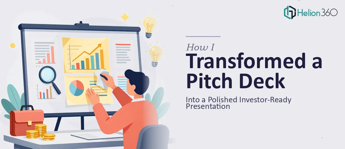
The Deck Was Ready. The Presentation Wasn't.
I had done the hard work — the business model was sound, the financials were mapped out, and the narrative arc of the company's story was clear in my head. What I had on screen, though, was a different story. The pitch deck looked like a working document: inconsistent fonts, slides that were dense with text, charts that didn't communicate hierarchy, and a visual identity that felt closer to a spreadsheet export than an investor-facing presentation.
The stakes were real. Investor meetings were on the calendar, and the deck was the first thing these people would see. In a room where first impressions shape the entire conversation that follows, walking in with a raw, unpolished deck wasn't an option. I knew the content was strong. What the deck needed was the visual and structural treatment that would let that content do its job. That recognition — that the content alone wasn't enough — is where this project actually started.
What I Found a Polished Investor Pitch Deck Actually Requires
I started researching what separates a deck that gets dismissed from one that earns a second meeting. What I found quickly was that investor pitch deck design isn't just about making things look nice. It's a discipline with real mechanics underneath it.
First, there's the narrative structure. Investors process decks fast — often in under three minutes on a first pass. Every slide needs to do exactly one job, and the sequence of slides needs to build a coherent case without redundancy or gaps. That structure isn't always obvious from inside the content.
Second, there's the visual language. Typeface hierarchy — title, subtitle, body at something like 36pt, 24pt, and 16pt respectively — matters because it tells the reader's eye where to go first. Color palette discipline, capped at three to four brand-consistent colors, signals professionalism without being said out loud. Charts need to be chosen for the data type, not for what's available in the default template.
Third, there's the consistency problem. A deck with 20 slides developed over weeks by someone deep in the content will almost always have alignment drift, padding inconsistencies, and slide-to-slide variance that trained eyes catch immediately. These details communicate carelessness, even when the underlying business is anything but careless. Once I understood what the solution actually required, it was clear this wasn't a weekend project.
What the Revamp Work Actually Involves
The right approach to revamping an investment pitch deck starts with a structural audit — reading every slide against the investor narrative arc: problem, solution, market, traction, team, ask. Slides that try to do two jobs get split. Slides that bury the lead get restructured so the key claim lands in the headline, not the third bullet. The story needs to move forward with each turn, and that sequencing work — deciding what goes where and what gets cut — is the foundation everything else is built on. Getting this wrong means even a beautifully designed deck fails to persuade. Getting it right typically takes several rounds of deliberate reworking by someone who understands how investors actually read.
Visual mechanics come next, and this is where execution friction is highest for someone without a design background. A proper investor deck uses a master slide grid — typically a 12-column layout with defined margin zones — so that every text block, every chart, and every image snaps to the same invisible structure across all slides. Typography follows a strict three-level hierarchy: a bold headline at 36pt that delivers the slide's core claim, a supporting label tier at around 24pt, and body copy at 16pt or smaller that carries the detail. Chart selection is deliberate — waterfall charts for financial bridges, grouped bars for competitive comparisons, area charts for growth over time. Applying these rules consistently across 15 to 20 slides, inside a live file where master slides interact with individual slide overrides, is genuinely complex and slow for someone building these habits from scratch.
Polish and brand consistency close the gap between a deck that looks professional and one that looks enterprise-grade. The palette needs to be locked — typically two primary brand colors, one accent, and one neutral — and every element on every slide needs to respect it without exception. Icon sets need to match in style and weight. Padding between elements needs to be uniform, which means checking every slide individually against a spacing standard. Shadow and gradient treatments need to be applied intentionally or not at all. The time cost here isn't the decision-making — it's the sheer repetition of applying, checking, and correcting across a full deck, especially when earlier content revisions cascade into layout changes that then need re-checking from the top.
Why I Brought Helion360 In to Handle the Full Project
I looked at the scope — the structural work, the visual mechanics, the consistency pass across every slide — and made a straightforward call. This wasn't something I could execute well in the time available, and attempting it myself would have produced something halfway between a raw deck and a finished one. That's worse than either extreme.
I engaged Helion360 to take the full project end-to-end. They handled the narrative restructuring, the visual system build, and the complete polish pass — not just a surface-level cleanup. The pitch deck was turned around quickly, in a fraction of the time it would have taken me to work through the learning curve and execution on my own. What I got back was a file where the master slides were properly configured, the typography hierarchy was consistent across every slide, the chart treatments matched the data types, and the brand palette was applied without exception. Done in days, not weeks, with the kind of execution depth the project actually required.
The Result and What I'd Tell Anyone Looking at the Same Problem
The finished deck looked like it belonged in the room. The narrative moved cleanly from problem to ask, each slide earning its place. Investors could scan the headline tier alone and get the story — the detail was there for the people who wanted to go deeper, but the core case was visible immediately. The visual consistency signaled that this was a company that takes its presentation seriously, which in an investor context carries real weight.
If you're sitting on a deck where the content is solid but the presentation isn't doing it justice — and a deadline is making the gap feel worse — Helion360 is the team I'd engage. They delivered the full execution fast, with the tooling and expertise already in place to handle exactly this kind of work.