

Why Visual Communication in Presentations Is Harder Than It Looks
There is a particular frustration that comes with a deck that has all the right information and none of the right impact. The data is there. The narrative is there. But the audience glazes over within the first three slides. This is almost always a visual communication problem, not a content problem.
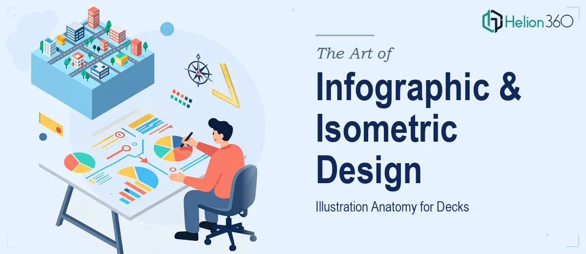
Infographics and isometric illustrations exist to solve exactly this. They translate dense, abstract, or multi-layered information into something a viewer can absorb in seconds. When done well, a single isometric scene communicates a workflow that would take four bullet-point slides to explain in text. When done badly — with misaligned geometry, inconsistent line weights, or colors that fight each other — the visual actively undermines trust in the content.
The stakes are real. A pitch deck that uses flat, inconsistent graphics signals amateurism before a single word is read. A marketing deck with polished, brand-consistent infographics signals credibility and care. The gap between the two is not a matter of artistic talent alone; it is a matter of disciplined process and the right technical foundation.
What Professional Infographic and Deck Design Actually Involves
The instinct when approaching this work is to open a design tool and start drawing. That instinct is almost always wrong. Before a single illustration is created, the work requires a visual communication audit: what story does each section of the deck need to tell, and what visual format serves that story best?
A process flow with five stages is a natural fit for an isometric scene with spatial depth. A comparison of three product tiers works better as a structured infographic grid than as an illustration. A regional market breakdown calls for a map-based visual, not a 3D render. Getting this taxonomy right before execution determines whether the visuals clarify or clutter.
Beyond format selection, professional execution demands three additional things. First, a unified visual language — every illustration in the deck must feel like it came from the same hand, using consistent perspective angles, line weights, and shadow logic. Second, a deliberate color system rather than ad hoc color picking. Third, full alignment between the illustration style and the deck's overall typographic and layout system. Illustrations that look like they were dropped in from a stock library rarely survive close scrutiny.
How to Build This Work Properly
Establishing the Isometric Grid and Perspective Rules
Isometric illustration is governed by a strict geometric logic: all three axes sit at 120 degrees from each other, and there is no vanishing point. Every element in an isometric scene must conform to this grid or the visual reads as broken. In Adobe Illustrator, the isometric grid is set up using the SSR (Scale, Shear, Rotate) method — scale vertically to 86.062%, shear by 30 degrees, then rotate by 30 degrees for the left face; rotate by minus 30 degrees for the right face. These numbers are not suggestions; deviating from them by even a few degrees makes objects refuse to sit flush against each other.
A working isometric scene for a deck typically operates on a base unit of 10px or 20px, depending on the canvas size. Each building block — a server rack, a desk, a workflow node — is constructed from the same unit so that objects can be combined without proportion mismatches. A tech company deck illustrating a cloud infrastructure might use a 20px base grid and build server towers, connection lines, and user device icons all from that same unit. The result is a scene where every element belongs.
Building the Infographic System
Infographic design for decks is fundamentally about information hierarchy made visible. The approach that holds up under scrutiny uses a three-level hierarchy: a primary visual anchor (the central chart, icon cluster, or process flow), secondary labels and connectors, and tertiary supporting annotations. Font sizes should follow this hierarchy: 24pt for primary labels, 16pt for secondary callouts, and 11pt for annotations. Going below 10pt on slides that will be projected is a readability error — not a style choice.
Color in infographics should be capped at four brand colors with one designated accent used exclusively for the single most important data point or call to action. In practice, a brand palette might include a navy primary, a teal secondary, a warm gray neutral, and a coral accent. The coral appears on exactly one element per infographic — the outcome metric, the conversion arrow, the key comparison bar. Overusing the accent color makes it meaningless.
For process flows specifically, the connector logic matters as much as the visual style. A linear five-step flow uses directional arrows with consistent 2pt stroke weight. A cyclical process uses a closed loop with rotation implied through arrow curvature. A branching decision flow requires a clear fork convention — typically a diamond node at 45 degrees with labeled exit paths. Mixing these conventions within one deck erodes comprehension even when individual slides look fine in isolation.
Integrating Illustrations Into the Deck Layout
The slide canvas for most professional decks runs at 16:9 (1920×1080px or 1280×720px). Within that canvas, the usable area after margins should follow a 12-column grid with 24px gutters. Isometric illustrations typically occupy a 7- to 8-column zone on one side of the slide, leaving 4 to 5 columns for headline text, a supporting stat, and a brief descriptor. This split prevents the illustration from overwhelming the message and keeps the slide readable at a glance.
Illustrations exported for PowerPoint or Google Slides should always be exported as SVG or high-resolution PNG at 150dpi minimum — 300dpi if the deck will be printed. Exporting at 72dpi creates visible pixelation when slides are projected on large screens, which immediately undercuts the professionalism the illustration was meant to convey.
What Goes Wrong When This Work Is Under-Resourced
The most common failure is skipping the visual language audit and jumping straight into illustration. Each designer or session produces a slightly different interpretation of the isometric style — one scene uses a 25-degree shadow angle, another uses 35 degrees, a third drops shadows entirely. By slide 12, the deck looks like a collage from three different projects rather than a unified visual system.
A closely related problem is color drift. Without a locked color library — defined HEX values, not approximate swatches — blues shift from slide to slide. A navy (#1B2A4A) becomes a midnight blue (#0D1B2A) in the next illustration because a designer eyedropped a nearby color rather than referencing the master palette. Across 20 slides, this drift is visible to anyone paying attention, and investors and clients do pay attention.
Underestimating the polish pass is another consistent problem. The difference between a working illustration and a presentation-ready one is often two to four hours of alignment correction, shadow consistency checks, and text kerning. Teams that budget for illustration hours but not for polish hours consistently ship work that is 80% of the way there — and 80% visible quality is perceived as carelessness, not as effort.
Building illustrations as one-off files rather than modular asset libraries is an expensive habit. If a deck needs 12 isometric scenes and each is built from scratch, the time investment scales linearly. If the first scene establishes a library of reusable objects — buildings, devices, figures, connectors — each subsequent scene draws from that library and takes a fraction of the time. Skipping the library phase feels like a time saver early and costs double later.
Finally, this work does not proof well in isolation. After hours of building, the eye stops seeing misalignments, color inconsistencies, and proportion errors. A structured review against the original brief — ideally with a second set of eyes — is not optional; it is part of the deliverable quality.
What to Take Away From All of This
The two things worth holding onto are these. First, infographic and isometric illustration design for decks is a systems problem before it is an artistic one. Getting the grid, the color rules, and the visual language locked before execution determines whether the final deck feels cohesive or assembled. Second, the polish pass is not a nice-to-have — it is where the work actually becomes professional. Budget for it.
If you would rather hand this work to a team that builds these visual systems every day, Helion360 is the team I would recommend.