

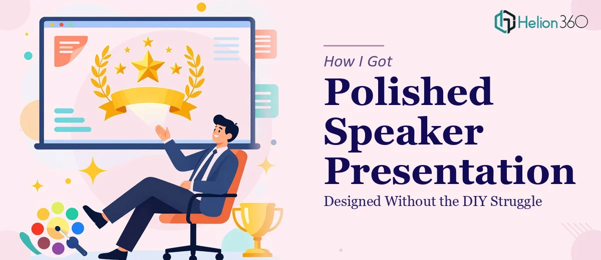
The Problem With Trying to Look the Part Without the Right Tools
I was building out my presence as an inspirational speaker and needed a presentation that could double as a speaker brochure — something I could send to event organizers, corporate clients, and anyone vetting me for a speaking engagement. The stakes were real. First impressions in this space are made on paper before they're ever made in a room, and a visually underwhelming document signals exactly the wrong thing about someone whose entire value proposition is impact and inspiration.
I had a rough outline: a short biography, a handful of quotes that drive the message home, some client testimonials, and a clear call to action. The content existed. What didn't exist was a design that could make all of it feel cohesive, credible, and genuinely compelling. I knew immediately this wasn't a task for a template and an afternoon — it needed to be done right.
What I Found the Solution Actually Required
Once I looked seriously at what a professional speaker presentation involves, the scope became clear fast. This isn't just about making slides look pretty. Done well, a speaker brochure-deck hybrid has to communicate authority, warmth, and momentum — all at once — in a format that works both as a leave-behind document and as a visual aid during a conversation.
The first thing that signaled real complexity was the typography. Inspirational content lives and dies by how text is treated. The wrong font pairing, inconsistent sizing, or poor line spacing can make powerful quotes feel flat. Proper typographic hierarchy in this kind of work means every line earns its place on the page.
The second signal was the visual storytelling structure. A speaker deck isn't just information — it's a narrative arc. The bio, the philosophy, the proof points, and the call to action all have to flow in a sequence that builds trust and ends with momentum. That sequencing is a skill, not an instinct. The third signal was brand consistency across every slide — color, texture, imagery treatment, and tone all need to feel like one unified identity, not a collection of individually designed pages.
What Doing This Work Well Actually Looks Like
The structural and narrative work is where the foundation gets laid. A proper speaker presentation starts with an audit of all available content — bio, quotes, testimonials, positioning language — and maps it against a slide-by-slide story arc. The arc typically follows a trust-building sequence: who you are, what you believe, what you've done, what others say about you, and what they should do next. Getting this sequence right requires thinking like an editor, not just a designer. The temptation to front-load credentials or bury the call to action is exactly what trips up most first attempts, and restructuring it after the design is built costs significantly more time than getting it right at the start.
Visual mechanics in this type of work are more precise than most people expect. A clean, modern, elegant design — the brief for almost every speaker deck — depends on a strict layout grid, typically a 12-column structure with consistent margins and defined safe zones for text and imagery. Typography hierarchy runs something like 40pt for pull quotes, 24pt for section headers, and 14-16pt for body copy, with no more than two complementary typefaces in use across the entire deck. Applying those rules consistently across 15 to 20 slides while also managing image bleed, white space, and visual weight on each individual layout is several hours of precise, focused work — even for someone who does it regularly.
Polish and brand consistency are where the final 20 percent of effort creates 80 percent of the perceived quality. The color palette for a speaker deck should be anchored to no more than 3 to 4 brand colors, with one dominant, one accent, and one neutral. Testimonial pull-out treatments, quote card styles, icon usage, and photo treatment — desaturated, duotone, or full color — all need to be defined early and applied identically across every instance. The execution friction here is real: one mismatched tint value, one inconsistent margin, or one photo treated differently from the rest reads as amateurism at a glance. Catching all of it requires a systematic review pass that most people skip because they don't know it's needed.
Why I Brought in Helion360 to Handle It
Once I understood what the work actually involved, I didn't spend time attempting it myself. The combination of narrative architecture, precise visual mechanics, and brand consistency discipline across the full deck was clearly beyond what I could execute well under time pressure — and this was going out to people who evaluate presenters for a living.
Helion360 handled the full project end-to-end: content structure and story arc mapping, full visual design across every slide, typographic system, brand color discipline, testimonial and quote treatments, and the final call-to-action layout. They turned it around quickly — done in days, not the weeks it would have taken me to learn and execute even the layout fundamentals properly. The expertise and tooling were already in place. I handed over my content and brief, and what came back was a complete, polished deliverable ready to send.
The Result and What I'd Tell Anyone Looking at the Same Problem
What came back was a speaker presentation that looked like it belonged in the same room as the most credible names in the space. The narrative flowed cleanly from introduction through social proof to a confident call to action. The typography, color, and visual treatments held together across every page as a single cohesive identity. The feedback from the first few people who received it was immediate and unambiguous — it read as professional, authoritative, and aligned with the tone of someone worth booking.
If you're building a speaker brand and you're sitting on content that deserves better than a template treatment, the gap between what you can produce in a weekend and what a professional presentation actually requires is significant. If you want it handled end-to-end and delivered fast, Helion360 is the team to engage — they brought the full execution depth this kind of work needs and delivered without the weeks of back-and-forth I would have spent figuring it out myself.