

When One Tool Just Wasn't Enough
I was midway through a marketing project when I realized the way we were tracking work had completely broken down. Tasks were scattered across sticky notes, email threads, and a half-finished spreadsheet that nobody trusted anymore. Deadlines were slipping not because the work wasn't being done, but because no one could see clearly what was happening at any given moment.
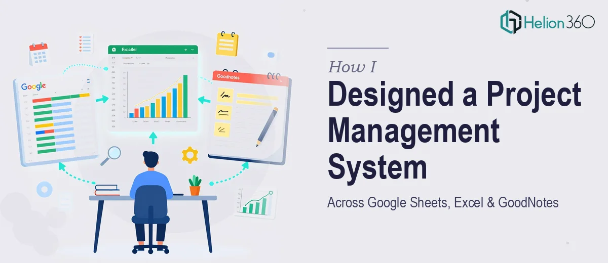
The decision I made — which seemed reasonable at the time — was to build a proper planning system that spanned the tools my team was already using. We were living in Google Sheets for shared collaboration, Excel for heavier data work and reporting, and GoodNotes for personal planning and annotated notes during meetings. The goal was to connect all three into something coherent: a unified project management dashboard that would keep everyone aligned without forcing anyone to change their working habits.
What I Tried to Build on My Own
I started by mapping out what each tool needed to do. Google Sheets would serve as the live collaboration hub — a shared task tracker with status columns, owner tags, and deadline visibility. Excel would handle the more structured reporting side, including Gantt charts and resource allocation tables that could be exported for stakeholder reviews. GoodNotes would be used for custom planner templates that team members could annotate on their tablets during standups and planning sessions.
The concept made sense on paper. The execution was where things started to unravel. Getting the Google Sheets dashboard to behave consistently across different users and access levels was manageable. But once I started trying to mirror that data into Excel in a way that stayed current without manual re-entry, the complexity jumped significantly. And designing GoodNotes templates that actually matched the visual language of the other tools — with the right grid layouts, color coding, and section structures — turned out to be a time-consuming design challenge that was eating hours I didn't have.
I also underestimated how much thought goes into designing Gantt charts that are actually readable at a glance. The ones I was producing in Excel were technically correct but visually noisy — hard to scan during a quick check-in.
Bringing in Outside Help
After losing a full week to troubleshooting and redesigning, I reached out to Helion360. I explained the setup — three tools, a marketing team, and the need for a clean, connected planning system that didn't require constant manual maintenance. Their team asked the right questions upfront: how often data needed to sync, what the primary use case was for each tool, and what level of visual polish the GoodNotes templates needed.
From there, they took over the build entirely. The Google Sheets dashboard came back structured and clean — color-coded by project phase, with dropdown-based status tracking and a summary view that made resource allocation immediately visible. The Excel side was rebuilt around a proper Gantt chart format that was easy to update and formatted for clean exports. The GoodNotes planner templates were designed to complement the digital dashboards visually, so whether someone was looking at the screen or annotating on paper, the system felt like one thing rather than three disconnected tools.
What the Final System Actually Looked Like
The end result was a project management setup that the whole team adopted within a few days — which, honestly, was the real test. When people actually use the system without being pushed, it means the design is doing its job.
The Gantt charts gave leadership the high-level timeline view they needed. The task dashboard in Google Sheets gave the team a daily operational view. And the GoodNotes templates gave individuals a structured way to carry planning into meetings without losing the thread of what the digital tools were tracking. Data visualization across the Excel reports also made our weekly reviews faster — we stopped spending the first ten minutes of every meeting figuring out where things stood.
The biggest lesson for me was that building across multiple platforms isn't just a technical problem — it's a design problem. The tools need to feel connected, not just linked.
If you're working on something similar — trying to get Google Sheets, Excel, or custom planner templates to work together in a way that actually holds up — Helion360 is worth reaching out to. They handled the parts that were genuinely complex and delivered a system that worked from day one.