

The Data Was There. Making Sense of It Was Not.
I was in the middle of planning a marketing campaign and sitting on a spreadsheet full of audience data — birthdays, gender breakdowns, device type preferences. It looked comprehensive on paper. The problem was that none of it was telling a story yet. Raw rows of data do not help a marketing team make decisions. Charts do.
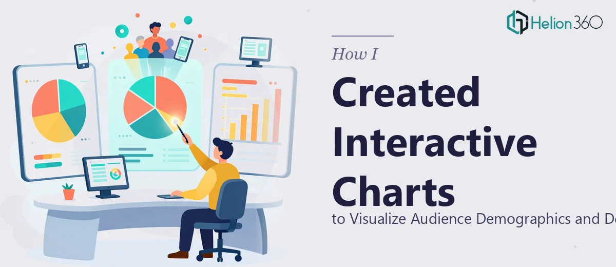
My goal was straightforward: take this audience data and turn it into visual charts that could actually inform how we target and time our campaigns. Specifically, I wanted bar charts showing gender-segmented birthday data for the next six months, and pie charts breaking down device usage across mobile, desktop, and tablet. Simple enough in concept. Messier in execution.
Where It Got Complicated
I started by trying to set up the charts myself in Excel. The birthday data alone spanned multiple years, and I quickly realized that filtering it down to rolling six-month windows while also splitting the view by gender was not as plug-and-play as I expected. I could get a rough chart going, but the formatting was inconsistent, the axis labels were cluttered, and the gender segmentation kept collapsing into a single undifferentiated bar.
The device type pie charts were less technically demanding, but making them clean and shareable for a marketing dashboard introduced another layer of work. Dynamic linking, consistent color coding, chart sizing — each small detail added up.
I spent the better part of an afternoon going in circles. The data was solid. My execution just could not match the output I needed.
Bringing in a Team That Knew What to Do
After hitting that wall, I reached out to Helion360. I described what I had — a multi-year spreadsheet with birthday, gender, and device fields — and what I was trying to produce. I shared a few sample rows so they could understand the data structure and get started without back-and-forth.
Their team asked the right clarifying questions upfront: how the charts would be embedded, whether the dashboard needed the charts to be dynamically updated as new data came in, and what color conventions matched our brand. Within a short time, they had taken the raw spreadsheet and mapped out a clear structure for both the demographic bar charts and the device behavior pie charts.
What the Final Charts Actually Looked Like
The bar charts were organized by gender and filtered to show upcoming birthdays within a rolling six-month window. Each gender segment was color-coded clearly, and the chart labels were clean enough to read at a glance during a presentation or a dashboard review. No overcrowded axes, no ambiguous data points.
The device type pie charts showed mobile, desktop, and tablet usage as clean percentage breakdowns. They were formatted to sit neatly within a marketing dashboard view and were easy to share across the team.
Beyond the visual output, the Excel file itself was structured so that updating the underlying data would automatically refresh the charts. That was something I had not thought to ask for, but Helion360 built it in anyway — which made the whole thing genuinely useful long-term rather than just a one-time deliverable.
What I Took Away From This
Data visualization sounds simple when the data is already collected. In practice, the gap between having data and presenting it clearly is where most of the real work lives. Getting the chart type right for the data story you are trying to tell, handling multi-year date logic, segmenting by category, making it shareable — each of those steps requires both technical know-how and a sense of visual clarity.
I came away with charts that the marketing team could actually use, and a better sense of where the complexity in this kind of work actually lives. The project ended up taking far less time once it was in the right hands.
If you are working with a similar pile of audience data and struggling to turn it into something readable and useful, consider a data visualization toolkit — it can transform raw data into clear, impactful visuals. I found that working through professional PowerPoint presentations helped our team communicate findings more effectively, and learning how others have tackled McKinsey-style consulting presentations showed us new approaches to data-driven storytelling. Helion360 took what I had, understood what I needed, and delivered charts that genuinely worked for our campaign.