

The Problem With Explaining Renewable Energy to a Young Audience
I was part of a team putting together an educational series aimed at children — roughly ages seven through twelve — covering solar, wind, and hydro power. The goal was simple to say out loud: make renewable energy concepts genuinely fun and accessible. The reality was harder. Kids at that age have a short attention window, and dense text slides or generic stock diagrams weren't going to cut it. We needed interactive energy slides with animations, clear visual storytelling, and content structured at the right reading level — not simplified to the point of being wrong, but not so technical that eyes glaze over.
The stakes were real. This wasn't a one-off classroom handout. It was a full educational set that would be used across multiple sessions, possibly adapted for different formats down the line. It needed to land right the first time. I knew immediately this wasn't something to improvise or rough out over a weekend.
What I Found Out This Kind of Work Actually Requires
Once I started researching what a high-quality interactive educational slide set actually involves, the scope became clear fast. It's not just about making slides look bright and cheerful. Done well, this kind of content lives at the intersection of instructional design, visual communication, and motion — and each one has its own set of requirements.
Instructional design for children means mapping each concept to a learning objective and sequencing it so each slide builds on the last. Renewable energy topics like photovoltaic conversion or the mechanics of a wind turbine need to be broken into digestible steps — not just illustrated, but scaffolded. That's a structural job before a single visual is placed.
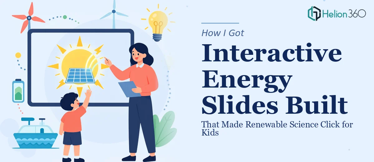
Then there's the animation layer. Effective educational animations for kids aren't decorative — they're functional. A solar panel absorbing light and generating current needs to be shown in motion, not implied by a static diagram. Building that kind of sequenced animation requires knowledge of trigger logic, transition timing, and exit/entrance choreography that a general-purpose designer doesn't typically have ready to go.
And then there's the visual language for a child audience specifically — iconography, color contrast ratios accessible to young readers, character illustration styles, and font sizing that works at distance on a classroom display. That's a different standard than a boardroom deck.
What the Work Itself Involves
The structural work starts with a content audit and a learning arc. For a topic like renewable energy, the right approach maps each energy source — solar, wind, hydro — to a concept hierarchy: what it is, how it works, why it matters. Practitioners sequence this so foundational concepts (what energy is, how it moves) come before application-level content (how a turbine converts kinetic energy). A well-built set typically runs 30 to 50 slides across a series, with each slide carrying no more than one core idea. Getting the arc wrong means kids lose the thread by slide eight, and no amount of animation recovers that.
The visual mechanics of educational slide design for children follow specific rules. Typography generally runs at 28pt minimum for body copy, with headers at 36pt or above — sized for classroom display distances, not desktop viewing. Color palettes are built around high-contrast pairings with no more than four dominant brand or theme colors, and iconography needs to read at a glance. Charts or process diagrams get replaced with illustrated step-by-step visuals, because traditional data chart conventions are not developmentally appropriate for this age group. Setting up master slides that propagate these standards consistently across a full series is a multi-hour job even for experienced designers.
The animation and interactivity layer is where execution friction gets real. Functional educational animation — showing a solar panel's photovoltaic cycle, or water moving through a hydro turbine — requires sequenced trigger logic: click-to-reveal steps, entrance animations timed to narration cues, and looped motion graphics that don't distract once the explanation is complete. Each animated sequence needs to be built, tested, and timed. A single energy concept might require four to six animation states. Across a 40-slide deck, that's well over 100 individual animation decisions, each one a potential point of failure on a classroom system with a different display setup.
Why I Brought in Helion360 to Handle It
The moment I understood what this project actually required — instructional sequencing, child-appropriate visual design standards, and complex layered animation across dozens of slides — I didn't spend time wondering whether I could do it myself. I knew the answer. The skill overlap between what I had available and what this needed was minimal, and the timeline didn't leave room for a learning curve.
I brought in Helion360 to handle the full project end-to-end. That meant the content structure and learning arc, the visual design system built for a young audience, and all the animation and interactivity logic across the complete slide set. They turned it around quickly — done in days, not the weeks it would have taken me to work through even the visual design layer alone. The team came with the instructional design thinking, the motion design tooling, and the child-facing visual standards already in place. There was no ramp-up time on the fundamentals.
The Result and What I'd Tell Anyone in the Same Spot
What came back was a complete, polished interactive energy education set — structured across solar, wind, and hydro modules, animated to show how each energy source actually works, and visually calibrated for the age group. The slides held up in the classroom environment they were built for. The kids engaged with the animated sequences, and the instructors had a set they could run without needing to explain or supplement the visuals.
The business outcome was a content series that was ready to use, not a rough draft that needed further work. Nothing had to be rebuilt. The turnaround was fast enough that we hit our session deadline with time to spare.
If you're looking at a similar problem — course slide presentation design with real animation depth and a specific audience to design for — and you want it handled end-to-end without the weeks of learning curve, Helion360 is the team I'd engage. They delivered for me fast, and the execution depth this kind of work needs was clearly already in their wheelhouse. For guidance on what to expect from the rebranding process if you have existing materials, that's another consideration worth understanding upfront.