

The Problem: A Prototype That Was Good But Not Good Enough
I work with a small group of athletes and fitness clients. Tracking their progress had always been a mix of spreadsheets, handwritten notes, and the occasional screenshot. It worked, but barely. I decided to build something better — an interactive Excel dashboard where each athlete could see their own gym metrics visualized clearly: weight trends, body fat percentage, workout volume over time, and key performance indicators that actually meant something to them day to day.
I am reasonably comfortable with Excel. I got a prototype up and running within a few days. It had the basic structure — a data entry tab, a summary tab, and a few charts. But when I sat down with one of my athletes and walked them through it, I saw the problem immediately. It looked like a spreadsheet. Because it was one. There were no dropdowns to filter by athlete, no dynamic charts that updated automatically, and the layout was cluttered enough that reading it felt like work rather than motivation.
Where Things Got Complicated
I knew what I wanted the dashboard to do. I wanted dropdown selectors so each athlete could pull up their own data. I wanted conditional formatting that highlighted progress milestones. I wanted the charts to update dynamically when new data was entered, not when someone remembered to hit refresh. And I wanted the whole thing to look clean — the kind of interface that a person actually wants to open.
I spent about a week trying to wire this together myself. I got the dropdowns working using data validation and INDIRECT formulas, but the dynamic chart logic was more complex than I anticipated. When I tied named ranges to the dropdown selection, the charts behaved unpredictably. Some updated correctly, others did not. I tried using OFFSET-based dynamic ranges, then switched to structured Excel Tables, and while that helped with the data side, the visual design was still a mess. The charts were functional but ugly, and I had no consistent color scheme or layout logic holding the dashboard together.
I also realized I was spending hours on something that was pulling me away from actually coaching.
Bringing in the Right Help
After hitting that wall, I came across Helion360. I explained the project — what the dashboard needed to do, who would be using it, and where my prototype had fallen short. Their team asked the right questions upfront: How many athletes would the dashboard support? Should individual athlete views be password-protected? What metrics mattered most for visualization?
That conversation alone helped me realize I had not fully thought through the user experience. I had been building it from a data perspective rather than from the athlete's perspective.
Helion360 took the prototype from there. They rebuilt the dynamic filtering logic using a cleaner named range structure and added a proper athlete selector that controlled every chart and KPI card on the dashboard simultaneously. The workout volume chart, the weight progression line, the body fat trend — all of it updated the moment an athlete was selected from the dropdown.
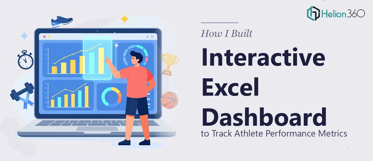
What the Final Dashboard Actually Looked Like
The finished Excel dashboard was a significant step up from what I had put together. The layout was organized into clear sections: a summary row of KPI cards at the top showing current stats versus baseline, followed by trend charts below. The color system was consistent — progress in the right direction showed in green, stagnation or regression flagged in amber. Everything was on one screen without scrolling.
The data entry tab was separated cleanly from the visualization layer, so athletes could log their sessions without accidentally breaking any formulas. Helion360 also added input validation rules to prevent common entry errors, which was something I had not thought to include.
For a small fitness operation, having this kind of structured performance tracking tool made a real difference. Athletes could open the dashboard before a session, see where they stood, and leave with a clearer sense of what they were working toward.
What I Took Away From This
Building an Excel dashboard for data visualization is not just about knowing Excel. It is about understanding how the end user will interact with it and designing the experience around that. I understood the data but underestimated the design and logic work required to make the interface genuinely usable.
If you are working on something similar — whether it is athlete tracking, business performance metrics, or any kind of interactive reporting tool — and the technical complexity is outpacing your available time, Helion360 is worth reaching out to. They picked up exactly where my prototype stalled and delivered something that actually gets used.