

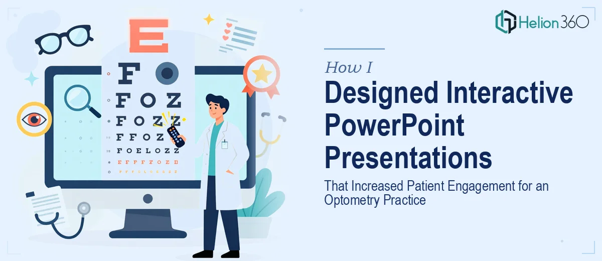
When a Decent Presentation Just Is Not Enough
I was in a situation that a lot of small practice owners find themselves in — I had content, I had slides, and I had a clear message. What I did not have was a presentation that actually held people's attention. My optometry practice was still building its reputation, and the PowerPoint decks I used to educate potential patients about services like myopia management, contact lens solutions, and dry eye treatment were functional at best.
The information was all there. But the slides looked flat, the layouts were inconsistent, and nothing about the experience felt engaging. When you are talking to patients about something as personal as their eye health, the way you present information matters just as much as the information itself.
What I Tried Before Asking for Help
I spent a few evenings trying to fix things myself. I swapped out fonts, pulled in some stock images, and rearranged a few layouts. It looked slightly better, but it still did not feel cohesive. The bigger challenge was that I wanted to add interactive PowerPoint elements — clickable buttons that could jump between sections, embedded videos demonstrating procedures, and slide flows that matched how a real patient consultation actually moves.
That level of interactivity was beyond what I could confidently build without breaking the structure I had already put together. I also realized that the presentation was not aligned with my website's visual identity, which was something I had worked hard to establish. The fonts were different, the color palette was off, and nothing felt like it came from the same brand.
Handing It Over to Specialists
After hitting that wall, I came across Helion360. I explained the situation — the existing slides, the interactive elements I wanted, the brand consistency issue, and the fact that the content needed to feel both professional and approachable for patients who might not have any medical background.
Their team asked the right questions upfront. They wanted to understand who the audience was, what actions I wanted viewers to take after seeing each slide, and what the practice's overall visual brand looked like. That level of intake gave me confidence that this was not going to be a generic redesign.
What the Redesigned Presentation Actually Looked Like
The finished presentation was a significant step up from what I started with. The slide design was restructured so that each section — myopia management, contact lens options, dry eye syndrome — had its own visual identity within the deck, while the overall presentation still felt unified. Typography, colors, and icon styles all matched what patients would see on the practice website.
The interactive elements were built cleanly. Clickable navigation buttons let viewers move between service sections without having to scroll through slides linearly. A short embedded video explained the dry eye treatment process in a way that text alone never could. The flow felt intentional rather than accidental.
Every slide was laid out so that the most important point was immediately visible. Supporting details were there for those who wanted them, but the hierarchy made sure nothing critical was buried.
What Changed After the Redesign
Patient consultations felt noticeably different. When I used the updated presentation during intake conversations, people engaged with it. They asked questions about specific sections, clicked through to the parts that were relevant to them, and left those conversations with a clearer understanding of what the practice offered.
The presentation also became a resource I could share digitally, since it was built to function well both in a live setting and as a standalone file. That kind of flexibility was something I had not even thought to ask for initially, but it turned out to be genuinely useful.
The experience reinforced something straightforward: the content inside a presentation only works if the design gives it room to breathe and a structure that guides the viewer through it.
If you are managing a similar situation — good content, unclear presentation, no time to rebuild it properly — consider PowerPoint Redesign Services. They took a scattered set of slides and turned them into something that actually works in a real patient-facing environment.
Learn more about how brand-aligned presentations can improve patient engagement, and discover how outdated presentations can be transformed into modern, multi-format materials.