

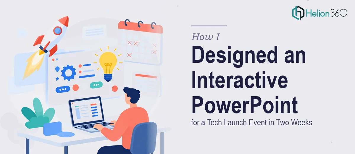
Two Weeks. One High-Stakes Tech Launch. Zero Margin for Error.
When our team confirmed the launch event date, I had exactly fourteen days to produce a presentation that could hold the attention of tech enthusiasts and senior industry leaders at the same time. That is not a forgiving runway, especially when the content itself was still being finalized internally.
The brief was clear enough on paper: build a dynamic, interactive PowerPoint presentation that showcased our product innovations, communicated our unique selling points, and left a strong impression on a technically sophisticated audience. In practice, that translated into a high-production deliverable that needed to feel polished, branded, and engaging — not just a slide deck with bullet points and stock photos.
I started working on it myself. I knew PowerPoint well enough to put together a functional deck, and I had a rough structure in mind. But as soon as I began building out the interactive elements — clickable navigation menus, animated product reveal sequences, embedded video transitions — I realized the gap between a working presentation and a genuinely impressive one was wider than I had anticipated.
Where the DIY Approach Started to Break Down
The core challenge was not the content. I had strong source material: product specs, feature comparisons, use case narratives, and brand assets. The problem was translating all of that into an interactive PowerPoint experience that felt cohesive and visually sharp under event conditions.
Every time I tried to build out an animated product demo slide, something looked off — the timing was wrong, the transitions were choppy, or the layout fell apart when I moved from one section to another. Getting the interactive logic right in PowerPoint, where clicks needed to route the presenter to the right section without losing the audience, turned out to be a specific technical and design skill I did not have at that level.
With the clock ticking, I also had to be honest about time. Even if I could eventually figure it all out, spending three or four days on slide mechanics alone was not a trade-off I could afford.
Bringing in the Right Team
After hitting that wall, I came across Helion360. I explained the project — the event context, the audience, the brand standards, the interactive requirements, and the two-week deadline. Their team asked the right questions upfront: How many sections? What navigation model? Should the presenter be able to jump non-linearly? What file format does the venue require?
That level of detail in the intake process told me they had done this kind of work before. I handed over the content, the brand kit, and a rough wireframe of the slide flow I had sketched out.
What the Final Deck Actually Looked Like
Helion360 came back with a structure that made immediate sense. The deck was built around a clean hub-and-spoke navigation model — an interactive menu slide that let the presenter jump to any section without breaking the visual flow. Each product feature had its own animated reveal, timed to support live narration rather than distract from it.
The slides used our brand palette consistently, with typographic hierarchy that made key messages land at a glance. The interactive elements worked reliably — no broken hyperlinks, no jarring transitions. The whole presentation felt like it had been purpose-built for a live audience, not assembled in a hurry.
The team delivered a review draft with four days to spare, which gave us enough time to swap in final copy updates and run a full rehearsal before the event.
What I Took Away from the Experience
Building a professional interactive PowerPoint presentation for a live tech event is a discipline on its own. It requires an understanding of how audiences move through information in real time, how animation supports rather than interrupts a spoken narrative, and how interactive navigation holds up under the pressure of a live demo environment.
I came away with a much clearer sense of where a capable solo effort ends and where specialist design work begins. For anything above a straightforward linear deck, especially one with interactive design requirements and a brand-conscious audience, the production quality gap matters enormously.
If you are in a similar position — solid content, tight deadline, and a presentation that needs to do more than just display information — Helion360 is worth reaching out to. They took a complex brief and turned it into something the audience actually remembered.