

The Brief Sounded Simple Enough
When my team asked me to lead the presentation design for our upcoming product launch event, I felt reasonably confident. I had used PowerPoint before. I knew the product well. I had all the content — feature highlights, market differentiators, competitor comparisons, and supporting data.
But once I actually opened a blank slide and started working, I quickly realized that knowing your product and knowing how to present it are two very different things.
The ask was clear: a modern PowerPoint presentation that could captivate a live audience, communicate our new product line's strengths, and leave a lasting impression. It needed high-quality visuals, infographics, logical flow, and a style that matched where our brand was headed — not where it had been.
Where the Real Work Began
I started with a slide structure. Introduction, problem, product features, market position, competitive edge, and a closing call to action. On paper, it made sense.
But when I tried to translate that into actual slides, the gaps showed up fast.
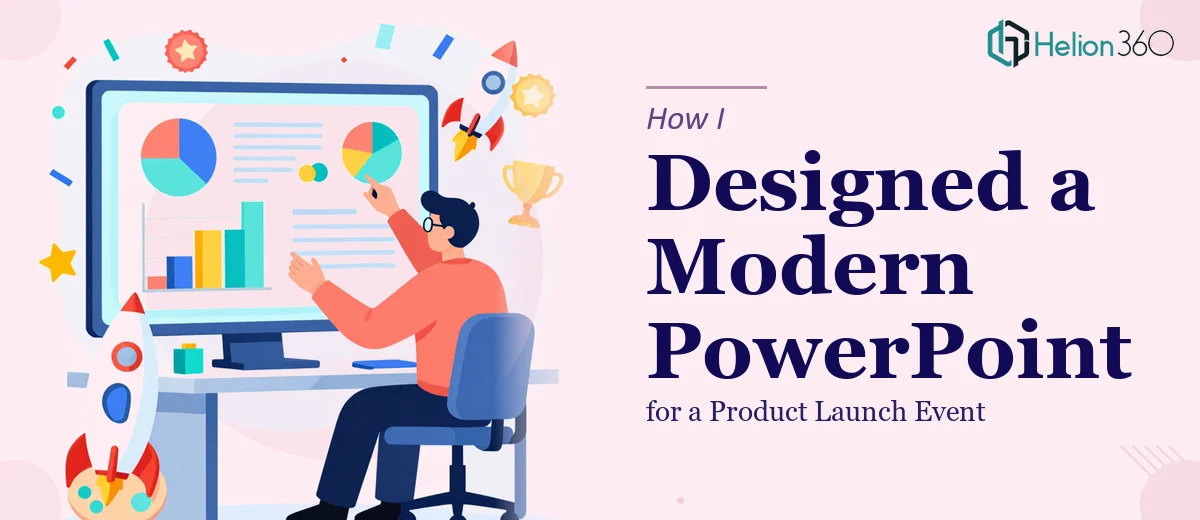
First, the design. I could place text and images, but creating a visually cohesive, modern layout — one that felt polished and professional — took far more skill than I had at hand. Every slide I built looked either too cluttered or too sparse. The color choices felt off. The fonts didn't match. The overall aesthetic lacked consistency.
Second, the data. We had solid numbers — market size, product performance metrics, customer validation data — but turning those into clean, readable infographics inside PowerPoint was slow and frustrating. Charts that looked fine in Excel looked awkward and unrefined on a slide.
Third, the narrative. Good presentation design for a product launch isn't just about putting information on slides. It's about controlling the audience's attention — knowing when to show a visual, when to let a headline breathe, and when data should do the talking. That rhythm is hard to fake.
Two days in, I had a rough draft that I knew wasn't going to cut it for a live launch event.
Bringing in the Right Help
After stepping back and being honest about where things stood, I reached out to Helion360. I explained the context — a product launch event, a tight timeline, a rough draft I had already started, and a clear need for professional-grade PPT design.
Their team asked the right questions upfront. What was the audience profile? What tone did the brand carry? Were there existing brand guidelines? What was the slide count target? Within a short briefing session, they had a clear picture of what the presentation needed to accomplish.
I handed over my draft along with all the raw content — product specs, competitive data, key messaging, and brand assets.
What the Final Deck Looked Like
The transformation was significant. Helion360 rebuilt the deck with a clean, modern visual language that felt consistent from the first slide to the last. Each section had a clear purpose and a defined visual hierarchy — headings that anchored the slide, supporting visuals that reinforced the message, and data presented through well-designed infographics that were easy to read at a glance.
The slide flow was restructured so the story built naturally. The opening grabbed attention. The product feature slides were scannable without being sparse. The competitive positioning section used a comparison layout that made our differentiation obvious without being aggressive. The closing slide was simple, focused, and memorable.
Subtle animations were added where they added clarity — not for visual effect alone, but to guide the audience's eye through complex information.
When I reviewed the rough draft they submitted within the first few days, the gap between what I had built and what they delivered was immediately clear.
What I Took Away From This
Product launch presentations carry real stakes. The audience at a launch event forms impressions fast, and those impressions stick. A deck that looks unpolished or feels disjointed doesn't just underperform — it actively works against the product it's supposed to promote.
The content was always there. The product was strong. What was missing was the design craft to present it properly. That's not a reflection of the work that went into the product — it's just an acknowledgment that professional presentation design is its own discipline.
If you're working on a product launch presentation and you're hitting the same walls I did — the visual inconsistency, the data that won't format right, the narrative that won't come together — Helion360 is worth talking to. They work with what you have, fill in what's missing, and deliver something that's actually ready for the room.
Need a presentation that's ready for launch day? If the design is taking longer than the product prep, let Helion360 take it from here.