

When Course Outlines Are Ready but the Slides Are Not
I had a deadline, a stack of course outlines, and a very clear vision of what I wanted the final presentations to look like. What I did not have was the time or the technical depth to turn all of that into polished, interactive PowerPoint presentations that could work across both internal training sessions and an online course platform.
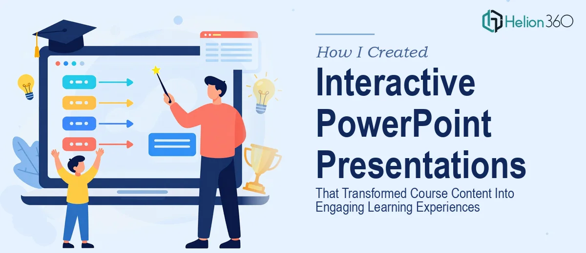
The content itself was solid. Several modules covering everything from basic introductions to more advanced concepts, each with its own tone and learning objective. But getting from a rough outline to a slide deck that actually teaches — one with clean layouts, clear visual hierarchy, charts where needed, and interactive elements like quizzes or clickable hotspots — that is a different kind of work entirely.
What I Tried to Build on My Own
I spent the better part of two days attempting to build the first module myself. I started with a standard PowerPoint template, tried to adapt the layout to the content, and quickly realized the gap between what I had imagined and what I was actually producing.
The slides looked flat. The charts I inserted from Excel felt disconnected from the rest of the design. When I tried to add a simple quiz interaction using triggers and hyperlinks in PowerPoint, it took me an hour to get one slide working — and even then it did not behave the way I expected when tested in presentation mode. Multiply that across multiple modules and I was looking at weeks of work, not days.
I also struggled with consistency. Each module had a slightly different feel because I was making design decisions on the fly. That kind of inconsistency does not look good when you are presenting training content to a professional audience, and it certainly does not build learner confidence.
Handing It Off to People Who Do This Every Day
After hitting that wall, I came across Helion360. I explained where things stood — the outlines were ready, the content was structured, but the presentation design work needed someone who understood both visual storytelling and the specific demands of training material.
Their team asked the right questions upfront. What platform would the slides be delivered on? What was the audience profile for each module? Were the interactive elements meant for self-paced learning or live facilitated sessions? Those questions alone told me they had done this kind of work before.
From there, I handed over the outlines and they handled the rest.
What the Finished Presentations Actually Looked Like
The difference between what I had started and what came back was significant. Each module had a consistent visual system — matching fonts, a coherent color palette, and slide layouts that changed meaningfully based on the type of content rather than looking like the same template repeated forty times.
Data-heavy slides had clean charts and supporting callouts that guided the reader without overwhelming them. Concept slides used visuals and minimal text to reinforce the key points rather than just restating them. And the interactive elements — knowledge-check quizzes with branching feedback, clickable hotspot diagrams — were built cleanly and tested to work reliably in both PowerPoint and the online course format.
The training presentation design held up across all the modules. Moving from the introductory content to the advanced sections felt like a natural progression rather than a jarring shift in quality.
What This Experience Taught Me About Course Presentation Design
Creating effective learning presentations is not just about making slides look good. It requires thinking about how a learner moves through the content, where they might lose attention, and how visual and interactive elements can carry the instructional load. That balance between clarity, design, and function is harder to get right than it looks — especially at scale, across multiple modules with a tight review timeline.
I also learned that starting with well-structured content does most of the heavy lifting. The outlines I prepared made it much easier to communicate intent and get accurate results quickly. The design execution, though, genuinely benefited from having a skilled team handle it.
If you are in the same position — course content ready, presentation design work piling up — Helion360 is worth reaching out to. They stepped in at exactly the right point and delivered presentations that were ready to teach from day one.