

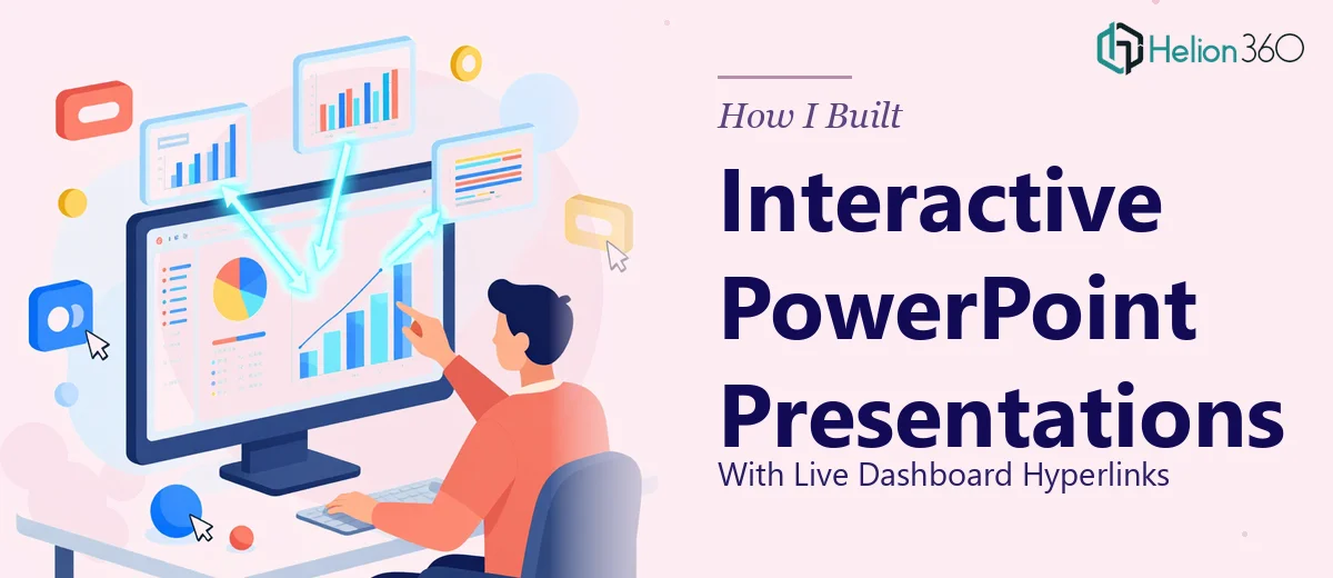
When a Simple Presentation Request Got Complicated Fast
It started as what I thought would be a straightforward task. Our team needed a set of PowerPoint slides that stakeholders could use during quarterly reviews — slides that did not just display data, but actually linked out to live dashboards on our internal platform. The idea was to let anyone in the room click through from a summary slide directly into the relevant dashboard view without leaving the presentation.
On paper, it sounded manageable. In practice, it turned into something far more involved than I had anticipated.
The Problem With Hyperlinks in PowerPoint
I started by mapping out the slides. The structure was clear enough — an overview section, department-level breakdowns, and a few summary pages that needed to point to specific dashboard URLs. The challenge was not the design itself. It was making the hyperlinks work reliably across different environments, especially when the destinations were internal platform links that behaved differently depending on network access and browser settings.
I spent a few hours embedding links manually into buttons and text objects. Some worked cleanly. Others opened in unexpected ways or broke entirely when the file was shared across the team. I also realized that the slides themselves needed better visual treatment — the data-heavy sections felt cluttered, and the transitions between summary views and detail pages were not smooth enough to hold attention in a live meeting.
Then there was the data visualization layer. The job required embedding charts and tables that reflected current figures, positioned in a way that gave context without overwhelming the slide. Getting that balance right while also maintaining the hyperlink structure across multiple slides was more time-consuming than I had budgeted for.
Bringing in Outside Help
After hitting a wall with the linking behavior and the visual layout, I came across Helion360. I explained the full scope — the internal dashboard links, the need for consistent interactivity across slides, the design clean-up, and the tight timeline. Their team understood the brief immediately and took it from there.
What stood out was that they did not treat this as a basic formatting job. They approached the interactive PowerPoint build as a structured design challenge. The hyperlink architecture was planned slide by slide, with each button and linked element tested for consistency. They also restructured the data visualization sections — replacing dense tables with cleaner chart layouts that communicated the same information without the visual noise.
What the Final Deck Looked Like
The delivered presentation was significantly more polished than what I had been working with. Every hyperlink connected reliably to the correct dashboard section, and the buttons were positioned clearly enough that stakeholders could navigate without any guidance. The slide flow moved logically from high-level summaries into clickable detail views, which is exactly what the review sessions needed.
The data slides were redesigned with cleaner visual hierarchy — the kind of layout where a stakeholder can absorb the key number at a glance and then drill deeper through the linked dashboard if they need more context. Transitions between sections were smooth and did not distract from the content.
From a practical standpoint, the presentation worked the way it was always supposed to. Stakeholders could follow along, click through to live data, and return to the slide flow without any friction. That is harder to pull off than it sounds when you are dealing with internal platform links and a complex slide structure.
What I Took Away From This
Building interactive PowerPoint presentations with live dashboard hyperlinks is not just a design task — it is partly a systems task. The linking has to be planned carefully, tested in the actual environment where the file will be used, and built into a visual framework that supports the navigation without making the slides feel cluttered.
I also learned that the data visualization decisions matter as much as the technical setup. If the charts and layout are not clear, the hyperlinks become an afterthought. Both sides of the work have to be done well for the presentation to function as intended.
If you are working on a similar project — slides that need to connect to live dashboards, internal platforms, or external data sources — Helion360 is worth reaching out to. They handled the complexity I could not manage alone and delivered exactly what the project required.