

The Problem With Explaining a Complex Tech Stack to a Non-Technical Audience
We had a presentation coming up that mattered. The audience included potential partners and a few senior stakeholders who understood business outcomes but had limited patience for dense technical architecture diagrams. The goal was to show how our software stack was structured — the layers, the integrations, the logic of how components related to each other — without losing the room in the first five minutes.
The stakes were real. A confusing or visually cluttered slide would signal to the room that we hadn't thought clearly about our own product. A slide that was too simplified would fail to convey the actual sophistication of what we'd built. I knew immediately that getting this right wasn't a "clean it up over the weekend" kind of problem. It required someone who understood both technical content and visual communication at a level I didn't have the bandwidth to develop on a tight timeline.
What I Found Out a Good Software Stack Diagram Actually Requires
I started researching what proper tech stack visualization looks like — not the hand-drawn whiteboard version, but the kind that holds up in a polished PowerPoint presentation in front of a serious audience.
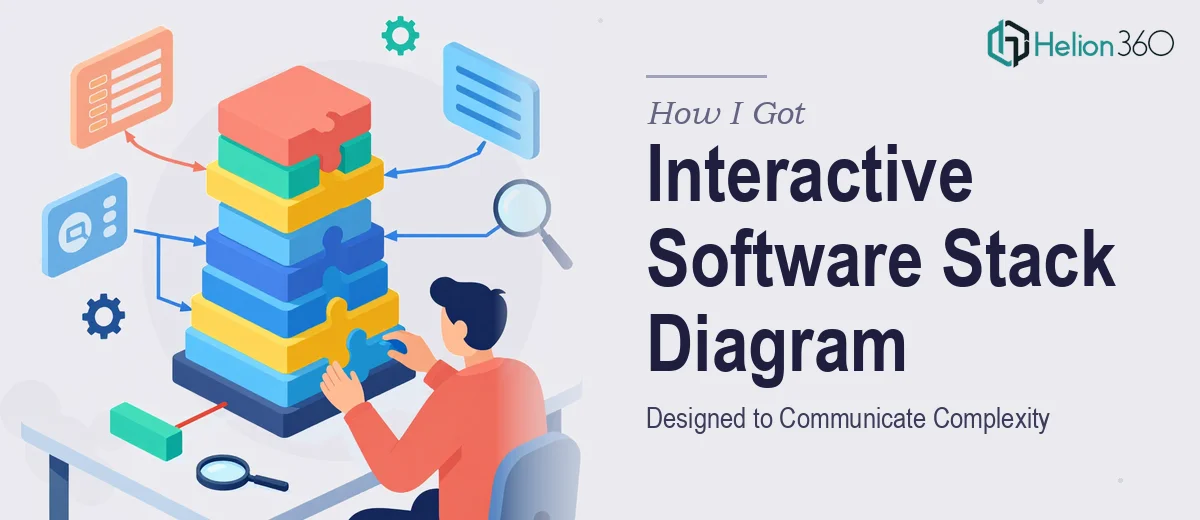
The first thing that became clear is that the diagram has to do two things at once: show structure and tell a story. Those are in tension. Pure structure diagrams look like network topology maps — accurate but unreadable to anyone outside the engineering team. Pure storytelling strips out the nuance that makes the diagram credible.
The second signal of complexity was interactivity. A well-designed interactive software stack diagram uses clickable layers, hover states, or animated reveal sequences so the presenter can control the pace of disclosure — showing one layer at a time rather than dumping the full architecture on screen at once. Setting that up correctly in PowerPoint requires trigger-based animations and hyperlinked navigation, not just the standard transition panel.
The third thing I noticed: every element in the diagram has to be on-brand. Font choices, icon styles, color coding by layer — all of it needs to be deliberate and consistent. Even minor inconsistencies (a slightly different shade of blue on one node, an icon that's one pixel off-center) make the diagram feel unfinished to a trained eye.
What the Work of Building This Diagram Actually Involves
The foundation of a strong software stack diagram is the information architecture — deciding what to show, at what level of abstraction, and in what sequence. Done well, this means auditing the actual stack, grouping components into logical tiers (typically three to five layers such as data, logic, integration, and interface), and mapping a narrative flow that a non-technical viewer can follow. The practitioner decision here is which components to name explicitly and which to abstract into a category label. Getting that wrong in either direction — too granular or too vague — undermines the whole slide. This structural audit alone, done thoughtfully, is a multi-hour exercise before any design work begins.
The visual mechanics of a PowerPoint software stack diagram have specific requirements that trip up most people attempting it for the first time. A proper layout uses a consistent grid — typically a 12-column base — with each layer occupying a defined horizontal band at a fixed height. Icon sets need to come from a single family (monoline or filled, not mixed) and be scaled uniformly, typically 32px or 48px depending on slide density. Typography follows a strict hierarchy: layer labels at 18–20pt, component names at 13–14pt, and annotation text no smaller than 11pt for legibility. Matching these specifications manually across 20 or 30 individual elements, while keeping alignment pixel-perfect, takes far longer than it looks.
Interactivity adds a distinct layer of execution complexity on top of the visual work. Trigger-based animations in PowerPoint require each interactive element to be named correctly in the Selection Pane, with animation sequences built per object rather than per slide. A diagram with five clickable layers and animated entry for each component group can involve upward of 40 individual animation triggers, all of which need to be tested across presentation modes. One misconfigured trigger breaks the reveal sequence mid-presentation — exactly the kind of failure that happens in front of the audience you most need to impress.
Why I Brought in Helion360 to Handle It
I looked at what the work actually involved and made a quick decision. This wasn't a project I could hand to someone with general PowerPoint familiarity and get back what we needed. The combination of technical content mapping, tight visual mechanics, and interactive trigger logic required a team that does this kind of work regularly — with the process and tooling already in place.
Helion360 handled the full project end-to-end. That meant the content audit and layer architecture, the visual design of the diagram itself with proper grid and icon discipline, and the full interactive build with trigger-based animation sequences. The project was turned around quickly — done in days, not the weeks it would have taken me to learn and execute the interactive mechanics alone. What came back was a slide that worked as a presentation tool, not just a diagram — each layer revealed on cue, on-brand, and readable by the non-technical audience we needed to reach.
The Result and What I'd Tell Anyone Who's Facing This Same Thing
The diagram landed well. The audience followed the architecture without getting lost, and the interactive reveal meant we could control the conversation — introducing each layer when it was relevant rather than asking people to stare at a wall of components. The visual credibility of the slide did real work in the room: it signaled that we understood our own product clearly enough to explain it simply.
Anyone who's staring at a complex tech stack and thinking about how to present it to a mixed audience should be honest with themselves about what the work involves. The gap between a rough diagram and one that actually communicates — and holds up in a high-stakes room — is significant. If you're in that spot and need it handled end-to-end without the learning curve, Helion360 is the team to engage — they delivered fast and brought exactly the execution depth this kind of work requires.