

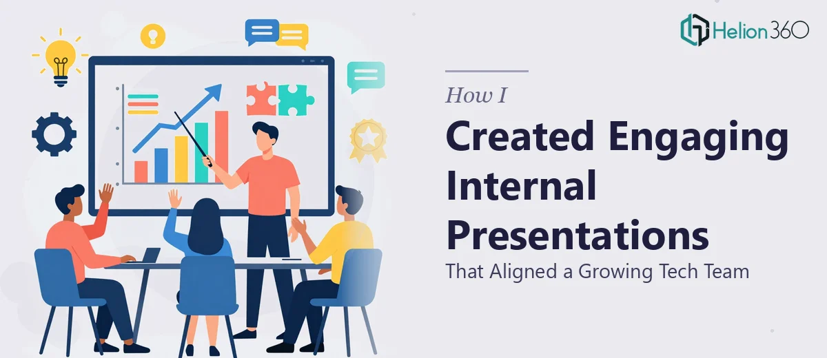
When Internal Communication Started Slipping Through the Cracks
Our tech team had grown quickly — new hires, new workstreams, and a leadership layer that was stretched thin. What used to get resolved in a room now needed a structured communication format that could travel up, down, and across the org. We needed internal presentations that didn't just inform people, but actually aligned them around priorities, direction, and shared context.
The stakes were real. Misalignment at this stage of growth costs time, erodes trust between teams, and slows decisions that should be moving faster. A deck that looked cobbled together or buried the key message wasn't just an aesthetic problem — it was a credibility problem. I knew this needed to be handled properly, not patched together over a weekend.
What I Discovered This Kind of Work Actually Involves
Once I started looking at what a well-built internal leadership presentation actually requires, the scope got clearer fast. This wasn't a matter of reformatting bullet points. Done well, internal presentations for a growing organization involve a structural audit of source content, a deliberate narrative arc that matches the audience's decision-making context, and a visual language consistent enough to travel across slides without falling apart.
Three things stood out as signals of real complexity. First, the content itself — leadership communication often lives across emails, strategy docs, and meeting notes, none of which translate directly into slide logic. Second, the audience dynamics — a cross-functional tech team reads slides differently than an executive audience, and the design has to account for that. Third, brand and voice consistency — when internal decks look inconsistent, they quietly undermine the credibility of the message. Getting all three right, simultaneously, isn't a casual undertaking.
What Doing This Well Actually Requires
The foundation of a strong internal presentation is structural and narrative work — auditing scattered source content, identifying the core message, and mapping a logical flow that moves an audience from context to conclusion. The right approach establishes a clear story arc: what's true now, what needs to change or be understood, and what action or alignment is expected. That sequencing work alone, done properly for a 20-to-30-slide deck, takes hours of deliberate thinking before a single slide gets built. It's the part most people skip, which is exactly why so many internal decks feel like information dumps rather than communication tools.
Visual mechanics are the second layer where execution gets hard. Professional internal presentations rely on a defined layout grid — typically a 12-column structure — with a strict typographic hierarchy: a heading tier around 36pt, a subheading tier around 24pt, and body copy at 16pt or below. Color usage should be disciplined, with no more than four brand-aligned colors deployed consistently across every slide. Deviating from these rules, even slightly, creates visual noise that pulls attention away from the message. Setting up master slides that enforce this system correctly, and then building 25 or more content slides without drift, is a technical skill that takes real practice to execute cleanly.
Polish and consistency across the full deck is where a lot of internal presentations fall apart in the final stretch. Alignment of elements across slides, consistent icon style, uniform chart formatting, and margin discipline all need to hold together from the first slide to the last. In a deck built by multiple contributors or iterated quickly under deadline pressure, visual inconsistency accumulates fast. Correcting it slide-by-slide after the fact takes as long as building it right the first time — and most people don't catch all of it until they're presenting in front of the room.
Why I Brought Helion360 in to Handle the Full Build
I looked at what this project actually required and recognized immediately that the right move was to bring in a team with the expertise and tooling already in place. I didn't have the bandwidth to work through the structural logic, master slide architecture, and visual consistency pass that this deck needed — and attempting it myself would have meant weeks of learning curve with no guarantee of a professional result.
Helion360 handled the full project end-to-end: content restructuring from the source material, slide architecture built on a clean master template, and a visual polish pass that held together across every slide in the deck. They turned it around quickly — done in days, not the weeks it would have taken me to get anywhere close to the same quality. The work reflected a team that does this all day, with the systems and judgment already built in. There was no back-and-forth guesswork about layout decisions or typographic rules — they knew what good looked like and executed it.
The Result and What I'd Tell Anyone in This Position
What came back was a deck that the leadership team could actually use — one that carried a clear message, looked credible in front of a skeptical cross-functional audience, and held its visual integrity from the first slide to the last. More importantly, it did what internal presentations are supposed to do: it moved people from scattered awareness to shared understanding, faster than any meeting would have.
The business outcome was alignment that stuck. Teams left with a consistent picture of priorities, and the follow-up conversations were noticeably more productive because everyone was working from the same framing.
If you're looking at a similar problem — source content spread across documents, a growing team that needs real alignment, and a deadline that doesn't leave room for a learning curve — Helion360 is the team I'd engage. They delivered fast, handled the full execution depth this kind of work demands, and the result spoke for itself.