

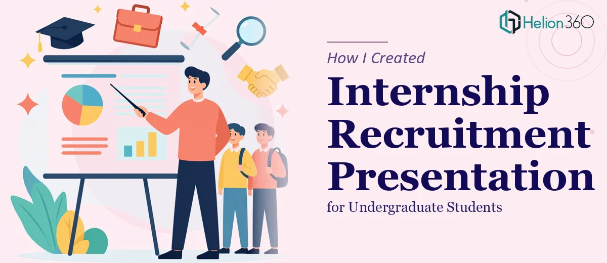
The Task: A Presentation That Had to Do More Than Inform
We had an upcoming campus event — the kind where you get roughly 20 minutes in front of a room full of undergraduate students who are sizing you up as a potential employer. My job was to create an internship recruitment presentation that would make our company stand out, communicate what we offer, and motivate students to actually apply.
Simple enough on paper. But when I sat down to build it, the gap between what I had (a rough outline) and what I needed (a polished, compelling presentation design) became very clear, very fast.
What I Started With
I had the basic structure in place. I knew the content areas: who we are, what the internship involves, the benefits, what a typical day looks like, and how to apply. That part wasn't hard.
What I struggled with was how to present it in a way that would actually resonate with students. Bullet-point slides with company logos and a contact email at the end weren't going to cut it. Undergraduates are a sharp audience — they've sat through hundreds of lectures and can tell instantly when something was thrown together.
I tried a few PowerPoint approaches on my own. The first version looked decent but felt generic. The second had better visuals but poor flow. By the time I realized I was spending more time adjusting slide layouts than thinking about messaging, I knew I needed a different approach.
The Deadline Made It Worse
The presentation had to be ready within 48 hours to align with internal planning and the event schedule. That wasn't a lot of time to go back to basics.
I needed someone who could take the structure I had and turn it into something that looked professional, communicated clearly, and felt engaging — without me having to explain presentation design principles from scratch.
Bringing in Helion360
After hitting a wall on the design side, I reached out to Helion360. I shared the outline, explained the audience (undergraduate students at universities), the event context, and the tight turnaround. Their team asked a few focused questions about tone, branding direction, and the key message we wanted students to walk away with.
From there, they took over.
What the Presentation Needed to Cover
Helion360 structured the internship recruitment presentation around a narrative that would actually make sense to a student sitting in an event hall:
Opening hook — a short, visual statement about what makes working with us different, not just what we do.
What we offer — internship roles, departments involved, and the kind of real work interns actually do. Not vague promises, but specific examples.
Benefits and growth — mentorship access, skill development, exposure to live projects, and what past interns have gone on to do.
A day in the life — this was a section I hadn't originally planned, but it made the deck far more relatable. A simple visual timeline of what an intern's week might look like humanized the whole thing.
How to apply — clear steps, contact information, and timeline.
Each section was designed to feel purposeful, not padded. The visual language was clean and professional without being stiff — which matters when your audience is in their early twenties.
The Result
The final presentation came back well within the deadline. It was polished, consistent, and structured in a way that guided the audience through the story we wanted to tell. The slide transitions were smooth, the typography was readable even from the back of a room, and the visual hierarchy made it easy to follow along.
More importantly, it communicated confidence. When students see a well-designed internship recruitment deck, they make an assumption about the company behind it — and that assumption has to be positive before they even speak to anyone.
The event went well. We had a strong turnout, and the follow-up applications came in ahead of what we'd seen in previous years.
What I Took Away From This
The lesson here wasn't that I couldn't handle presentations. The content and structure — that was doable. What required real skill was translating that content into a visual format that would land with the right audience in the right setting.
Presentation design for recruitment is a specific kind of challenge. It's not just about making things look nice. It's about guiding a room full of skeptical, busy people toward a clear action — in this case, applying for an internship.
Having a team that understood both the design and the communication goal made a real difference.
Need Help With a Presentation Like This?
If you're working on a recruitment or corporate presentation and the design side is eating up time you don't have, Helion360 can step in and take that off your plate.