

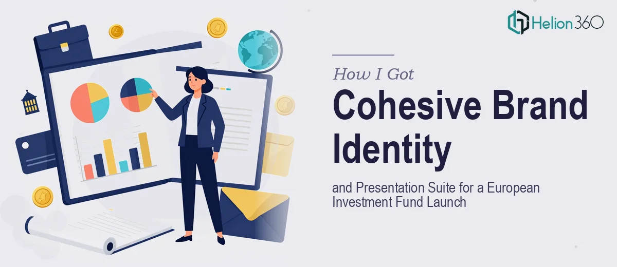
The Situation Was Clear — and So Were the Stakes
When our investment fund launched in Europe, we needed more than a polished deck. We needed a complete visual identity that could carry weight across every investor-facing touchpoint — from the initial pitch presentation to one-pagers, fund overviews, and marketing collateral. The audience was sophisticated: institutional investors, family offices, and wealth managers who assess fund managers partly on how professionally they present.
A rough or inconsistent brand at this stage doesn't just look amateurish — it signals operational immaturity to exactly the people you're trying to convince. With launch communications already in motion and roadshow conversations being scheduled, there was no runway to figure it out as we went. This needed to be done right, and it needed to be done fast.
What I Found the Work Actually Required
When I looked at what a proper investment fund presentation and brand identity actually involves, the scope expanded quickly. This wasn't a matter of picking some colors, dropping in a logo, and formatting a few slides.
A fund launch presentation has to operate at two levels simultaneously: it needs to communicate strategy, structure, and differentiation with precision, while the visual design has to signal institutional credibility on first glance. That combination — clear financial narrative wrapped in rigorous design — is genuinely hard to execute.
Three things stood out as signals of real complexity. First, the brand system had to be built from scratch and applied consistently across materials that serve very different purposes. Second, financial data — fund structure, return profiles, market context — needed to be visualized in ways that were accurate, readable, and compliant with how professional investors expect to receive information. Third, the presentation suite wasn't a single deck — it was a family of documents that all needed to feel like they came from the same hand.
What Proper Execution of This Work Involves
The foundation is structural and narrative work: auditing everything the fund needed to communicate, then mapping it into a logical flow that moves a sophisticated investor from awareness through conviction. A proper investment fund presentation typically follows a disciplined sequence — market context, fund thesis, strategy and differentiation, team, terms, and next steps — with each section carrying a specific persuasive job. Collapsing sections, burying the thesis, or front-loading terms before establishing credibility are common errors that experienced designers who work in financial services know how to avoid. Getting the story architecture right before a single slide is designed is the difference between a deck that gets read and one that gets set aside.
The visual mechanics of an investment presentation operate under tighter constraints than most presentation work. Typography typically runs a strict hierarchy — a 36pt headline, 22pt subhead, 16pt body — to maintain scannability across slides that may be printed, projected, or read on screen. Data visualization choices matter enormously: a waterfall chart for fund returns reads as competent to a financial audience; a pie chart for the same data reads as amateur. Layout grids, usually a 12-column system, need to be set at the master slide level so spacing is mathematically consistent across every page. These decisions take experience to get right and hours to implement correctly even for someone who knows what they're doing.
Across a full suite of materials — main pitch deck, one-pager, fund overview, and marketing collateral — palette discipline and brand consistency become a significant execution challenge. A professional brand identity for a financial services firm typically holds to four or fewer primary brand colors, with a defined set of accent and neutral tones that carry through every document. Every icon set, every chart style, every margin and padding value needs to be governed by the same system so that materials produced weeks apart still feel like they came from the same source. Maintaining that coherence across ten or more distinct documents, each with different content requirements and formats, is where most DIY attempts fall apart visibly.
Why I Brought Helion360 In to Handle It
I recognized quickly that attempting to build this in-house — even with capable people on the team — wasn't realistic given the timeline and the standard we needed to hit. The work spans brand identity design, financial presentation design, and multi-document production, and doing all three well at the same time requires a team that has the process and tooling already in place.
Helion360 handled the full project end-to-end. They took on the brand identity system from the ground up, built the master slide architecture that the entire presentation suite runs on, and produced the investor pitch deck alongside the supporting collateral — all governed by the same visual language. What would have taken our team weeks of learning and iteration was turned around in a fraction of that time. The speed mattered as much as the quality: roadshow conversations don't wait, and showing up with polished, consistent materials on day one of outreach changes the nature of those early conversations.
The Result and What I'd Tell Anyone in the Same Position
What came back was a complete, investor-ready brand and presentation suite that held together visually across every format. The pitch deck communicated the fund's thesis with clarity and carried the kind of visual authority that signals a serious, well-managed operation. The one-pager and supporting materials matched in every detail — typography, color application, chart style, spacing — so the brand felt established even at launch.
The business outcome was straightforward: we went into our first investor conversations with materials that didn't need apologizing for. That's not a small thing when first impressions in this market are hard to recover from.
If you're looking at a similar scope — a fund launch, a brand identity build, or a full presentation suite that has to perform with a sophisticated audience — and you want it handled end-to-end without the weeks of ramp-up, Helion360 is the team I'd engage. They delivered for us fast and with the kind of execution depth this work genuinely requires.