

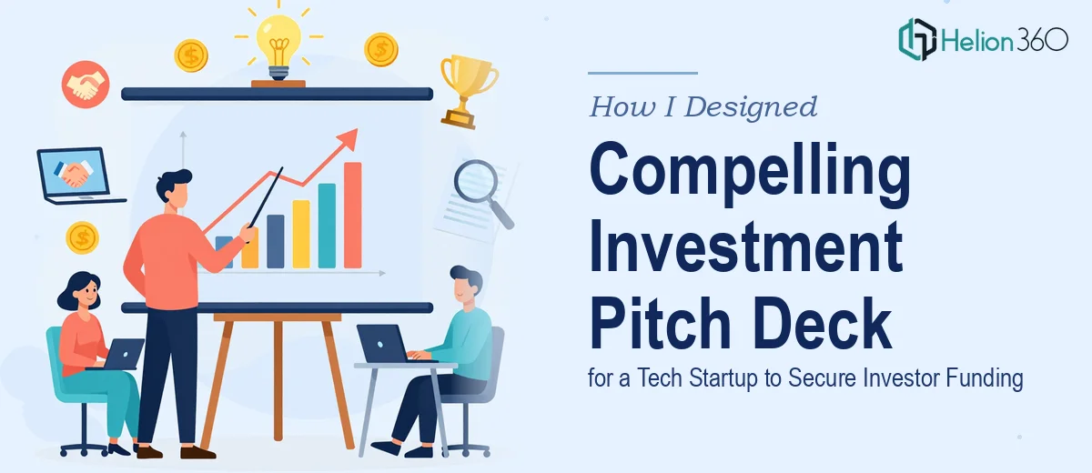
The Pressure of a High-Stakes Pitch Deck
When I set out to build the investor pitch deck for TechSage Inc., I knew the stakes were high. We had a solid product — a platform designed to help businesses manage digital assets and improve operational productivity — but turning that into a deck that would actually resonate with investors was a different challenge altogether.
I had two weeks. The deck needed to cover market analysis, product features, financial projections, our competitive edge, and team credentials. It had to tell a coherent story while looking polished enough to sit in front of serious investors. I started drafting it myself.
Where the DIY Approach Fell Short
I am reasonably comfortable with PowerPoint. I know how to build slides, add charts, and clean up formatting. But somewhere around the third draft, I realized the deck was not doing what a startup pitch deck needs to do — it was presenting information, not making a case.
The market analysis slide felt like a data dump. The financial projections looked technically correct but visually confusing. The product feature section lacked a clear narrative thread. I was so close to the content that I could not step back and see it the way an investor would see it for the first time.
The visual design was also inconsistent. Some slides looked clean, others felt crowded. There was no cohesive brand tone running through it. For a tech startup trying to communicate credibility and growth potential, that inconsistency was a real problem.
Bringing in the Right Help
After hitting that wall, I came across Helion360. I explained the situation — tight timeline, complex content, and a deck that needed to work both visually and strategically. Their team asked the right questions upfront: Who are the investors? What stage are we pitching? What is the one thing we want them to walk away believing?
That framing exercise alone helped clarify what the deck needed to say. From there, Helion360 took over the design and structure.
How the Deck Came Together
The team worked through the deck section by section over the first week. Here is what changed most significantly:
Market Analysis was restructured into a visual narrative — market size, opportunity gap, and TechSage's entry point presented as a logical flow rather than isolated statistics. Charts were simplified and labeled so investors could grasp the numbers in seconds.
Product Features were translated into benefit-driven visuals. Instead of bullet points listing capabilities, the slides showed how the platform solves a specific pain point in the digital asset management space. Screenshots and workflow diagrams replaced walls of text.
Financial Projections got a dedicated section with clean graphs showing a three-year revenue trajectory, key assumptions clearly noted, and a simple unit economics breakdown. The design made the numbers easy to follow without undermining their credibility.
Competitive Positioning was presented as a comparison matrix that highlighted TechSage's unique selling propositions without dismissing competitors unfairly — a balance that tends to land well with experienced investors.
Team Background was formatted to emphasize relevant experience quickly, using a layout that feels confident but not self-congratulatory.
By day ten, the first complete version was ready for review. There were two rounds of revisions — mostly minor adjustments to copy tone and one chart that needed a different visualization approach. The final deck was delivered ahead of schedule.
What the Finished Pitch Deck Delivered
The completed investor pitch deck was a significant step up from what I had been building on my own. It had a consistent visual identity, a logical narrative arc, and slides that communicated clearly without requiring the presenter to over-explain.
More practically, the deck gave our team more confidence going into investor meetings. When the visual storytelling does the heavy lifting, you can focus on the conversation rather than compensating for slides that are not landing.
The experience reinforced something I already suspected: the content expertise and the design expertise are both necessary, but they are rarely the same skill. Knowing your product deeply does not automatically translate into knowing how to present it.
Need Help With Your Own Investor Pitch Deck?
If you are working on a startup pitch deck and finding that the gap between what you know and what the slides communicate is wider than expected, that is a common place to get stuck. Helion360 works well in exactly that situation — when the content is solid but the presentation needs a team that understands both structure and design. It is worth reaching out before the deadline gets closer.